It’s nice to see you for another issue of UI Designer Weekly. This week, you’ll find more beautiful, inspiring, and thought-provoking examples of design.
My hope is that you find something that you can mix into your own work. Thank you for joining me, have a great, restful weekend!

Color, Back with New Meaning
A row of purple elements in iOS 16 shares Focus filtering is on. I think this an amazing use of color. Purple has become the color for Do Not Disturb, and now Focus here. Making everything in the row the same color helps it feel separate and different from all the rows after it. It even has a quiet sort of feeling to it, with the purple. Did you notice the interesting alignment that’s shared by the all the icons on the right, or how the “Turn Off” button seems to be not so bold?

Rectangular in the Front, Party in the Back
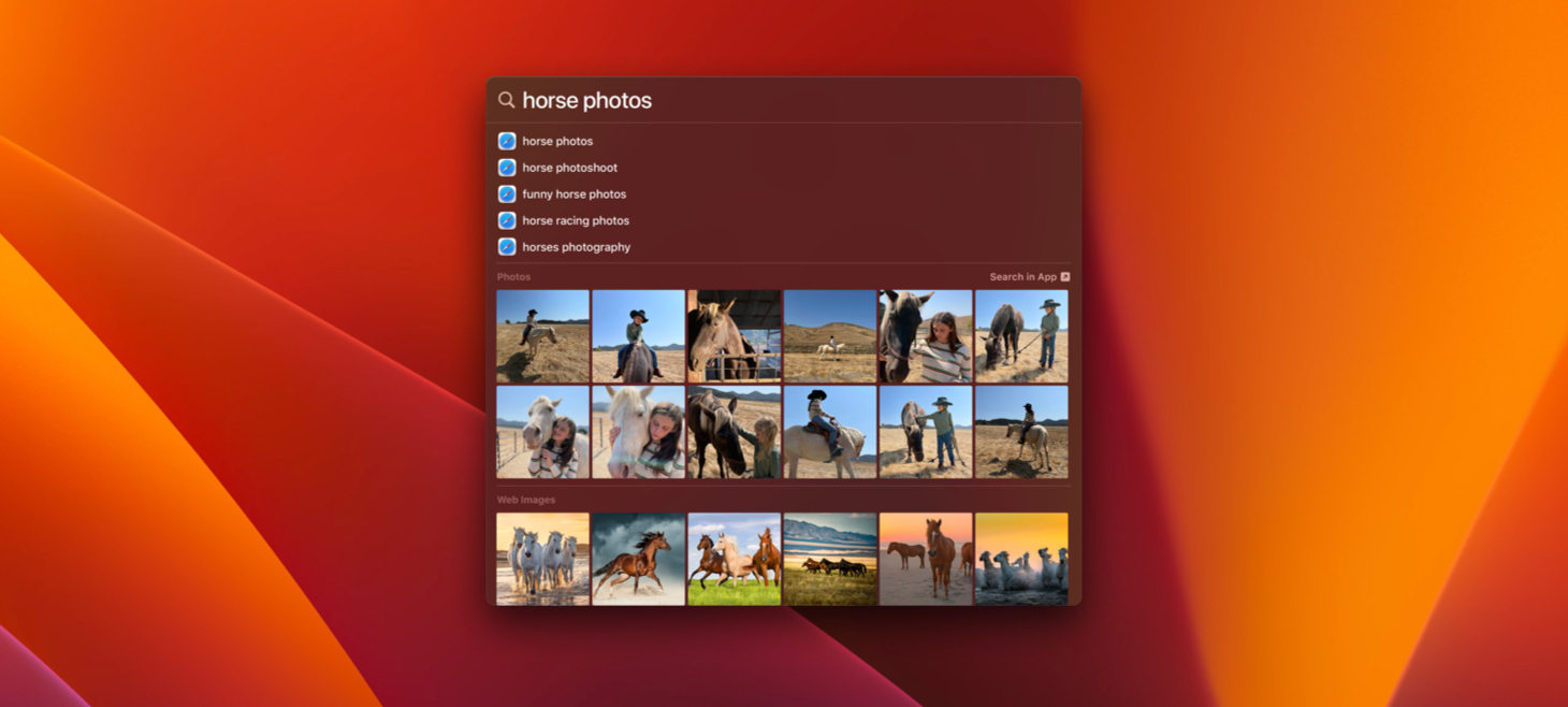
Inside Spotlight on macOS Ventura, the beautiful pop-up design with rounded corners, there’s a photo grid without rounded corners. This is maybe one of the best reminders that we don’t need to use rounded corners all the time on everything. The photo rows here feel big, easy to see, and like they have a lot of photos in them, and the tight spacing and no rounding are a part of that. Maybe we can use rounding a lot on the outsides of our designs, but on the insides we can find grids that can be great as regular rectangles (gasp!).

It’s Been a Blur
The menu bar extends across the top of the screen and has been a central piece Mac design for decades. Today, the menu bar is a vibrant blur of the wallpaper behind it. Just that blur is enough to create enough separation and foundation for icons, text, and colors to be placed on top. This struck me as beautiful and inspiring and made me wonder what other bars and interface elements could work better with a blur as their foundation.

Headlines Standing Out
There’s still just something beautiful about white text on photography.
Thank you for reading UI Designer Weekly. See you next week.
