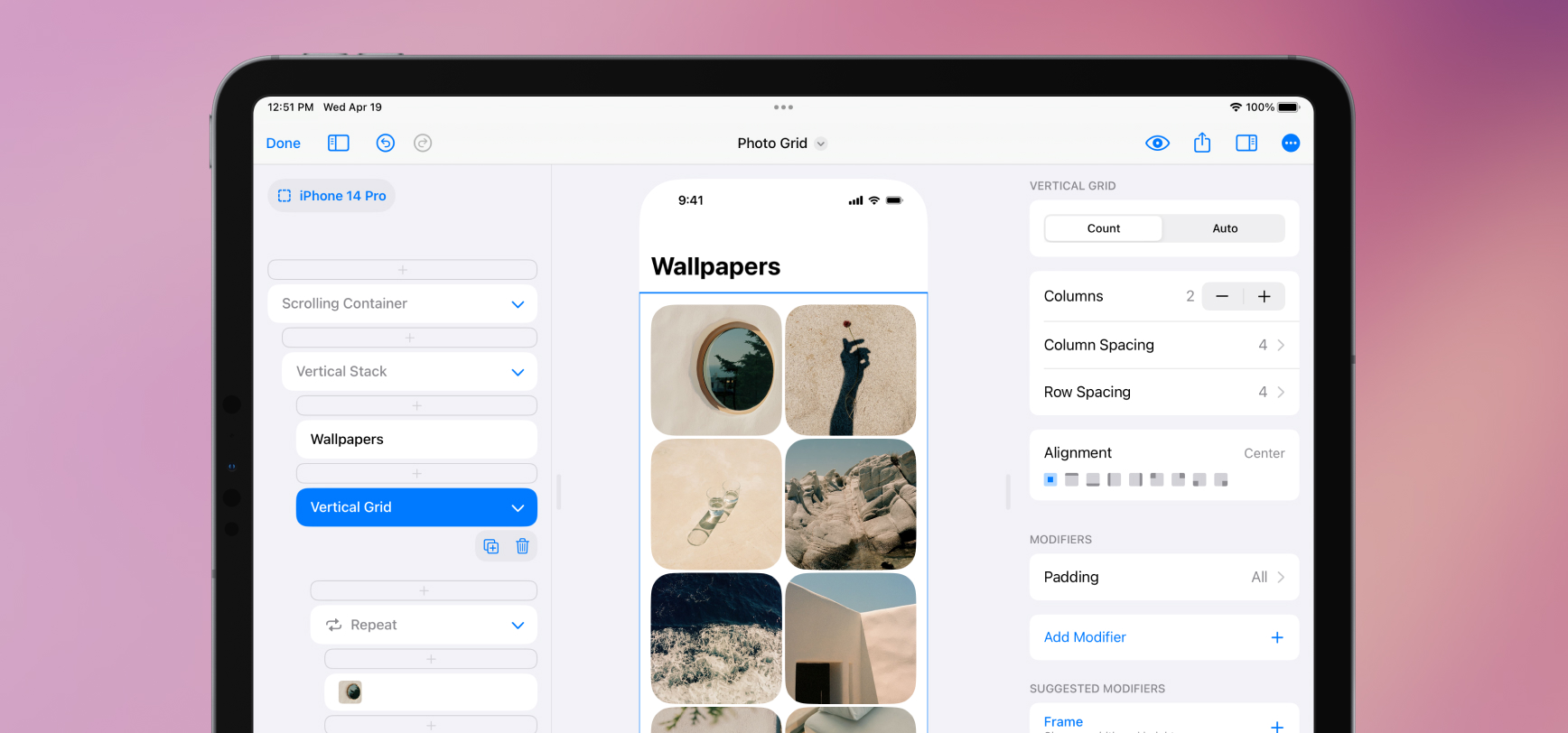
We added two new elements, Vertical Grid and Horizontal Grid. These elements make designs like this and this fun and easy to make in SwiftUI. Grids are a dream when paired with Repeat—your designs intelligently flow elements from left to right and wrap to new rows.
Grids work in two modes, Count and Auto. If you want to make a grid with equal columns, use Count and manually set the number of columns. DetailsPro and SwiftUI will automatically and equally size that number of columns. If you want to set the minimum and maximum size of your grid elements and let the number of columns be determined automatically, use Auto.
We also added a new modifier, Aspect Ratio, which lets you give your elements set ratios to fit into. You can make a hero area stay 16:9, or a grid photo stay 1:1. If you are using Aspect Ratio with an image element, make sure to set the image to Fill so it fills the set ratio.
New Templates
- Photo Grid—use this as a starting point for big, beautiful grids with added style. The corner radius and spacing applied give this design a fun feel.
- Profile—use this as a starting point for a tighter grid that fits in with elements above and below it. Lower grid spacing and an aspect ratio modifier set to 1:1 make this a good general starting point.
- A few existing templates that had grids before Grid have been updated to use the new elements. Check out Store, Grid, and Adventure Grid.
Fixes and Improvements
- Two new elements have been added, Vertical Grid and Horizontal Grid. These export in code as
LazyVGridandLazyHGrid. Vertical Grid is probably the grid you are thinking of, where elements go across and then down the screen. Horizontal Grid is like what you see in Apple Music and the App Store, where there are a couple of apps on top of each other and then more going off to the side that you can scroll to. - Aspect Ratio is a new modifier available. Set a width and height to create your aspect ratio (like 16:9 or 4:3) or select from a list of presets. You can also tap the flip button to instantly switch the sides of your aspect ratio. You can also set an alignment property for elements that fill the aspect ratio. You can use this to make the top, bottom, or center of an image element show, for example.
- Repeat now always shows the Add Item button at the top so you can repeatedly add new items without having to move your finger with the button.
- The Line Limit modifier now properly defaults to a line limit of 1.
