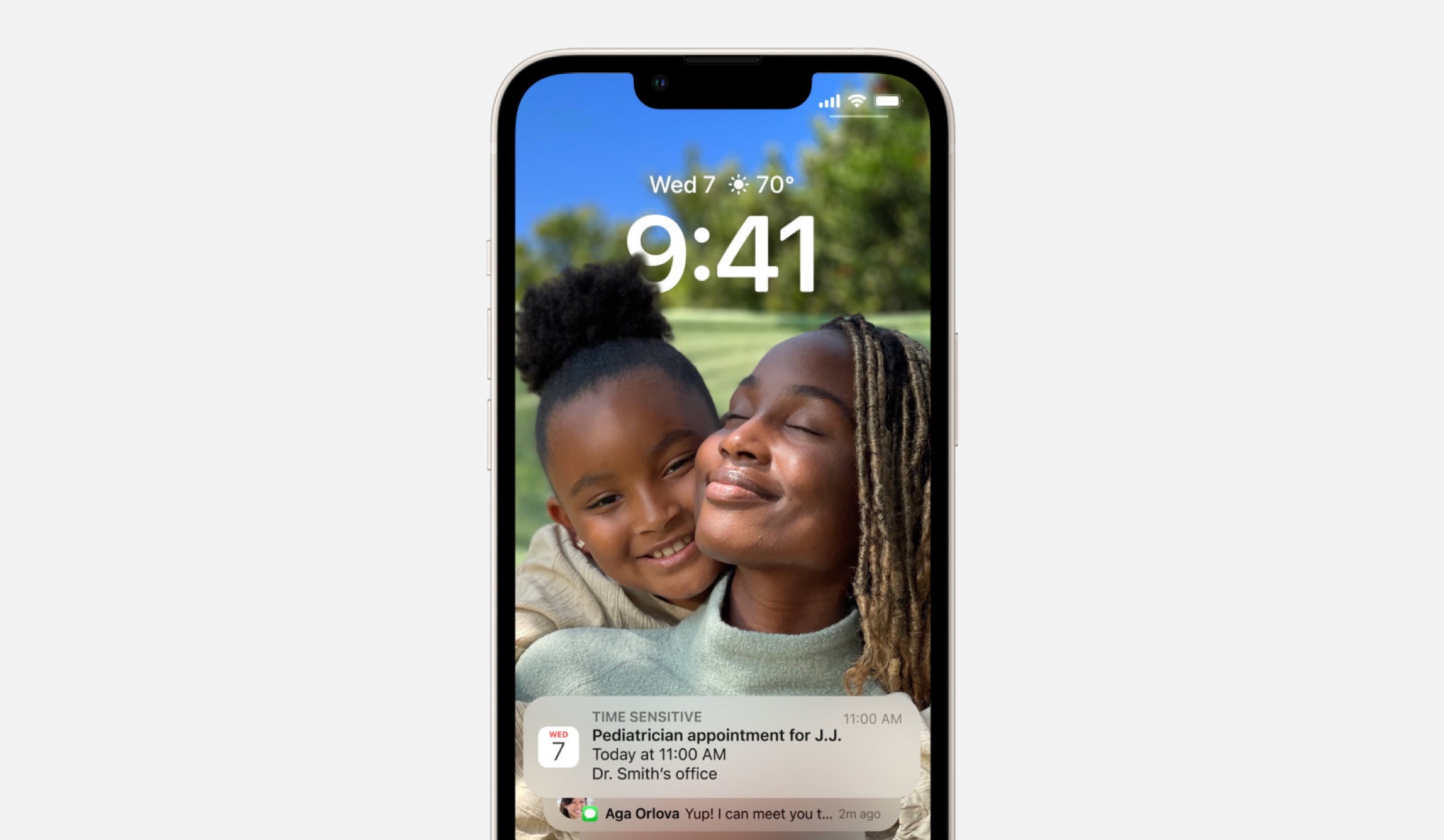
Recently, I was reminded how important family is. This reminder has been the guiding force behind my writing this week. I want to look at how family appears in Apple design. In these designs, there are experiences we share because they have become as common as pencils and pens (like the Notes app, one of my grandma’s favorites) and there are experiences that stay personal: the received phone calls, the sent messages, the checked locations.
While a small computer can be a productivity machine, life has much more in store for each of us than simply moments to be productive. We will grow, fall, love, live, mourn, laugh… and this will happen, even if by accident, here and there on our small computers.
The examples in this week’s issue create a string of design decisions that, to me, underscore Apple’s commitment to dignifying people in design. By pairing names with photos in one place and allowing hair to block the time in another, these designs appear to understand, if not actively join in on, the care that we have for people in our lives.
Let’s have a look. I hope that you’re able to hold the ones you love close, always. I also hope you find something here that you can mix into your own design work. Thank you for reading UI Designer Weekly. —S

Family Comes First
iOS 16 can place a photo of your favorite people in front of the time and the weather on the Lock Screen. Their hair, their shoulders, and their faces will even partially block your view of the time. This design is as beautiful and artistic as it is effective, in my opinion. I think this is a great reminder for us to look for ways to break the rules (partially-make-the-time-unreadable break the rules) in our designs if it means bringing out the things people love.

We Talk and That’s the Best Part
Designs center people on watchOS 9, like here in Find My and Messages. Each chat bubble is shown on its own—I want to draw attention to the fact that there is no metadata visible on each chat bubble here. Each bubble shows the message and that’s it. And on the left, Find My shows a name and a photo beautifully and in large positions at the top. I think this is a great example of how we can leave things out of our designs to emphasize what we believe is important.

I Saw You There Looking Dignified
iOS shows a photo for each person you’re adding to a shared album. When Apple designs do this on any platform, I think they’re sending a small gesture of a message that these people matter—that they are real people. Apple Design’s handling of people was one of the first things I remember noticing before I got my first Mac. I think this is a great reminder that we should want our designs to be fluent in the way people think. We want to design in a way that visual elements of any given task align with the task itself in shape, layout, and appearance; adding people to a shared album is tapping on faces, creating a Find My notification is dragging a radius bigger on a map.

This Frame is See-Through
Photos on iOS 16 shows the latest additions to shared family photo album. Edge-to-edge, with ever-so-thin borders, each photo is shown in clear view without any interface elements over them. This is another example of what’s not there as opposed to what is—we can remove things from our designs to let people get lost in what they’re looking for.
Thank you for reading UI Designer Weekly. See you next week.
