We’re a couple weeks away from the wonders, the magic, the curtains-being-pulled on June 5th, WWDC23. My excitement has reached a maximum vibration wherein I am now numb to the feeling and have transcended into a pure zen state.
I am ready to receive the beauty and creativity contained within each announced innovation. My life, ready to subtly reorganize itself to make room for a new feature. My mind, ready to play the toddler’s game of trying to fit my ideas into the square-and-circular (squircular?) holes of Apple’s new operating systems.
Today though, we have something wonderful to look at. A true gem of the kind that inspired me to originally start this newsletter. Apple’s new Assistive Access, announced this week on Apple Newsroom, debuts what Apple refers to as a distillation of app designs that make apps easier to access for those with cognitive disabilities.
What follows in this week’s issue is a collection of Assistive Access designs from this announcement. We’ll look at each and appreciate something about the design and the way it distills an app’s design.
There is something beautiful, functional, and abstract here in all this. The foundations of human-computer interaction are on display with the signature touch of Apple Design. Tapping on an app to “open it” or “enter it” remains an abstract human invention. What Apple would do to reduce the cognitive load of these interactions, and to support people wanting to use their devices to make calls, take photos, and listen to music, we now get to see and study in plain view.
I hope you find something here that you can mix into your own design work. Thank you for reading UI Designer Weekly. —S

Thank You for Welcoming Me Into Your Home
I once read cautionary design advice: when designing an interaction, make sure to design from the beginning of the interaction. If you’re designing a photo editing screen, make sure to consider how someone arrives at that screen. It’s not enough to design the middle of the interaction. The Assistive Access Home Screen design displayed here represents this idea done right. I love that apps can be displayed in a grid or in a list. I love that there is an icon, a title, a background color, and a shadow. This is thought put into the beginning of the entire Assistive Access experience to prepare people for the middle.
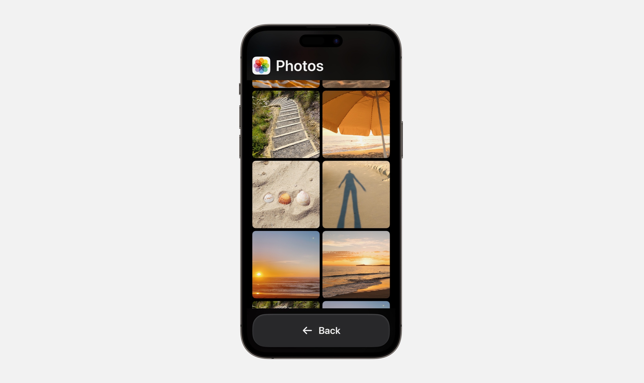
I Put Up These Pictures the Other Day

Apps opened in Assistive Access display their app icon and app name in the top corner. This might be a great reminder for us to keep the most relevant information visible in our designs. In the experience of Assistive Access, it’s not too much information to remind someone which app they’re in by showing the name and the icon nice and big all the time.
Second, the elements of this design are arranged vertically with no layering. There is a title area, a scrolling area, and a big back button. Seeing a major button like Back displayed at the bottom is amazing, and those who think about reachability and what is easiest for the hand to reach will be pleased. Take a second to take in the absence of decoration—lines, toolbars, blurred backgrounds. Not in sight and I don’t miss them.

You’re Going to Want to See This
Camera in Assistive Access carries on the same shapes and layout we saw in Photos, except here there is a layered button for Take Photo. What strikes me here is the existence of labels on each button that have an icon and a title. Even in the Assistive Access experience, where cognitive load is the primary focus, these designs contain and icon along with a title (as opposed to either one alone). This tells me that we can look through our designs for where we might have buttons without icons, or icons without titles, and look for opportunities to pair them up to make buttons easier to recognize.

The New Phone Line Works Both Ways
Calls in Assistive Access is Phone + FaceTime. I think this is a great reminder that just because something has been done a certain way, doesn’t mean it needs to stay that way. In our designs, we can combine, shape, split, and form new ideas to make things easier for people.

I’ve Been Chatting All Day on This Machine
Messages on Assistive Access has an option for an emoji-only keyboard for those who prefer communicating visually. The primary and secondary button styling can still be seen here, with Send in blue and Back in white. The title area changes to show your contact’s name instead of the name of the app, but keeps the larger, clearer design. Messages shows us how a more complex design looks in Assistive Access, and I’m in love with the cleared-out keyboard, free of all the other buttons that would normally be there.
Thank you for reading UI Designer Weekly. See you next week.
