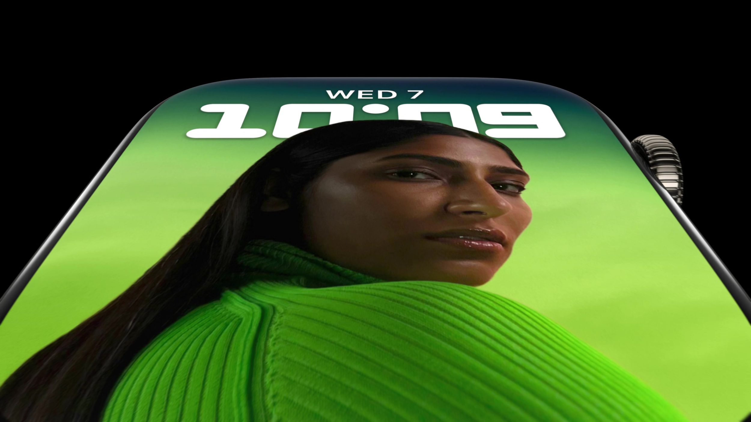
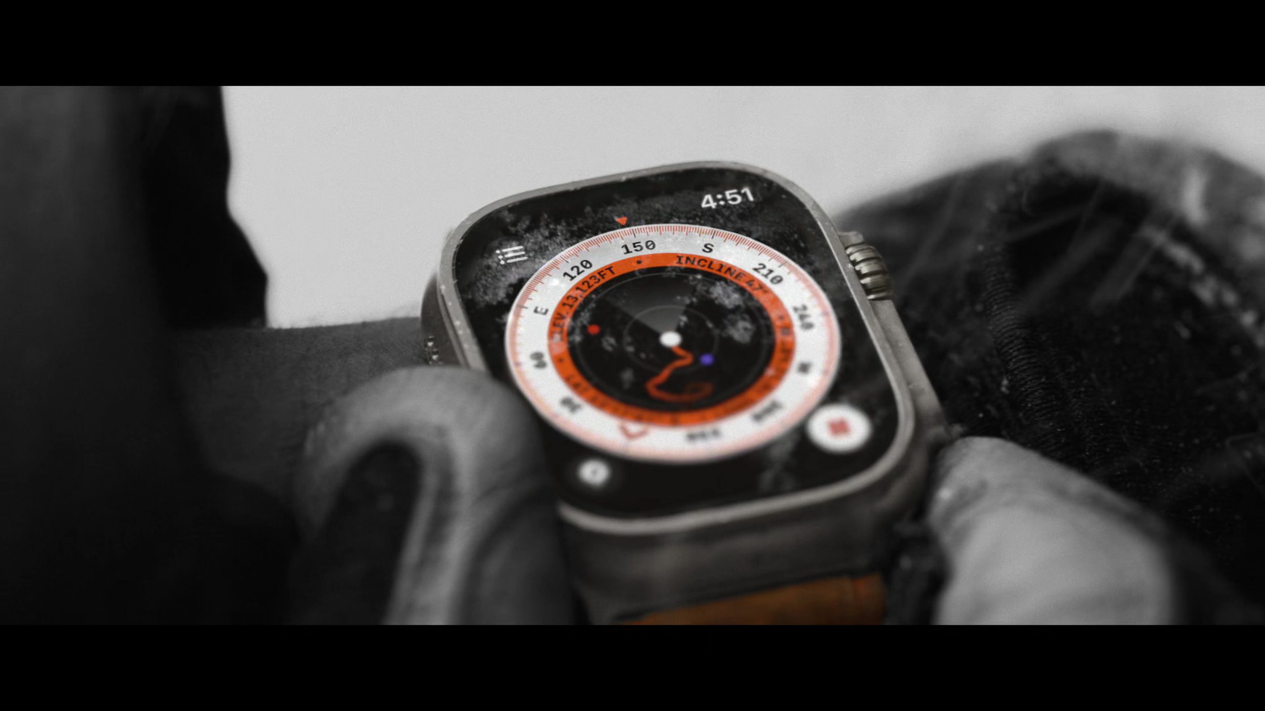
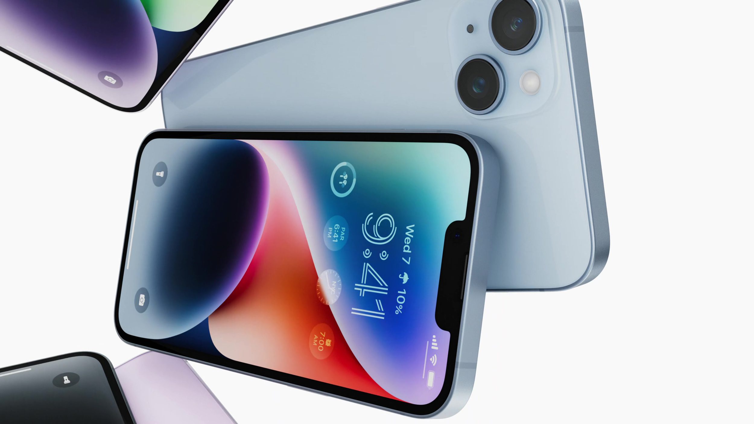
For this week, we have a collection of small designs (in size but not in impact, as we always chase in design work) ranging from an Apple Music design almost smaller than your thumb to a macOS System Settings design actually smaller than your thumb.
WWDC draws ever, ever closer. Less than two weeks!
I hope you find something here that you can mix into your own design work. Thank you for reading UI Designer Weekly. —S
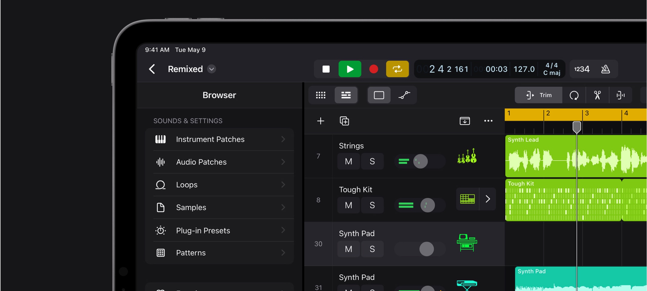
Tiny Thumbnails
The Wallpaper section in System Settings shows a small preview of each wallpaper in an added wallpaper folder. It even changes the shape of the preview based on how many wallpapers are in the folder. I think this is a wonderful way of embedding content directly into a design—the cycle symbol is more specific here with the small thumbnails.
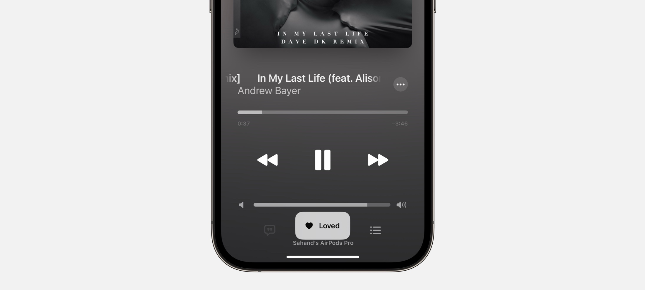
Under My Thumb
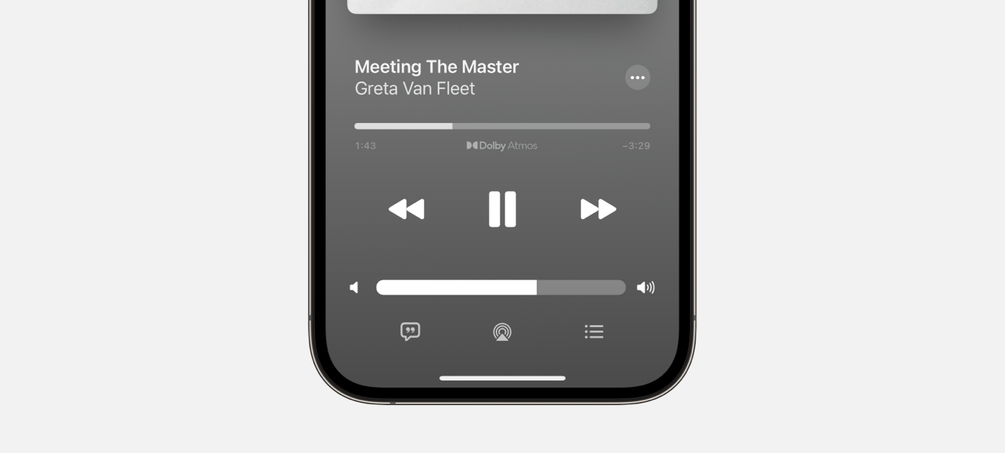
A new, smaller notification design appears in Apple Music after interacting with a song. Besides being smaller and out of the way, I was struck by the less see-through treatment and all the spacing.
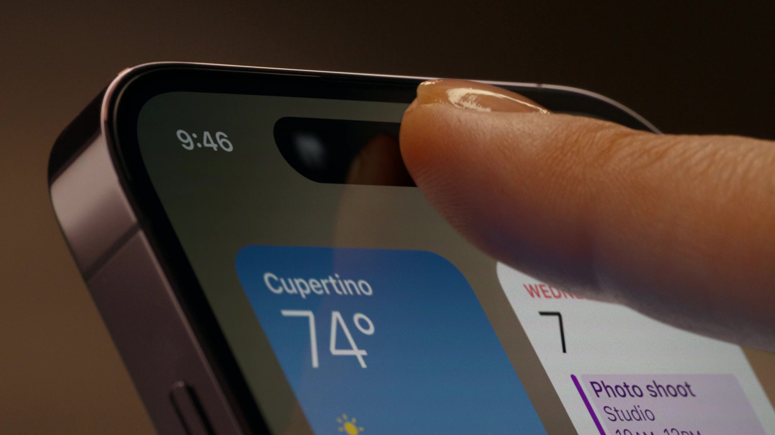
Thumbing Through Wallpapers
The Wallpaper section in iOS Settings features a new design that shows pairings of Lock Screens and Home Screens and the wallpaper selections for each. I think this is a great example of adding in buttons and labels for parts out of our designs that are more complicated, like the button for “Set as Current”.
Two Thumbs Up
A new welcome screen design in Final Cut Pro for iPad. The top area shows a video montage and cycles through other messages like “Built-In Pro Camera Mode”. I think this is a nice reminder that sometimes it can be worth it to create an explanation area ahead of something people will use, and this shows us Apple’s latest standard for a design like this.
Thank you for reading UI Designer Weekly. See you next week.
We’re a couple weeks away from the wonders, the magic, the curtains-being-pulled on June 5th, WWDC23. My excitement has reached a maximum vibration wherein I am now numb to the feeling and have transcended into a pure zen state.
I am ready to receive the beauty and creativity contained within each announced innovation. My life, ready to subtly reorganize itself to make room for a new feature. My mind, ready to play the toddler’s game of trying to fit my ideas into the square-and-circular (squircular?) holes of Apple’s new operating systems.
Today though, we have something wonderful to look at. A true gem of the kind that inspired me to originally start this newsletter. Apple’s new Assistive Access, announced this week on Apple Newsroom, debuts what Apple refers to as a distillation of app designs that make apps easier to access for those with cognitive disabilities.
What follows in this week’s issue is a collection of Assistive Access designs from this announcement. We’ll look at each and appreciate something about the design and the way it distills an app’s design.
There is something beautiful, functional, and abstract here in all this. The foundations of human-computer interaction are on display with the signature touch of Apple Design. Tapping on an app to “open it” or “enter it” remains an abstract human invention. What Apple would do to reduce the cognitive load of these interactions, and to support people wanting to use their devices to make calls, take photos, and listen to music, we now get to see and study in plain view.
I hope you find something here that you can mix into your own design work. Thank you for reading UI Designer Weekly. —S
Thank You for Welcoming Me Into Your Home
I once read cautionary design advice: when designing an interaction, make sure to design from the beginning of the interaction. If you’re designing a photo editing screen, make sure to consider how someone arrives at that screen. It’s not enough to design the middle of the interaction. The Assistive Access Home Screen design displayed here represents this idea done right. I love that apps can be displayed in a grid or in a list. I love that there is an icon, a title, a background color, and a shadow. This is thought put into the beginning of the entire Assistive Access experience to prepare people for the middle.
I Put Up These Pictures the Other Day
Apps opened in Assistive Access display their app icon and app name in the top corner. This might be a great reminder for us to keep the most relevant information visible in our designs. In the experience of Assistive Access, it’s not too much information to remind someone which app they’re in by showing the name and the icon nice and big all the time.
Second, the elements of this design are arranged vertically with no layering. There is a title area, a scrolling area, and a big back button. Seeing a major button like Back displayed at the bottom is amazing, and those who think about reachability and what is easiest for the hand to reach will be pleased. Take a second to take in the absence of decoration—lines, toolbars, blurred backgrounds. Not in sight and I don’t miss them.
You’re Going to Want to See This
Camera in Assistive Access carries on the same shapes and layout we saw in Photos, except here there is a layered button for Take Photo. What strikes me here is the existence of labels on each button that have an icon and a title. Even in the Assistive Access experience, where cognitive load is the primary focus, these designs contain and icon along with a title (as opposed to either one alone). This tells me that we can look through our designs for where we might have buttons without icons, or icons without titles, and look for opportunities to pair them up to make buttons easier to recognize.
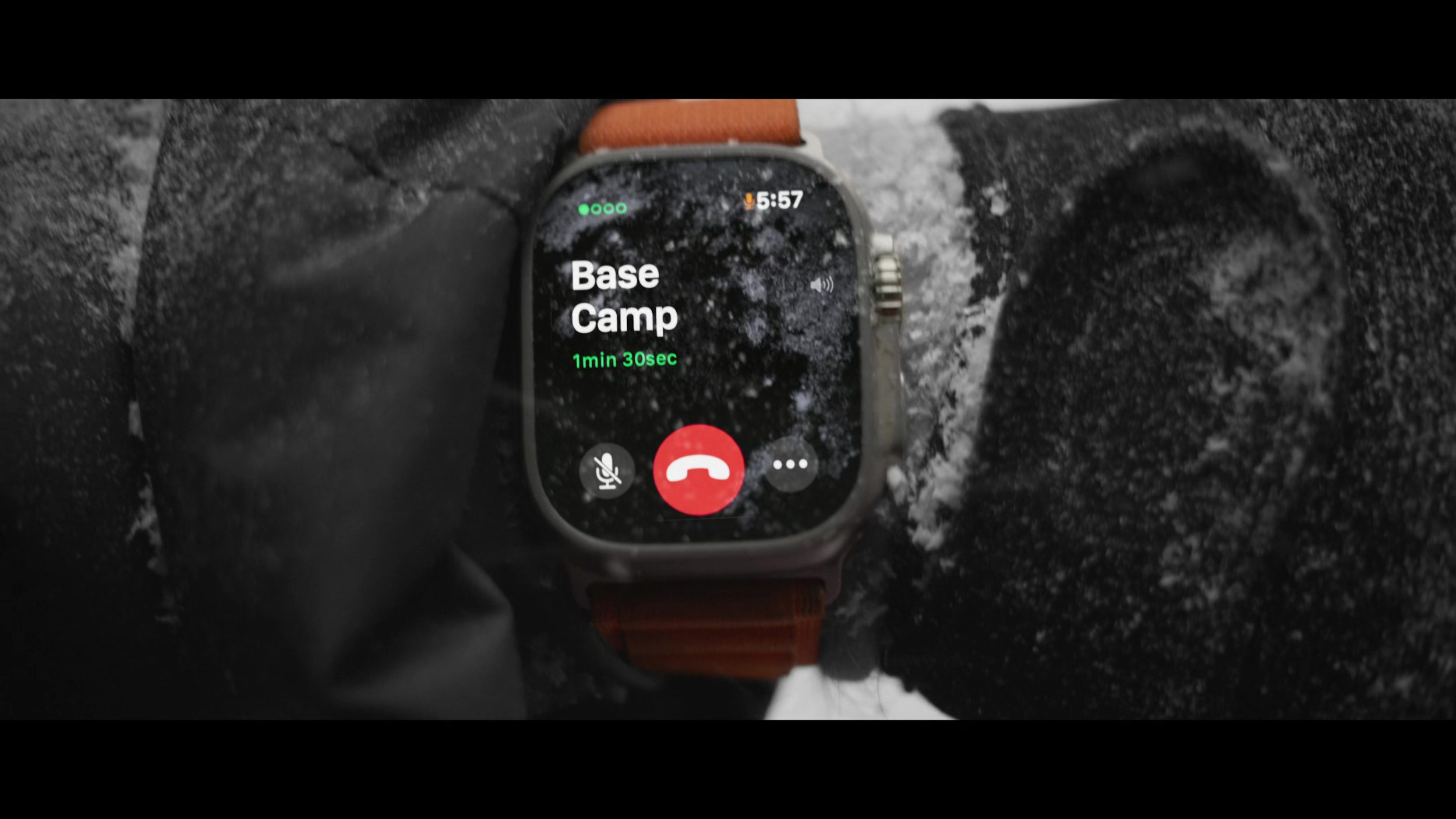
The New Phone Line Works Both Ways
Calls in Assistive Access is Phone + FaceTime. I think this is a great reminder that just because something has been done a certain way, doesn’t mean it needs to stay that way. In our designs, we can combine, shape, split, and form new ideas to make things easier for people.
I’ve Been Chatting All Day on This Machine
Messages on Assistive Access has an option for an emoji-only keyboard for those who prefer communicating visually. The primary and secondary button styling can still be seen here, with Send in blue and Back in white. The title area changes to show your contact’s name instead of the name of the app, but keeps the larger, clearer design. Messages shows us how a more complex design looks in Assistive Access, and I’m in love with the cleared-out keyboard, free of all the other buttons that would normally be there.
Thank you for reading UI Designer Weekly. See you next week.
I would say that the design of iPadOS (formerly, “iPad”) apps has always been an advanced skill. As easy as it can be to fill an iPhone-sized canvas with a new design, daunting is a word I would use to describe trying to do the same on a big, blank canvas sized for an iPad. The iPad is as inspiring and beautiful as the iPhone; The Apple Human Interface Guidelines help just as much—but it’s a larger mountain to climb.
What has always helped has been good examples. Patterns, as we call them in the design discipline, were described by Christopher Alexander to pair a design problem and design solution together in a way that allows others to replicate the solution easily, broadly, and repeatedly. Patterns in design also help us help people who use our products—once you’ve seen something here, you’ll understand how to do it there.
This week, Apple announced Final Cut Pro and Logic Pro for the iPad. As two apps long-seen as iPadOS holdouts, they will sit squarely in the world of iPadOS design as it differs from iOS design. They’re bringing a bundle of new design patterns that we can keep coming back to as we design new corners of our own iPadOS apps. I’m excited to show you the design details that stand out to me from the announcement.
On first impression, they both look great, and these are two apps that cannot be watered down by their own definition of “Pro”, so this should be fun.
I hope you find something here that you can mix into your own design work. Thank you for reading UI Designer Weekly. —S
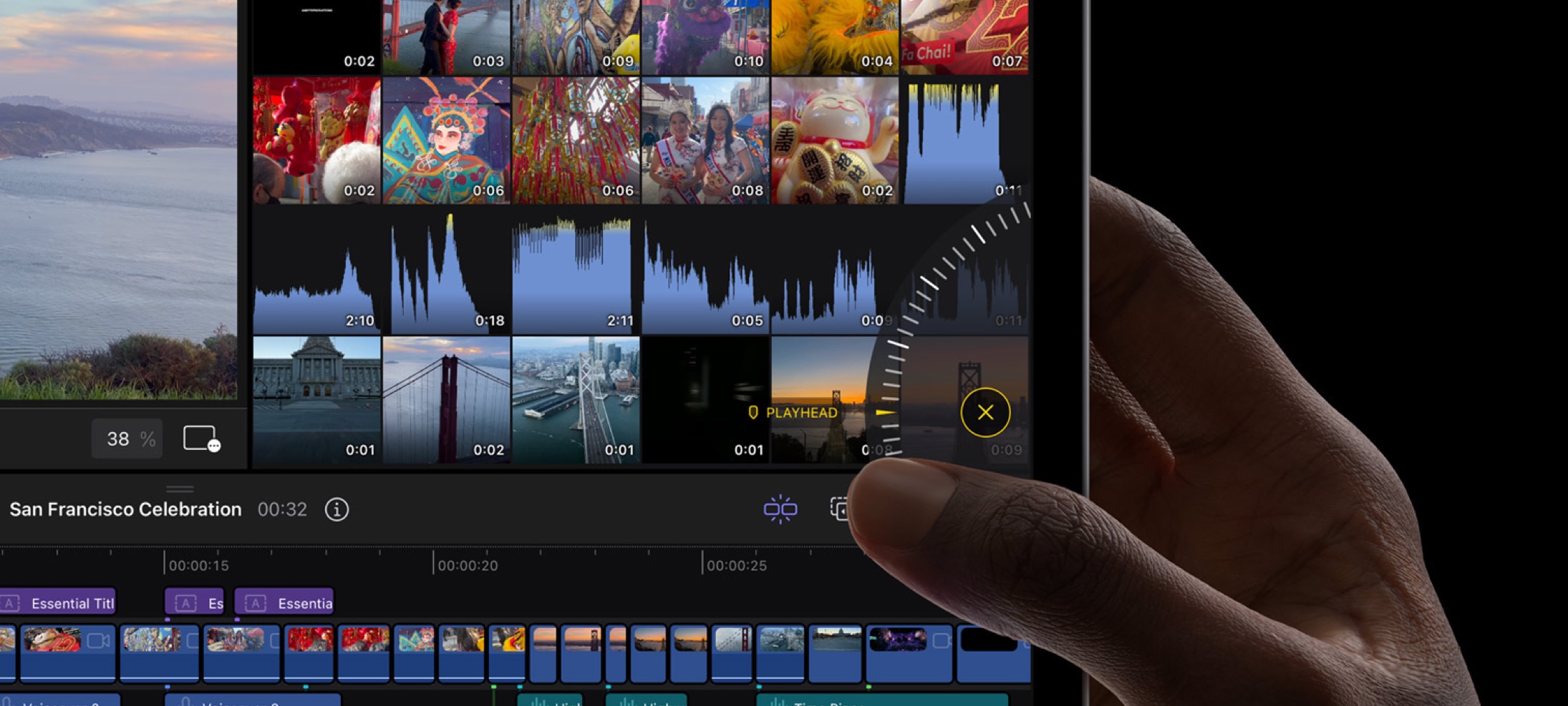
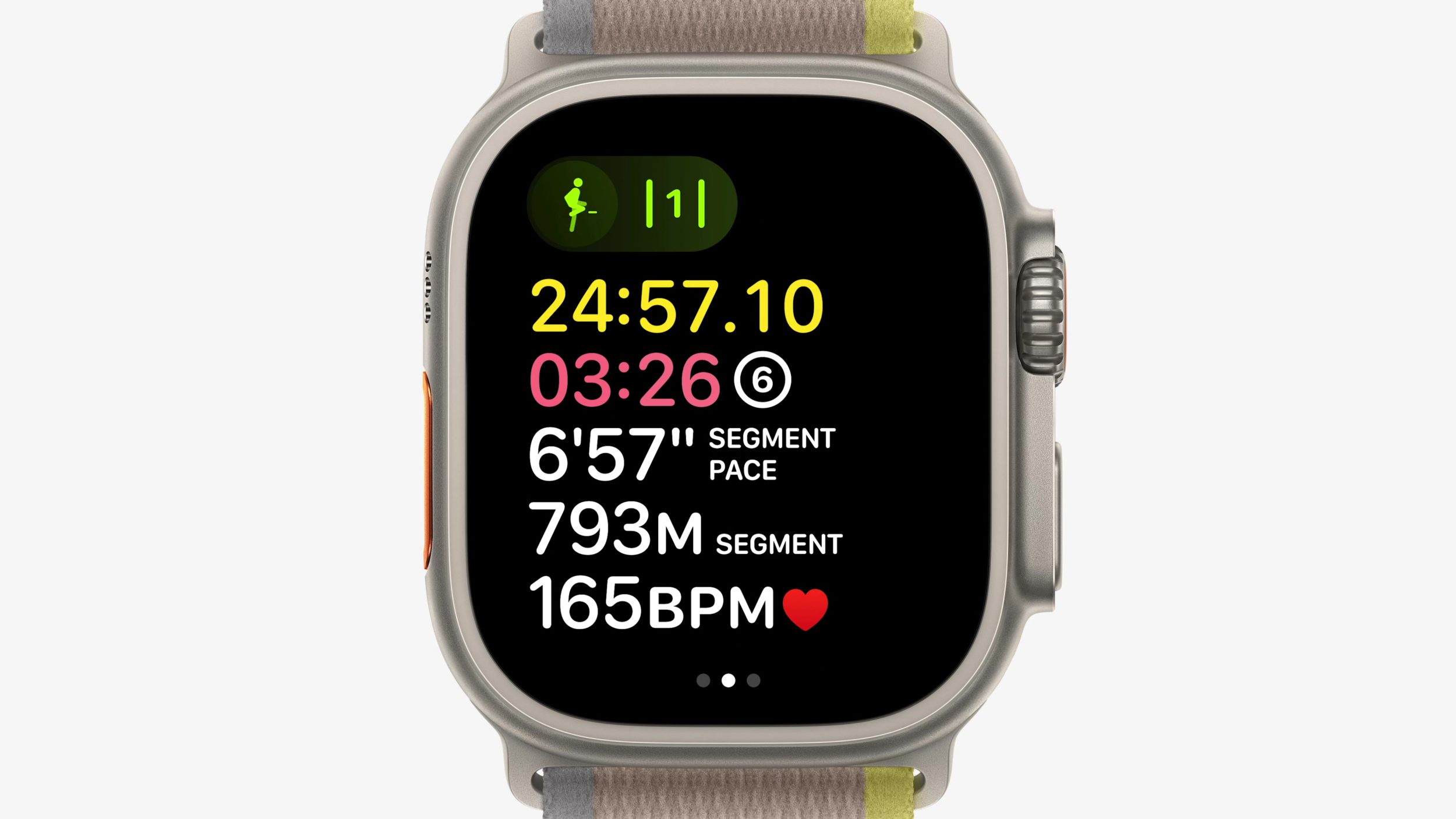
A Touch Different
A jog wheel sits on the side of screen in Final Cut Pro on iPadOS. The project timeline, large and directly scrollable, is one of the largest areas of the design. But, as we see, that wasn’t enough. I think this is a great example of going past enough and adding multiple ways to do something where it will count. The jog wheel is listed as allowing scrubbing through footage and nudging clips—even if that’s all it ever does, it could become a video editor’s favorite thing.
Within Reach
Each camera angle of a multicam clip is arranged at the bottom of the screen in Final Cut Pro on iPadOS. Traditionally, video editing applications might have reserved the bottom half of the screen for the project timeline and things related to it, but this touch-friendly design lets that space be used by a horizontal arrangement of camera angles you can tap on. This is a great reminder that we can move things around in our designs because what we’re making might not need to look like everything before it.
My iPad Can Handle It
A quiet, double-line drag handle tells you what you can drag and what you can’t. I’m struck by how close together the handle, “West Coast”, and “03:11” are while still looking great. This is a great example of how we can embed hints into our own designs that are small enough and light enough to recede into the background when you’re not looking for them.
To Each, Its Own
From top to bottom, several areas of Final Cut Pro on iPadOS feature their own toolbars. There’s the main toolbar, the Project Media toolbar, and the toolbar for the project timeline… there’s the one at the bottom of preview pane, and one outside of the screenshot. Toolbars are a tried-and-true design pattern for local-but-global actions specific to area of a design. I think Final Cut Pro gives us the permission we might have needed to put toolbars in all the places our designs might want them.
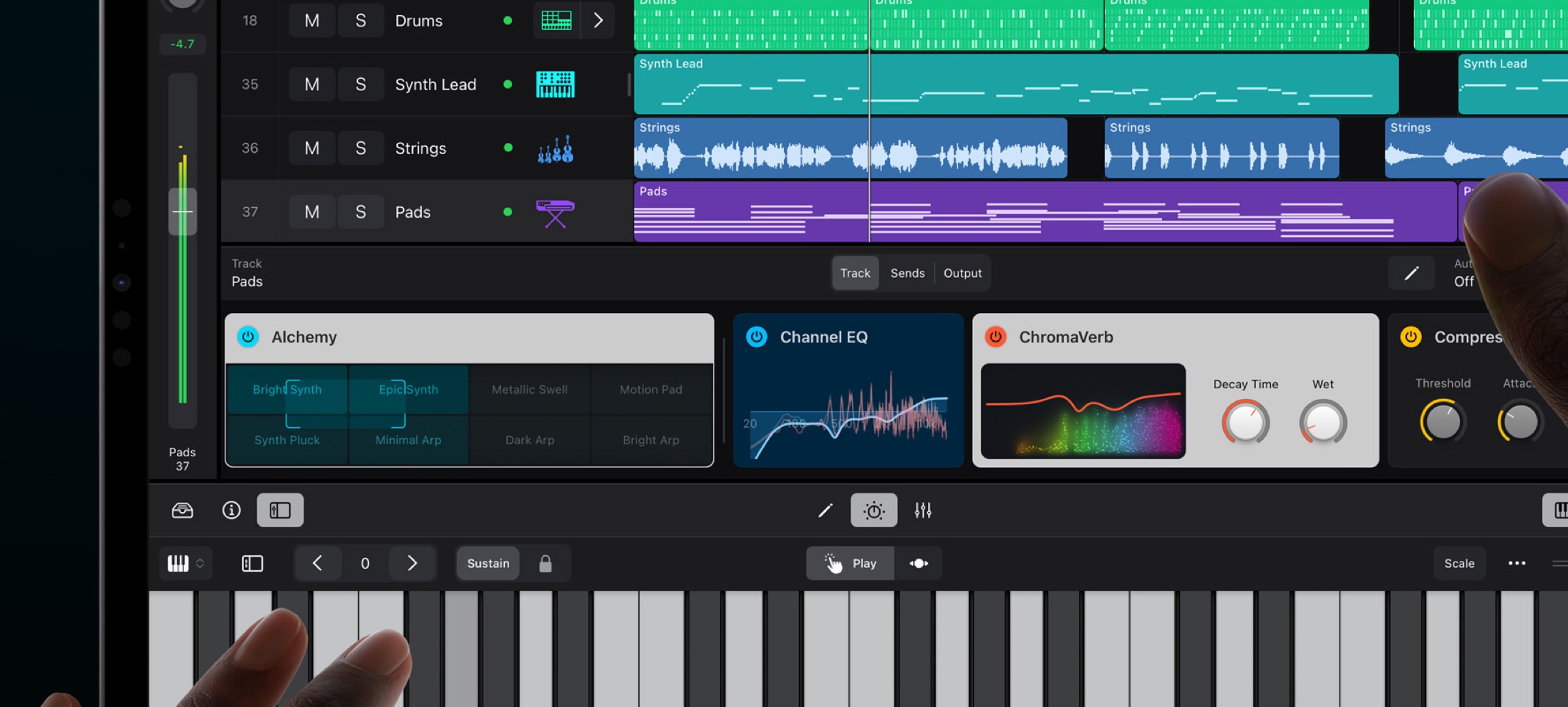
Front Row Seats
A beautiful horizontal stack of Plug-In Tiles in Logic Pro on iPadOS. Each one surfaces the important controls for a given plug-in and can be tapped for more. Notice the consistent title area with icon and title, made unique with colors, design, and everything else. This is a wonderful design that makes something complex smaller, consistent, and informative. What a great reminder that we can look at our own designs for places we could be surfacing smaller (and beautiful by way of summarization) design elements.
The Original Recipe
Buttons, Menus, Pickers, Chevrons, Drop-Downs, Slides, and Toggles all feature throughout the design of Logic Pro on iPadOS. Even on an app far removed from the same purpose as the Mail app or Calendar app, the design patterns and interface elements are the same. They have been recombined and curated to the places where they are the most effective. A complete reinvention is not what has happened, everything is actually not different. I think this is a good example as any of the power and flexibility of the elements in the Apple interface design library.
Thank you for reading UI Designer Weekly. See you next week.
Well-roundedness is a quality difficult to quantify. It’s not enough to follow somebody’s many pursuits; you have to understand their many sides and know the stories of their life. Perhaps after all of that, you can start to see the richness of the single person and the many angles reflecting in their movements.
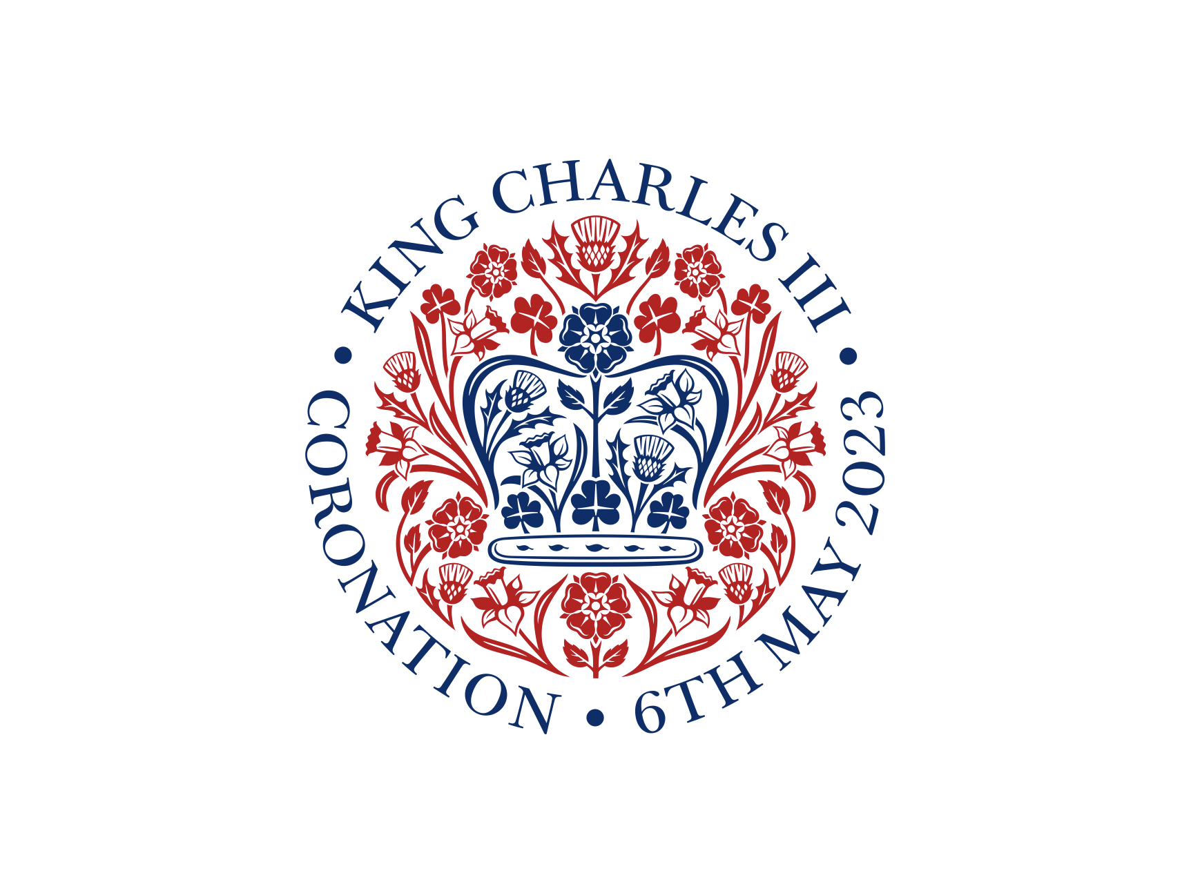
Tomorrow, the coronation of King Charles III will take place and emblazoned throughout the ceremony, the imagery, and the artifacts will be its official emblem—an emblem designed by Sir Jony Ive KBE and LoveFrom.
Knowing what we know about Jony Ive, I see this as an inspirational-shooting-star of well-roundedness. People who categorize these things would call making an emblem “logo design” and making a phone “hardware design”, two disciplines not known or expected to collaborate. And yet, what a splendid sight.
In the past I’ve been self conscious, interrogating myself about whether any good designer would spend time learning how to surf or if, strangely, any good surfer would spend time learning how to design. Creating the cookie-cutting tools out of my mind’s own metal shop, I sought to remove parts of me to bring out the lines that would prove me to be the type of person I wanted to be. Now that I’m older, I know that it’s those rounded, hanging-off, un-cookie-cut shapes of who I am that make me unique.
In designing, we bring forward our experiences. Every connection we make between the very many things we’ve seen gives us just that bit more of chance we’ll make something great. We should allow ourselves to blend activities, interests, and knowledge that maybe we’ve never seen blended before.
The typography and color on this emblem are beautiful. There’s even more to read on the typeface itself. And there’s a freedom by example in the whole thing—you can be as well-rounded as you want to be.
This week, I wanted to leave you with this message. I hope you find something inspiring here that you can mix into your own design work. Thank you for reading UI Designer Weekly. —S
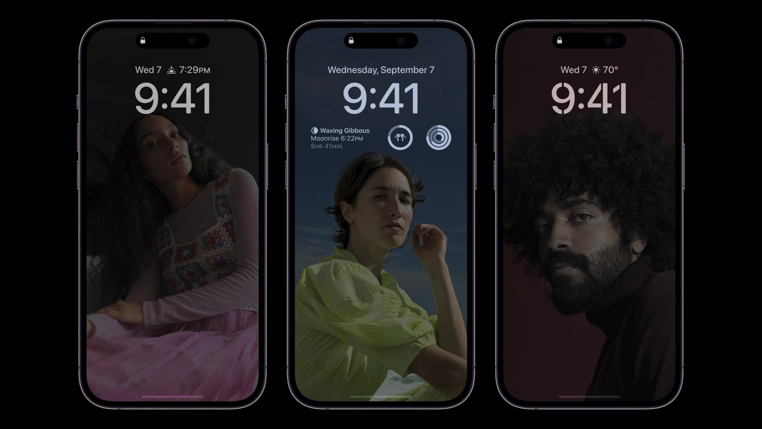
Recently, I was reminded how important family is. This reminder has been the guiding force behind my writing this week. I want to look at how family appears in Apple design. In these designs, there are experiences we share because they have become as common as pencils and pens (like the Notes app, one of my grandma’s favorites) and there are experiences that stay personal: the received phone calls, the sent messages, the checked locations.
While a small computer can be a productivity machine, life has much more in store for each of us than simply moments to be productive. We will grow, fall, love, live, mourn, laugh… and this will happen, even if by accident, here and there on our small computers.
The examples in this week’s issue create a string of design decisions that, to me, underscore Apple’s commitment to dignifying people in design. By pairing names with photos in one place and allowing hair to block the time in another, these designs appear to understand, if not actively join in on, the care that we have for people in our lives.
Let’s have a look. I hope that you’re able to hold the ones you love close, always. I also hope you find something here that you can mix into your own design work. Thank you for reading UI Designer Weekly. —S
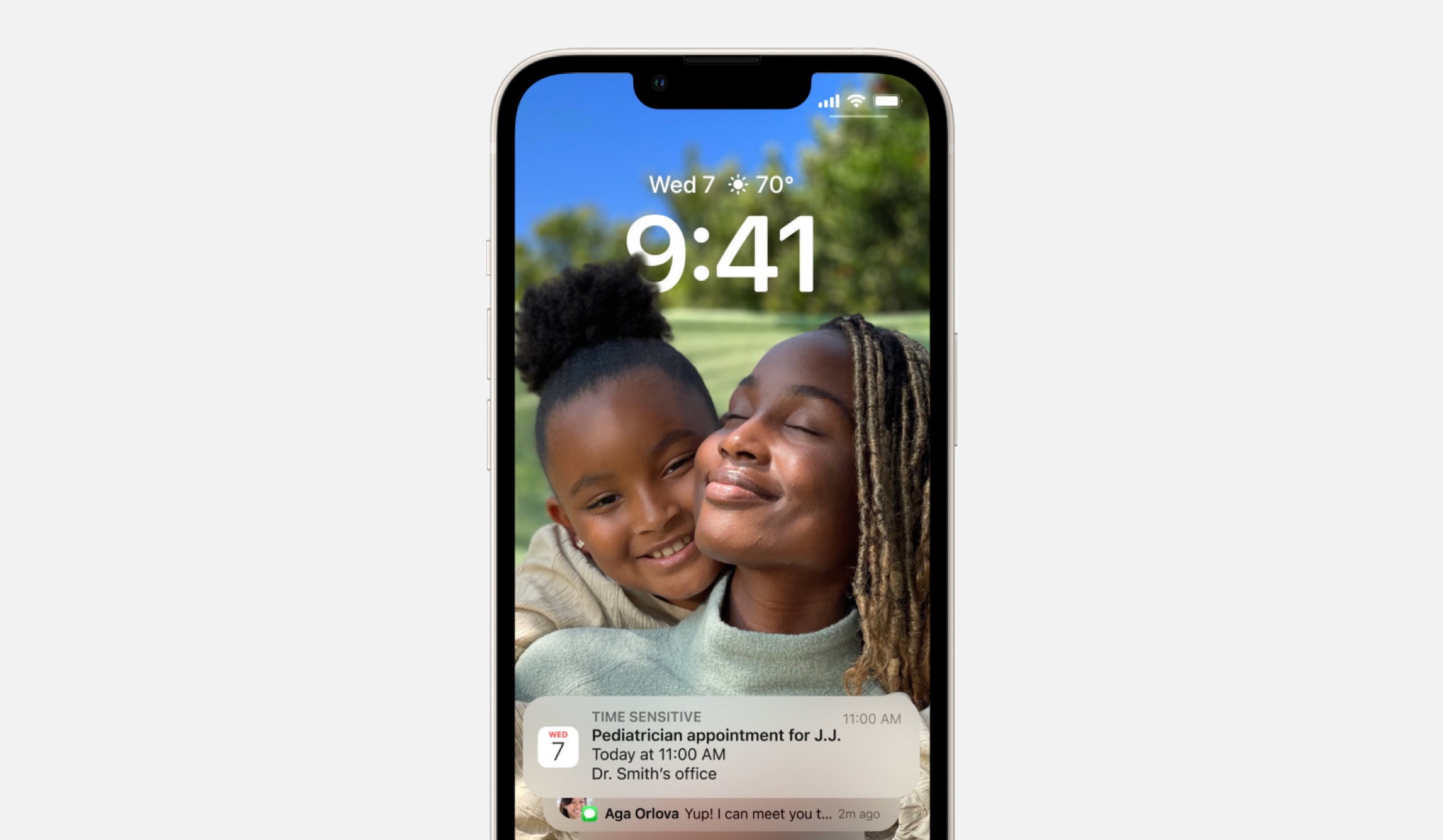
Family Comes First
iOS 16 can place a photo of your favorite people in front of the time and the weather on the Lock Screen. Their hair, their shoulders, and their faces will even partially block your view of the time. This design is as beautiful and artistic as it is effective, in my opinion. I think this is a great reminder for us to look for ways to break the rules (partially-make-the-time-unreadable break the rules) in our designs if it means bringing out the things people love.
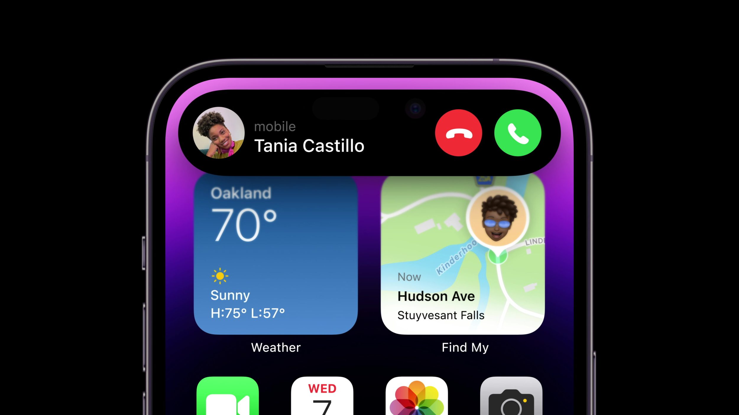
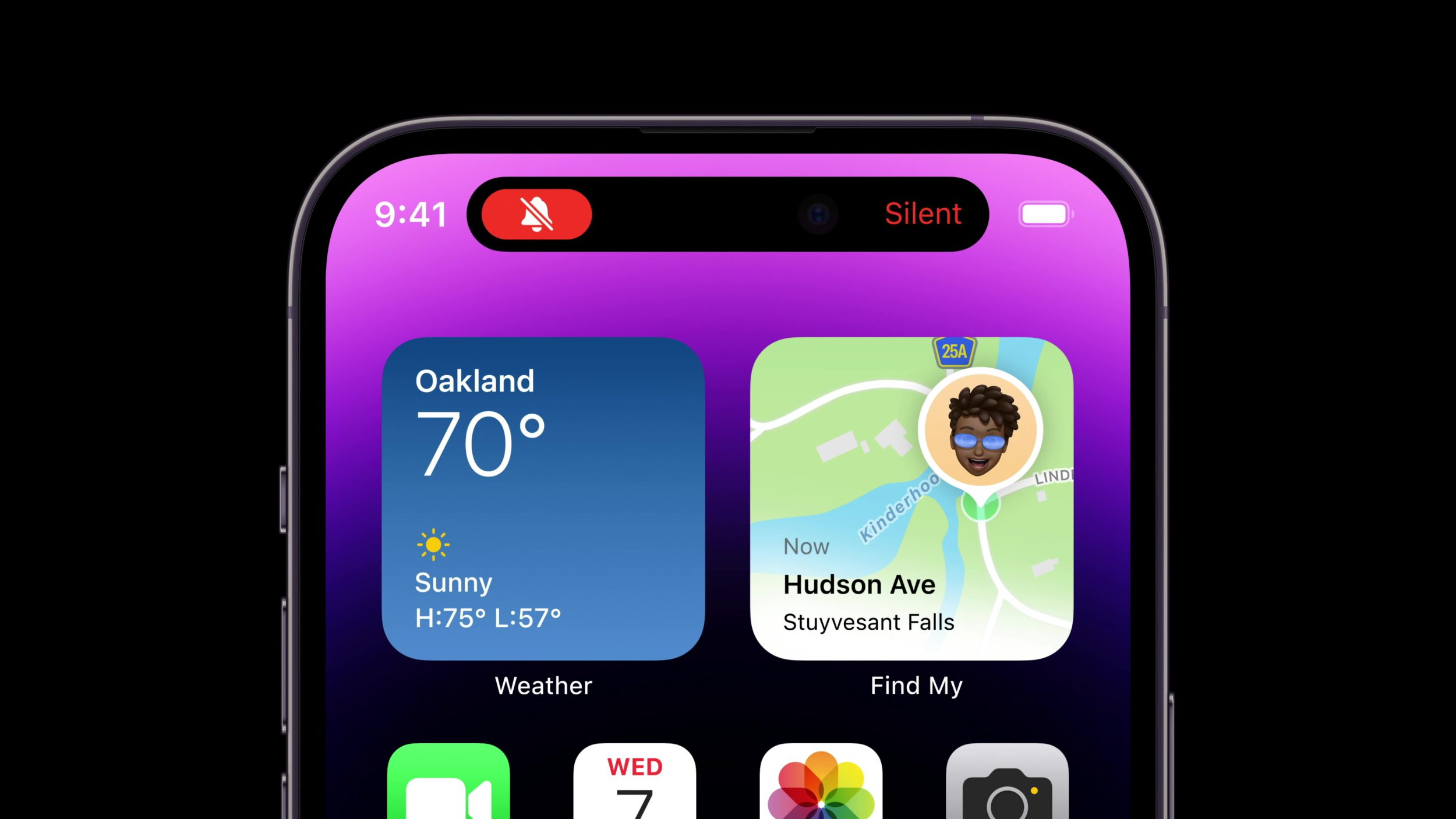
We Talk and That’s the Best Part
Designs center people on watchOS 9, like here in Find My and Messages. Each chat bubble is shown on its own—I want to draw attention to the fact that there is no metadata visible on each chat bubble here. Each bubble shows the message and that’s it. And on the left, Find My shows a name and a photo beautifully and in large positions at the top. I think this is a great example of how we can leave things out of our designs to emphasize what we believe is important.
I Saw You There Looking Dignified
iOS shows a photo for each person you’re adding to a shared album. When Apple designs do this on any platform, I think they’re sending a small gesture of a message that these people matter—that they are real people. Apple Design’s handling of people was one of the first things I remember noticing before I got my first Mac. I think this is a great reminder that we should want our designs to be fluent in the way people think. We want to design in a way that visual elements of any given task align with the task itself in shape, layout, and appearance; adding people to a shared album is tapping on faces, creating a Find My notification is dragging a radius bigger on a map.
This Frame is See-Through
Photos on iOS 16 shows the latest additions to shared family photo album. Edge-to-edge, with ever-so-thin borders, each photo is shown in clear view without any interface elements over them. This is another example of what’s not there as opposed to what is—we can remove things from our designs to let people get lost in what they’re looking for.
Thank you for reading UI Designer Weekly. See you next week.
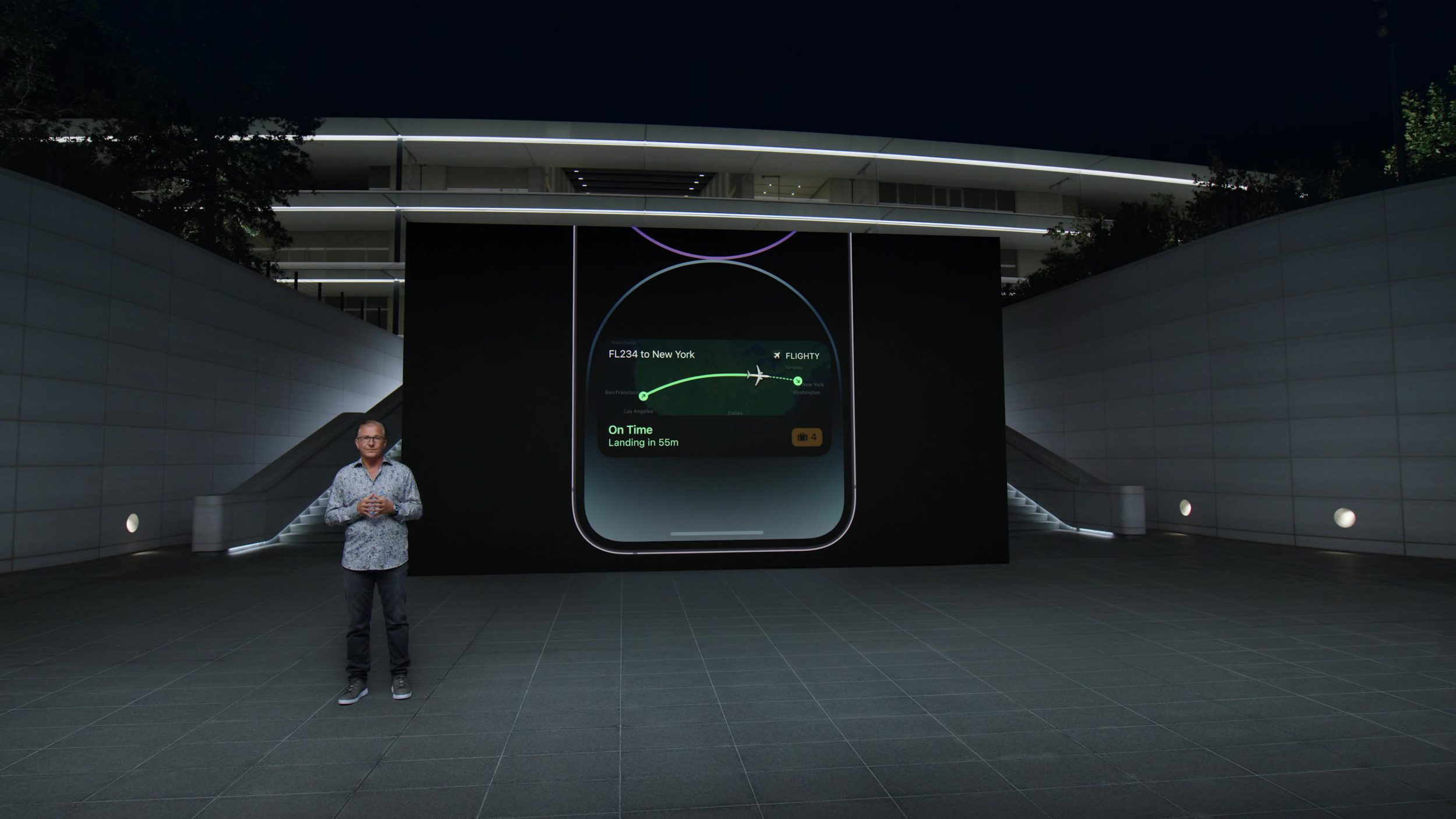
I find this year to be a fascinating year for interface design. Apple announced last year that the Next Generation of Carplay is coming in late 2023. If that were the only news, I would think this year was huge. I think CarPlay is gorgeous today. I want front-row seats to seeing the interface elements of our phones and computers, as dreamt up by Apple Design, extend into more of the automobile. I want to see what works, what didn’t work, how they made it work, how they thought about it… give me hours of that design process and that result.
But that’s not all that’s slated for this year. Oh, no, no, no. Everyone thinks we are going to see an Apple augmented reality headset. And at the same time, designers and engineers formerly at Apple at Humane have Spring 2023 typed out as the glamorous release-date-in-lights for their product, which has been marketed as not a phone, not a tablet, and not a screen.
Products can be good or bad, successes or failures, divisive or universal. But beyond all that noise, I see a world of human creativity, thoughtfulness, and effort: design.
I want to know everything about everything we are supposed to see this year. I want to congratulate every person who put their life into designing these inventions. I want to get lost in their abilities and enjoy myself.
This week, we’re looking back at a few of the beautiful designs Apple shared with us at last year’s WWDC. Looking back, but daydreaming about the year ahead—that’s where you’ll find me.
I hope you find something here that you can mix into your own design work. Thank you for reading UI Designer Weekly. —S
Come on Out, There’s a Patio
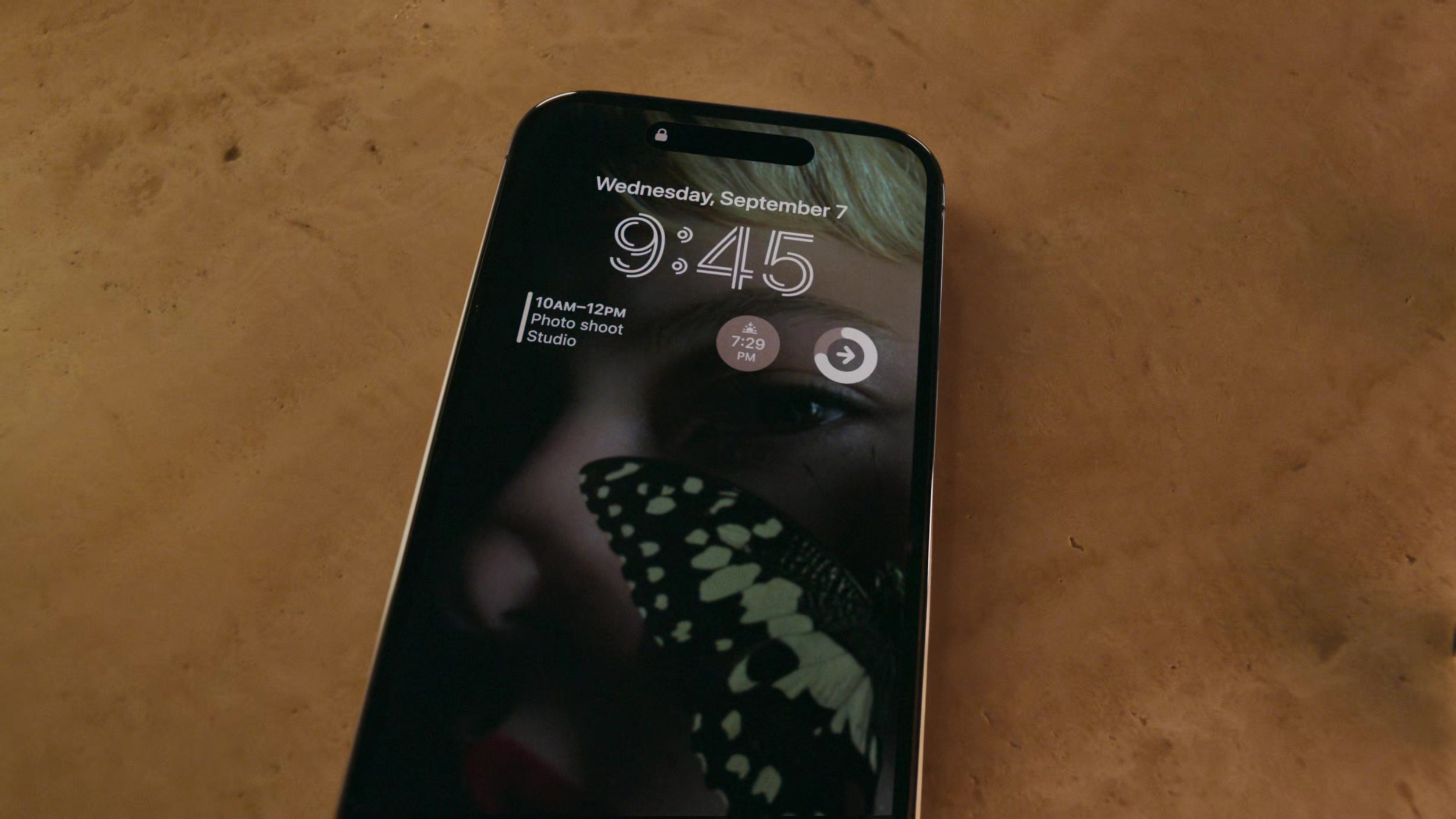
An iPhone on iOS 16 shows an area outside the Lock Screen. I love the way this design connects to the design of watchOS. There’s never been an area outside (or bigger than) the Lock Screen. And yet, if you wanted to edit the entire Lock Screen itself, wouldn’t you need to get to someplace outside it? I think this design shows a beautiful understanding of human-computer interaction. It reminds us to look for those moments in our own designs where someone might think, “of course it works that way.”
Quick, Hide the Computers
I love the written language of Now, Tonight, Tomorrow Night, and Later… here on Mail in macOS Ventura. There’s an understanding of the person there at the Mac—someone who wants to send an email tomorrow, but doesn’t mind when. If this design required picking a specific time, it’d be cumbersome. This is a great example of how we can remove computer-y details and steps from our designs to relate to the person on the other side.
I Didn’t Even Notice the Tiles
Weather on iPadOS 16 displays everything from the day’s weather to the week’s weather and the wind. This design beams with care and creativity. It’s a reminder that we can step outside the most common interface layouts (like lists, for example). We can try something new and dense, and we might end up with a beautiful result.
We Added Our Own Touches
I love watching iOS grow, seeing interface designs from the Mac spring up in the garden of iOS human interface guidelines. Here, this file menu has everything you could ask for in an iOS reimagining. I think this shows us that there’s more in the past that we can bring to the present—that the present has some room still.
We Know It’s a Mess, But It’s Our Mess
A lived-in home gets messy, as does a screen. I have always found Stage Manager to be incredibly inspired and beautiful. Proportions at play, gravity with its give, designs overlaying atop each other. This is the inventive spirit we could only imagine landing on planet Apple—and beyond. It might not be for everybody just yet, but I think there’s something grand here.
Can You Give Me a Hand?
This year, folks. I’m telling you…
Thank you for reading UI Designer Weekly. See you next week.
Waking up on the morning of WWDC and watching the keynote is a tradition I look forward to every year. It’s a time not only for seeing what Apple as a company has been up to, but for seeing what the people at Apple have been up to. Our favorite Apple employees do not have the luxury (or the burden, depending on how you see things) of being able to share their work online all year.
The morning of WWDC lets loose many years of work, creativity, and coordination, in a form made to entertain, delight, and inspire us. If you can’t tell, it’s a day that I’m looking forward to as much as ever.
Next week, in the UI Designer Weekly newsletter we’ll be looking back at a few of the coolest designs that were introduced at last year’s WWDC keynote.
For this week, we have everything from an Apple Newsroom web design to an intuitive Apple Maps screen to Steve Jobs Foundation interface charm.
I hope you find something here that you can mix into your own design work. Thank you for reading UI Designer Weekly. —S
Adding to the Experience
An Apple Maps button asks you if you want to share pictures you’ve recently taken somewhere the next time you search for it in Apple Maps. Tapping the button opens a screen that takes your review and gives you an easy and inline picker to select the pictures you want to share. I love this design because I think it does a gentle job of suggesting I share my pictures and then the screen to do so is quick, light, and doesn’t ask me to write a review. I think this is a great example of how we can include suggestions in our designs and how a single page can take all sorts of input without feeling overly long.
Slide to Unlock (Knowledge)
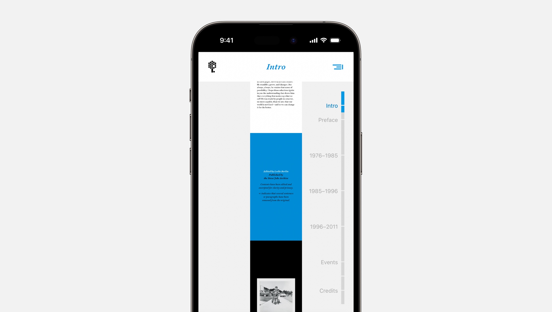
An inviting part-timeline-part-navigation design from Make Something Wonderful. This design feels new to me. We’ve seen book navigation where pages are a horizontal scroll along the bottom, but maybe with a book like this where jumping around chapters is encouraged, a design like this fits better because the navigation is more visible. This is a great reminder that we can look for ways to bring gestures into our design’s interactions (this bar supports tapping chapter titles or sliding up and down the bar) to make things more inviting.
One More Things
I loved the way the Steve Jobs Foundation handled instructions for accessing the book. A list of expandable sections has each destination titled “For iPad, iPhone, or Mac”, “For Kindle”, and so on and expanding each section shows a simple sentence explanation for what to do and where to go.
While You Listen, or While You Look
An Apple Newsroom story combines photography with audio from that moment in the photo. A play button paired with a waveform (iOS 16, anyone?) invites you to click and listen. I keep going back and forth on whether I think this is the audio paired with a photo or the photo paired with audio. It must not matter. But what a great example of how we can add that one additional bit of interactivity and sensation to make two separate things one new whole.
Thank you for reading UI Designer Weekly. See you next week.
Hello and welcome back to another issue of UI Designer Weekly!
Since it’s hard for me to do this newsletter year-round, I’m going to break it up into “seasons” and let you know when a season is starting and stopping. This way, you’ll know when to expect this newsletter and when to expect it to be on a break.
We’re going to call everything before today Season 1 and this issue you’re reading the first issue of Season 2. I’m excited to be back with the same goal as before. From the very first issue of UI Designer Weekly back in October 2020:
My hope is to collect these beautiful, informative, and thought-provoking examples of design, no matter how subtle, and share them with you so they help you see something new and give you ideas you can mix into your work.
This year will hopefully be chock-full of beautiful Apple design. With that, let’s get started.
Thank you for being here,
Sahand
The Whole Bar is the Circle
A new volume slider and track slider in iOS 16. This design is without something that used to be there: a small circle on the bar. You used to have to touch the circle (wherever it was on the slider showing you the volume level) to then start sliding. Now, you can touch anywhere and start sliding immediately. This is maybe a great example of how an updated design can hint at its new functionality. Without a small circle, people might see this and wonder how they are supposed to use it. And then, needing to adjust the volume, they’ll surely try.
Oh, Before You Go
Sending an iCloud Drive PDF on iOS 16 shows a new dropdown outside of iCloud Drive and inside the Messages screen. Since PDFs can be sent as copies or as shared items, there’s a choice people have to make, and before this update people had to make that choice on the share sheet. You can still do that, but now you’ll see this choice and have another a chance at it when you’re preparing the message. I think this is a great example of putting a design where people will see it. You can place the choices people have to make “on their way” so they’ll always see it on the way out (or in).
A Classical Separation
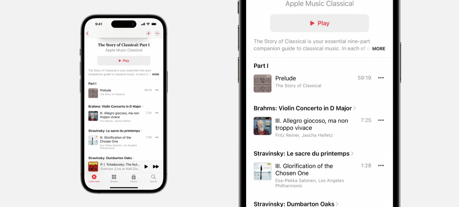
Apple Musical Classical features a design made for dense information, and yet has in many places done away with separators. Separator lines (the thin, gray divider lines used throughout iOS) are usually known to be useful precisely in the situation Apple Musical Classical addresses: when you have so much information you need to clearly display lots of information. This could be a gentle reminder for us all: we can try our designs with a little bit of added whitespace instead of another visual element added.
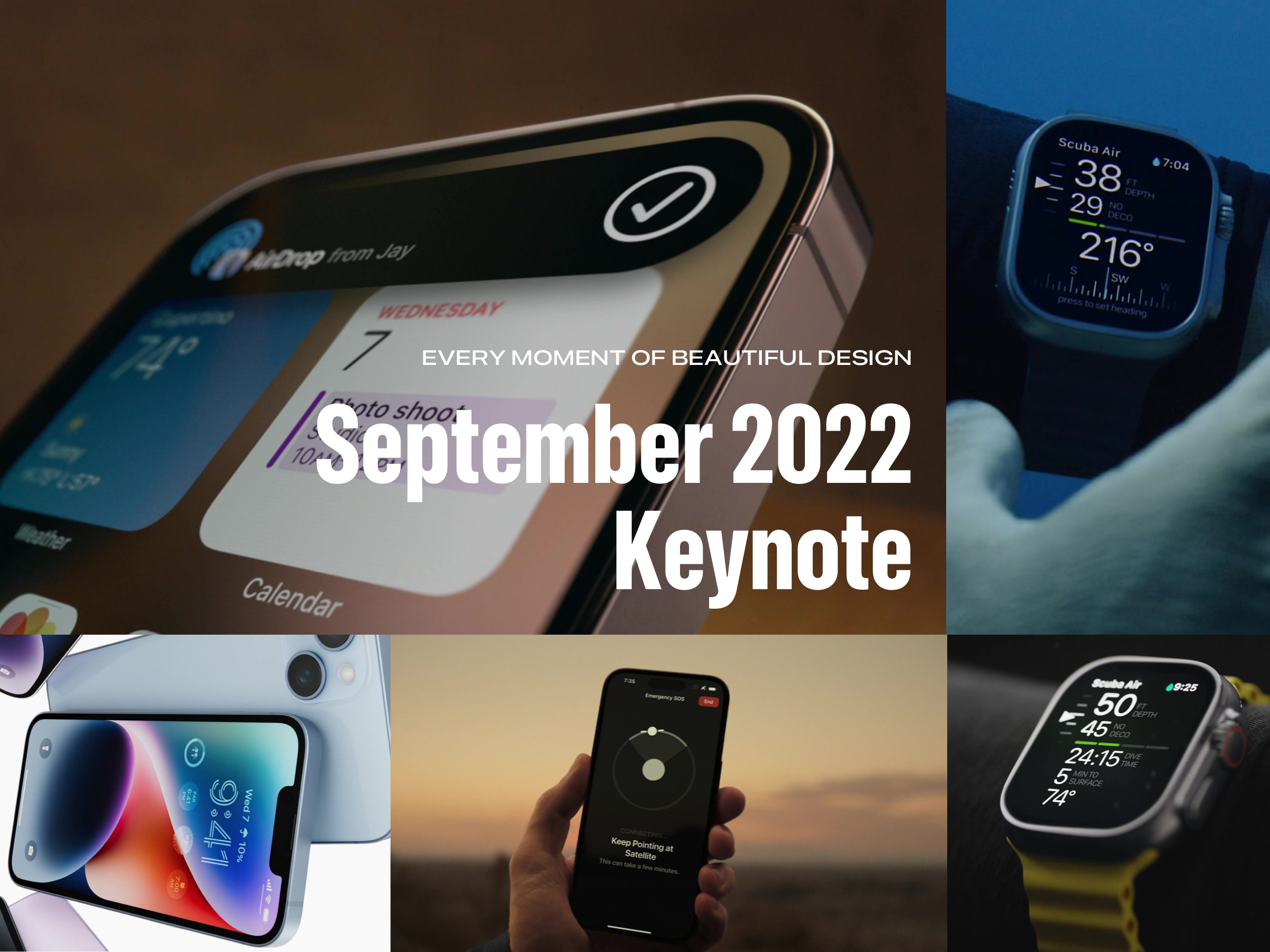
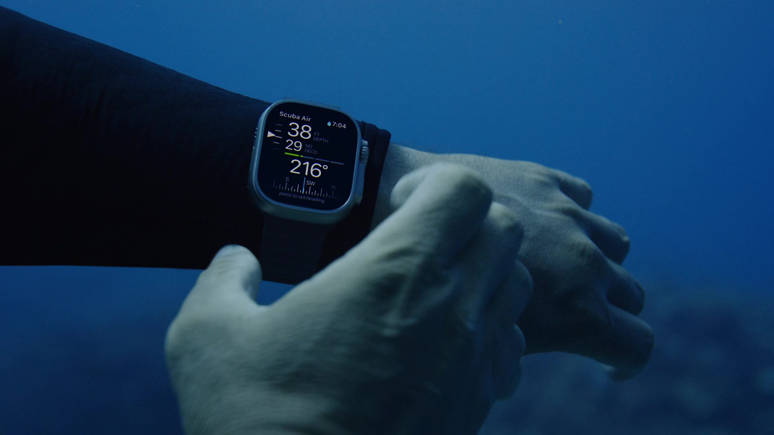
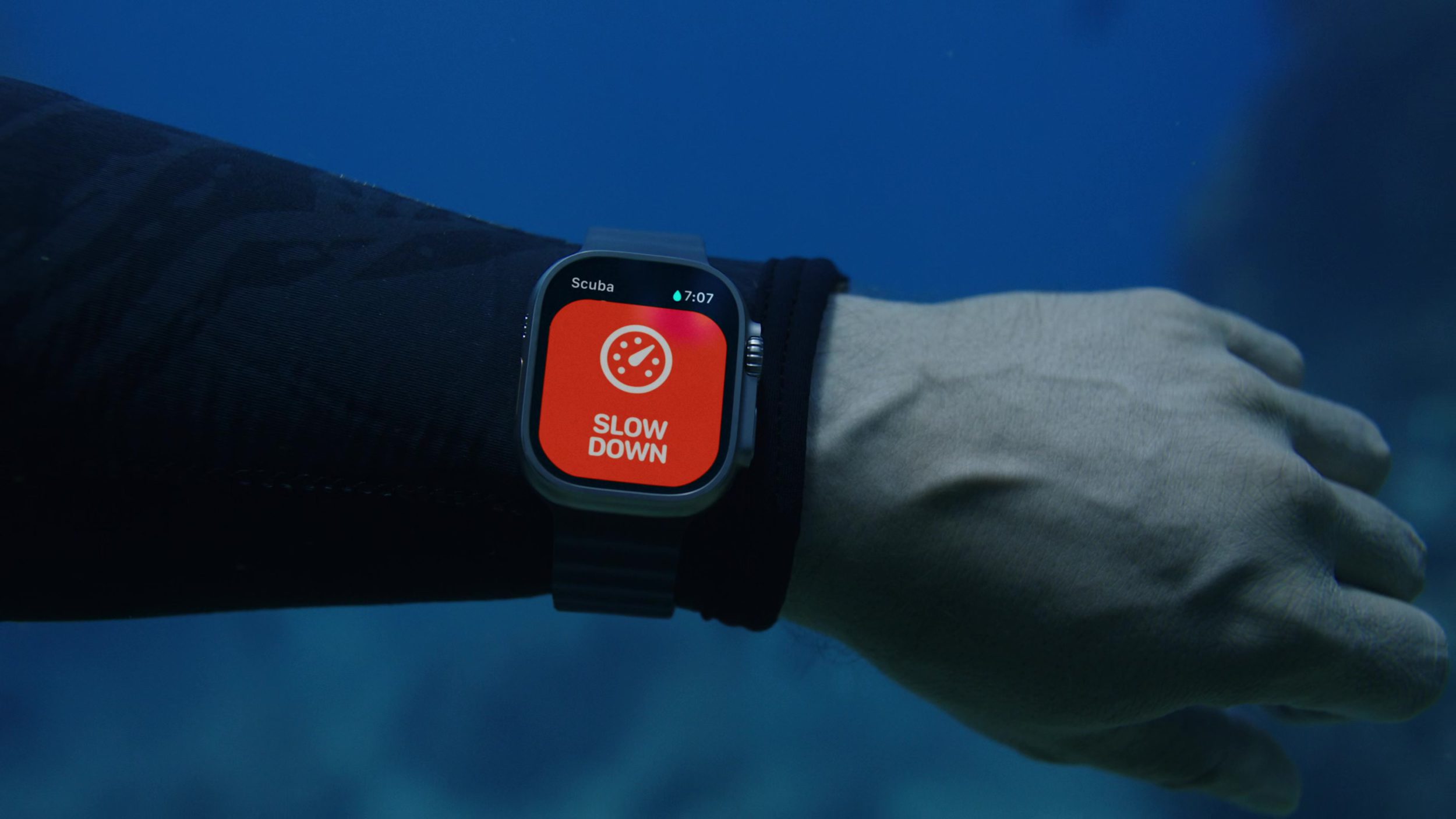
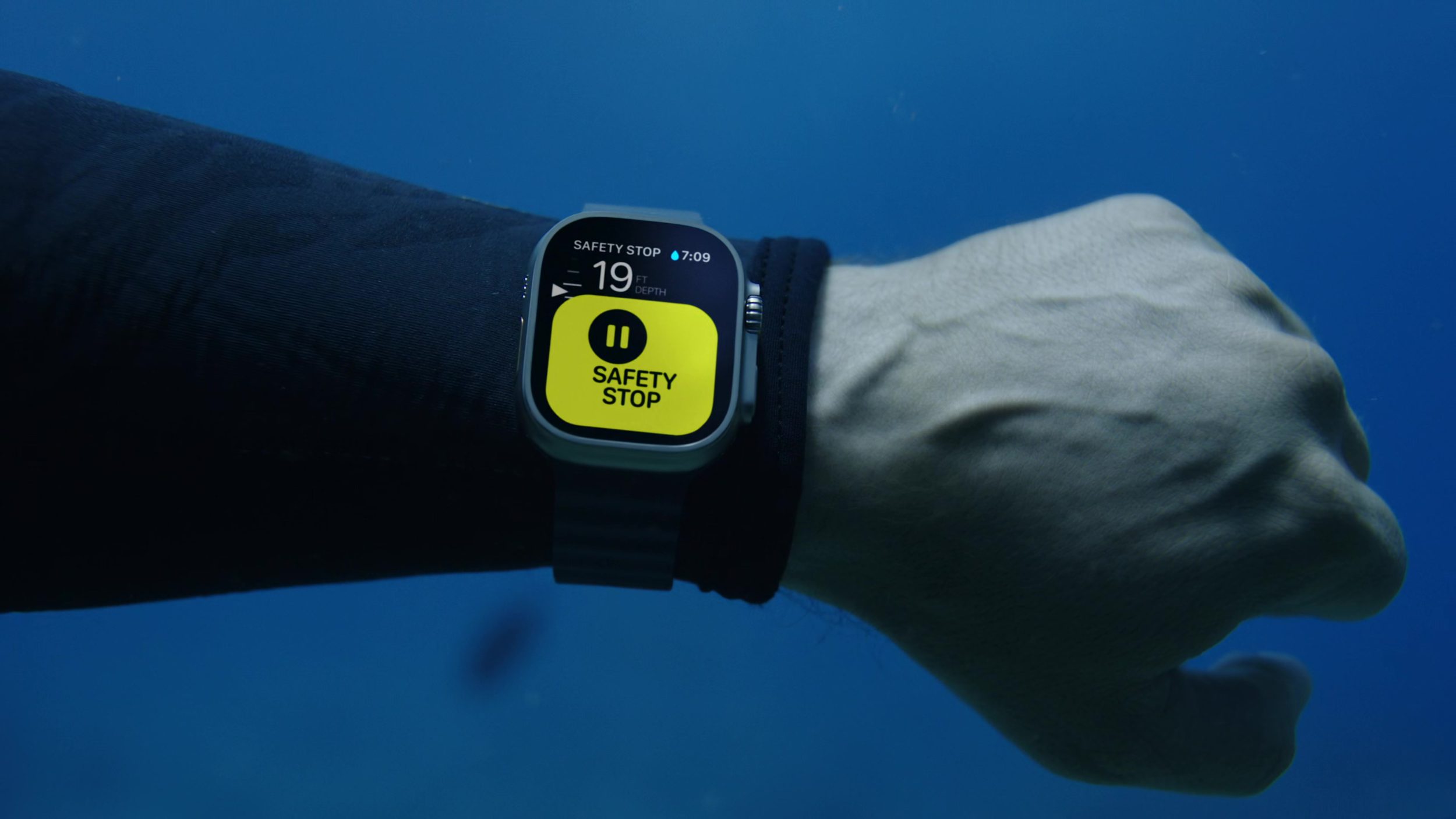
I’m writing this in early evening after the beautiful, inspiring, and exciting September 2022 Apple Keynote. Apple Design, and Alan Dye himself, came out with a dizzying amount of new designs and interfaces that are going to take weeks to appreciate and study. The Apple Watch Ultra, alone, introduced so many new designs and that’s even before getting to the new Dynamic Island!
I wanted to collect, in one spot, the beautiful moments of Apple Design that were presented all throughout the keynote. You can watch the full Apple September 2022 Keynote here.
I hope this post can serve as an inspiration point for you, a page you can return to throughout the iPhone 14 year to catch a glance at that one design you loved, and also as a moment of appreciation for the designers, thinkers, planners, and everyone at Apple who makes these creations possible.
And, if I missed any moment that you think should be in here, just let me know!
It’s nice to see you for another issue of UI Designer Weekly. This week, you’ll find more beautiful, inspiring, and thought-provoking examples of design.
My hope is that you find something that you can mix into your own work. Thank you for joining me, have a great, restful weekend!
A row of purple elements in iOS 16 shares Focus filtering is on. I think this an amazing use of color. Purple has become the color for Do Not Disturb, and now Focus here. Making everything in the row the same color helps it feel separate and different from all the rows after it. It even has a quiet sort of feeling to it, with the purple. Did you notice the interesting alignment that’s shared by the all the icons on the right, or how the “Turn Off” button seems to be not so bold?
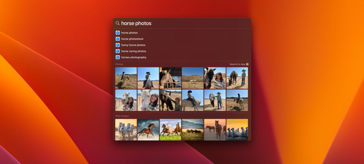
Inside Spotlight on macOS Ventura, the beautiful pop-up design with rounded corners, there’s a photo grid without rounded corners. This is maybe one of the best reminders that we don’t need to use rounded corners all the time on everything. The photo rows here feel big, easy to see, and like they have a lot of photos in them, and the tight spacing and no rounding are a part of that. Maybe we can use rounding a lot on the outsides of our designs, but on the insides we can find grids that can be great as regular rectangles (gasp!).
The menu bar extends across the top of the screen and has been a central piece Mac design for decades. Today, the menu bar is a vibrant blur of the wallpaper behind it. Just that blur is enough to create enough separation and foundation for icons, text, and colors to be placed on top. This struck me as beautiful and inspiring and made me wonder what other bars and interface elements could work better with a blur as their foundation.