Category: Tutorials

  • How to Make a Scrolling Carousel

    How to Make a Scrolling Carousel

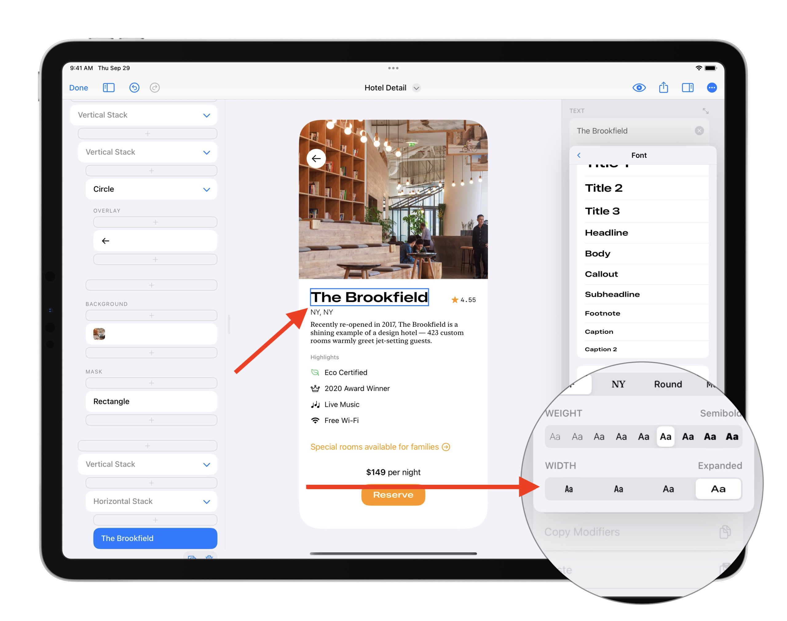
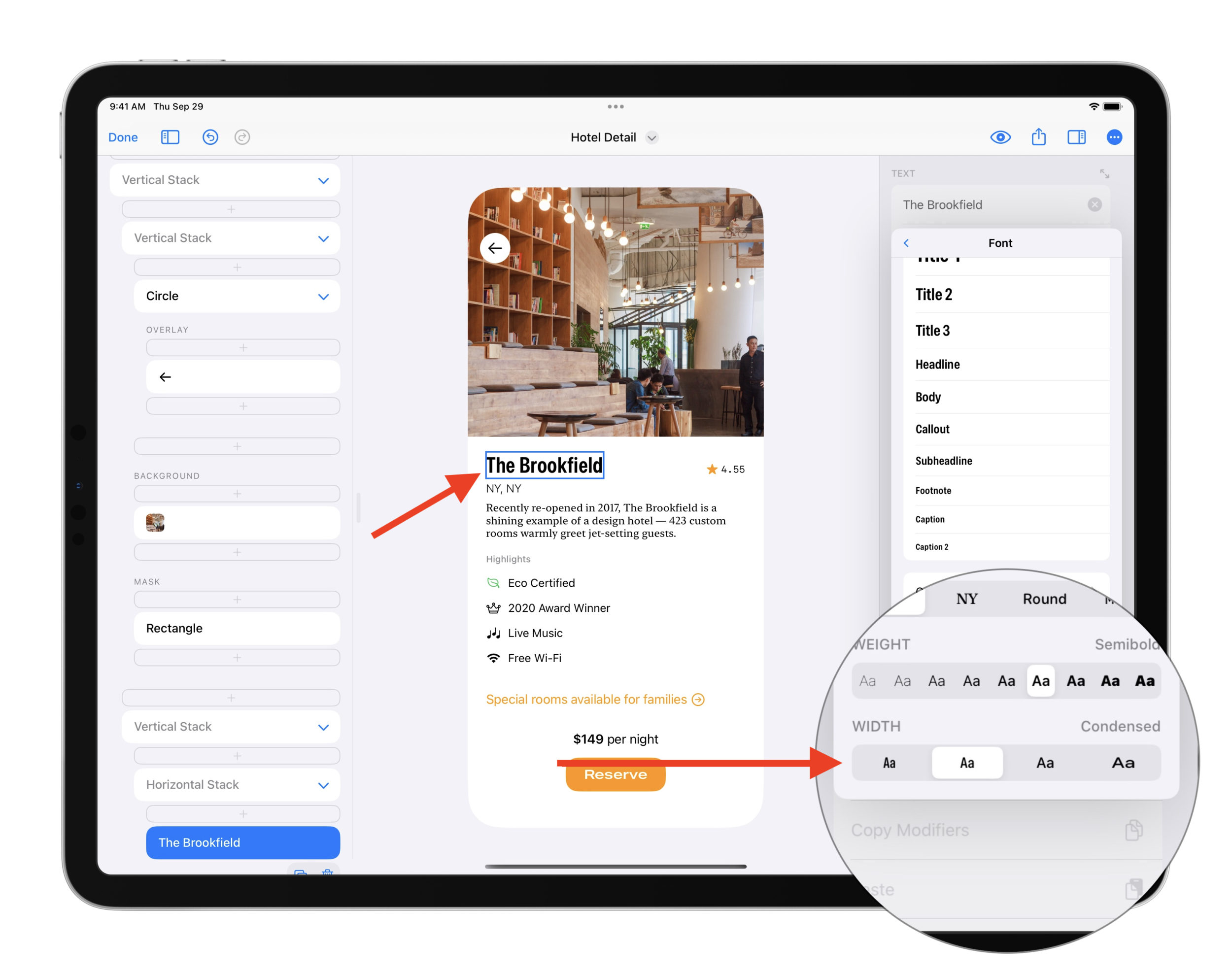
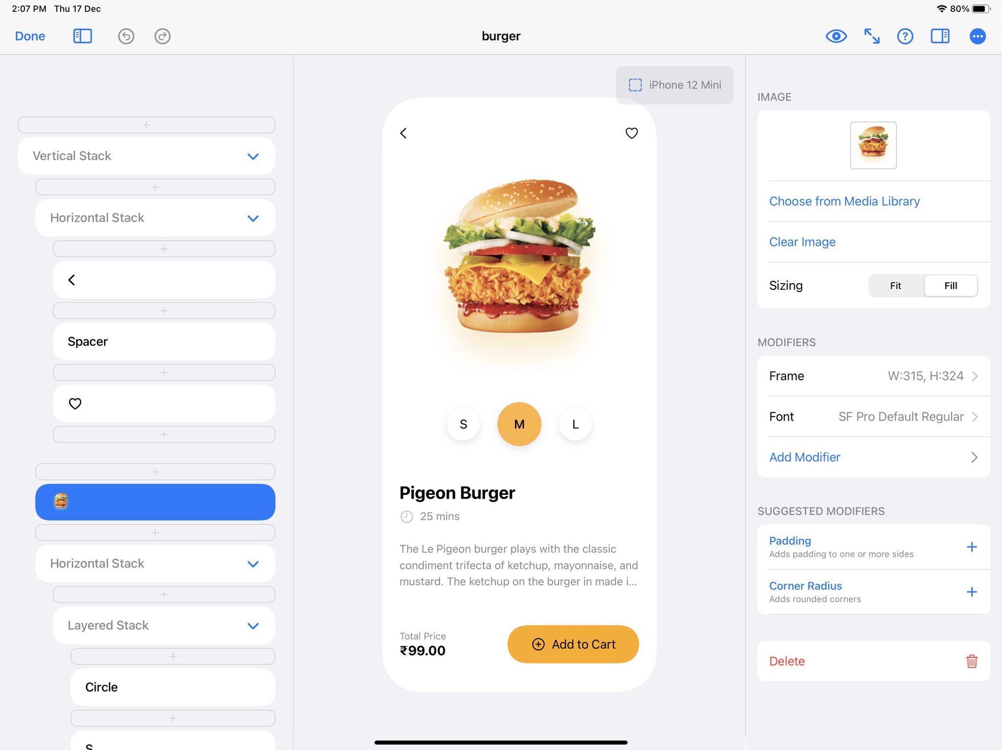
    Designing a scrolling carousel is easy in DetailsPro. The main concepts at play are scrolling containers, horizontal stacks, and frames.

    Scrolling containers are a type of element in SwiftUI that create a “scrolling window” where anything placed inside of them can be scrolled. Horizontal stacks arrange elements horizontally. Frames are a type of modifier that let you give things a specific size. We are going to make some cards, put them in a horizontal stack, and make them scroll!

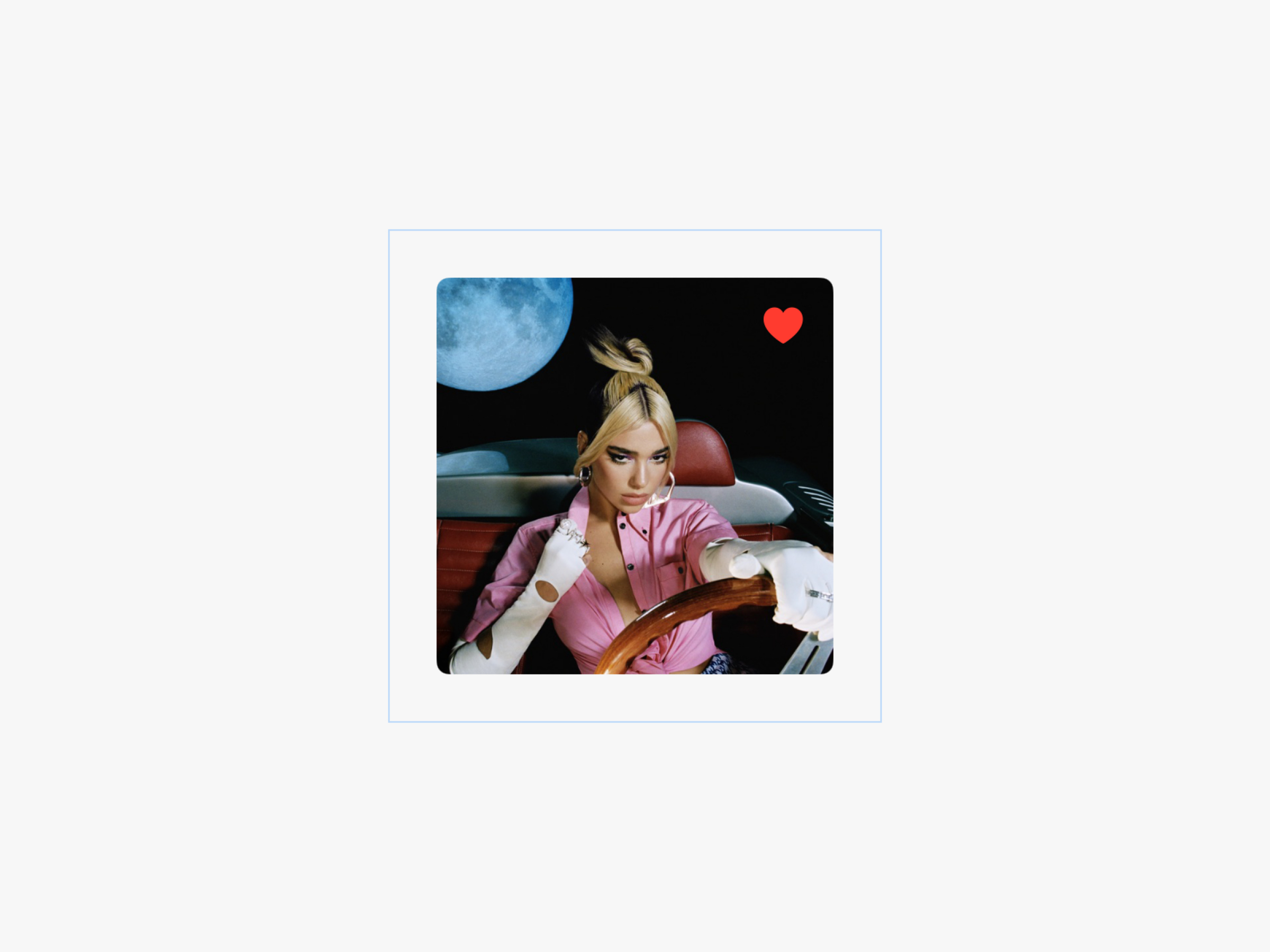
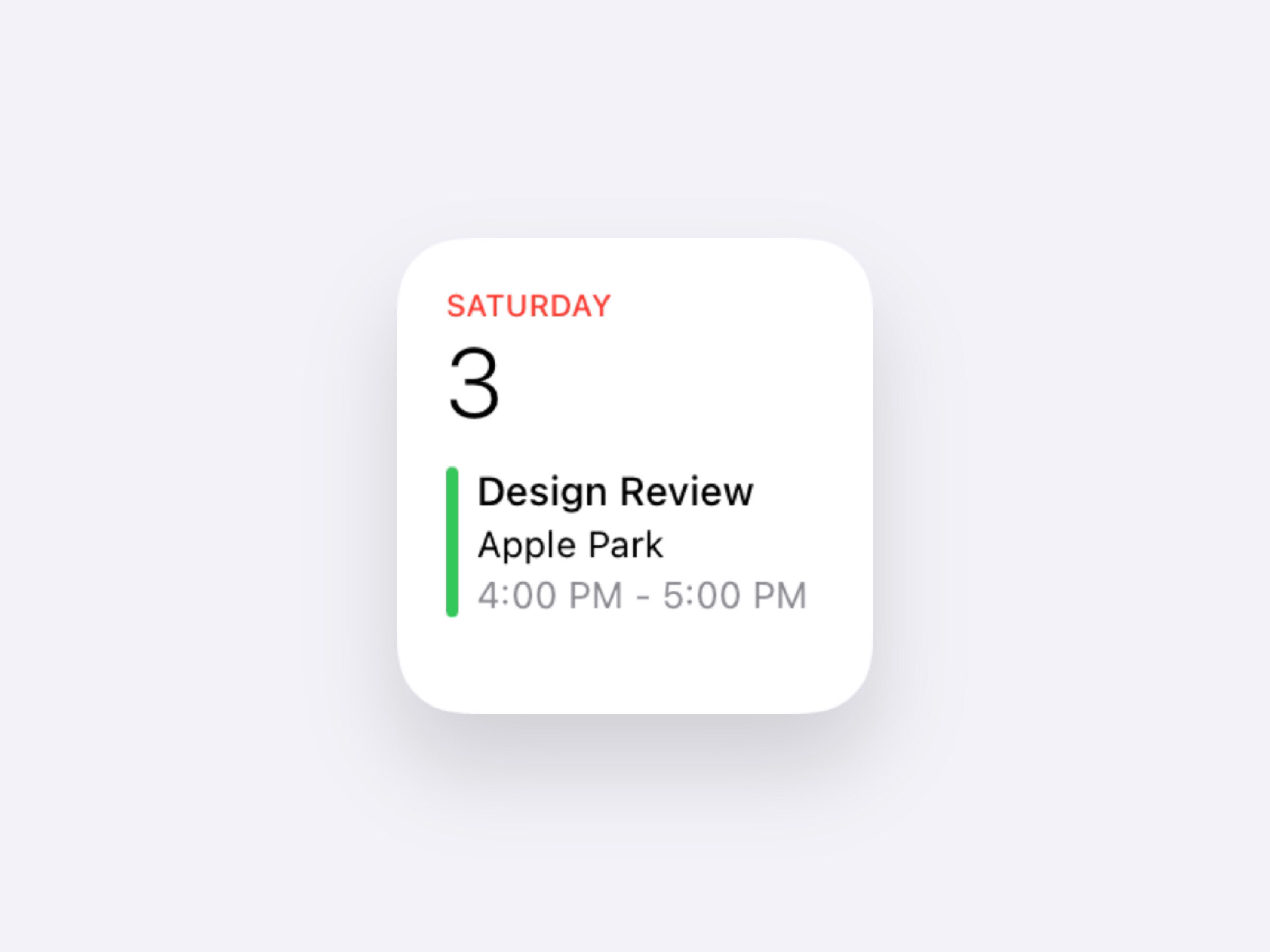
    1. Start with a Card

    We’ll want to start the actual element that is going to be in our scroll. We’ll make sure our element has a set width by giving it a Frame modifier and entering in a width value. This will be necessary because once we put this element into a horizontal scroll, we’ll need that width value to help the element stays uniform regardless of their content.

    Our card design is ready to go with a Frame modifier that gives it a set width and height. This will come in handy when we repeat this card to have multiple in the scroll.

    2. Wrap with a Horizontal Stack and then a Scrolling Container

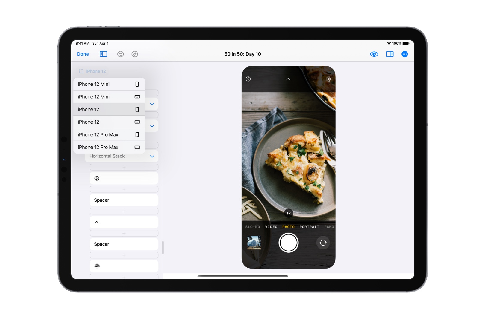
    Next, we’ll place our card into a new Horizontal Stack, and then place that Horizontal Stack into a Scrolling Container. We’ll also make sure the Scrolling Container has its direction set to “horizontal”. Pro-tip: If you use the “New Scroll with Item” action by long-pressing on an element, Scrolling Container will automatically set it’s direction for a Horizontal Stack to be horizontal.

    Note: at this point, it’s normal for the card to be right up against the side of the phone. We’re going to fix this in the next step.

    Now we should have a Scrolling Container that has a Horizontal Stack that has our card.

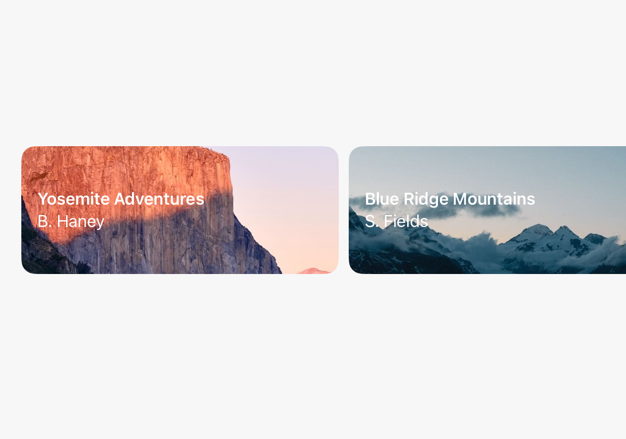
    3. Add Padding and Repeat the Card

    We’ll add a single Padding modifier to our Horizontal Stack to give us a beautiful, uniform spacing from the sides of the device so our scroll starts with a nice offset. Next, we’ll long-press on our card element and tap Repeat to make five cards appear, filling our scrolling row and giving us content to customize. Learn more about repeat here.

    Our Horizontal Stack has been given a Padding modifier, making it look amazing, and we added a Repeat around our card to give us that filled out content.

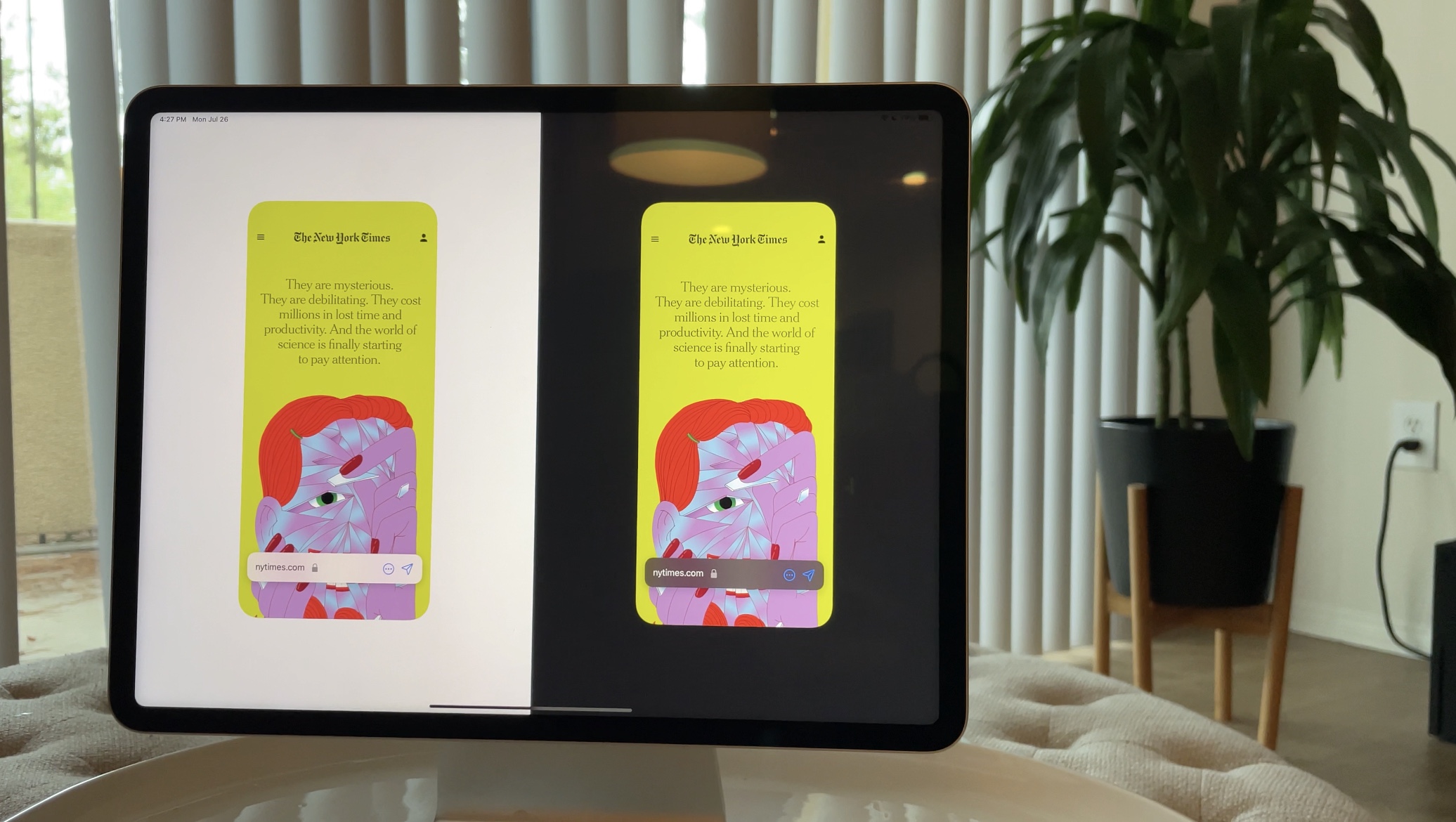
    4. Done and Ready to Refine!

    Now that we’ve got our content scrolling, we can do anything from change up our content in each repeat item to refining the design of our cards themselves. Fine-tune the width, adjust the fonts, and make your design beautiful.

    And now with a little refinement and some filled-in content, we’ve got a beautiful scrolling carousel!

    DetailsPro makes it easy to design in SwiftUI and get a carousel ready to go to export into Xcode.

  • How to Use SF Pro Expanded and the Other New Font Widths

    How to Use SF Pro Expanded and the Other New Font Widths

    Apple announced three new fonts at WWDC 22 that make up the new and expanded San Francisco font family: Compressed, Condensed, and Expanded. I’m excited to share that DetailsPro now makes it easy for you to start experimenting and designing with these beautiful new fonts in your designs today.

    From top to bottom: Compressed, Condensed, Standard, and Extended. Each is set in 39pt Semibold. Every “Opens at 10:00 a.m.” text is set in Standard 19pt Regular.

    To use these fonts, you must be on iOS 16, iPadOS 16, or macOS Ventura and the latest version of DetailsPro. You can use these fonts anywhere you could use SF Pro before, and selecting these new widths is easy. Here’s how you do it:

    How to try the new fonts in your designs

    1. Open a design
    2. Select any Text element
    3. Add a Font modifier
    4. Choose a width in the “Width” section
    5. Try Compressed, Condensed, or Expanded
    Select any Text element to start.
    Select the Font modifier to edit the font.
    Choose from Compressed, Condensed, Standard, and Expanded when using the SF Pro default font.
    “Condensed” is my early favorite. I think it gives text a wonderful fun feeling that is perfectly subtle.

    From the WWDC Session

    Export as SwiftUI code

    DetailsPro fully supports exporting code for the new expanded San Francisco font family so you can take these designs with you for iOS 16 and up. When you design with DetailsPro, you can take the design you make with you as 1:1 SwiftUI that can be exported to Xcode, Swift Playgrounds and more. Export as SwiftUI code is available free to all DetailsPro designers.

    Just the beginning

    As I’ve been building in support for these new fonts to DetailsPro, I have been using them and I truly think we haven’t even seen 1% of how far these fonts will go. Condensed is straightway my favorite because it’s got almost a The Flintstone’s/The French Dispatch feeling of wonder to it. I thought Expanded would be my favorite, because it’s outwardly the coolest in my opinion, but I am loving Condensed and itching for an excuse to use it in something.

    I can’t wait to see what you design with it. If you make anything you want to share, tag me on twitter @sahandnayebaziz and @detailsproapp!

  • Every Keyboard Shortcut in DetailsPro

    Every Keyboard Shortcut in DetailsPro

    DetailsPro’s mission is to make designing with SwiftUI accessible to as many people as possible, and on macOS and iPadOS part of that mission is supporting the great keyboard commands and interaction patterns that people are used to.

    DetailsPro supports a powerful range of keyboard commands that are all accessible from ?K, and on top of that supports a range of other keyboard shortcuts.

    Read on below for a list of everything. For more information, you can also read our blog post announcing keyboard commands in DetailsPro.

    Keyboard Commands

    • Open Keyboard Commands — ?K
    • Select Next Element — ??
    • Select Previous Element — ??
    • Select Next Insertion Point — ???
    • Select Previous Insertion Point — ???

    Numpads

    • Enter a number — 0-9
    • Delete — delete
    • Clear the numpad — c
    • Enter a decimal point — .
    • Return from the numpad — return
    • Decrease by the nudge amount — -
    • Decrease by the larger nudge amount — ? Shift -
    • Increase by the nudge amount — =
    • Increase by the larger nudge amount — ? Shift =

    Keyboard Support

    DetailsPro’s keyboard shortcuts work on iPhone, iPad, and Mac with any Bluetooth keyboard connected, including the iPad Smart Keyboard and Magic Keyboard.

    Stay tuned for more!

    We’ll be updating this post with all keyboard shortcuts in the app. Stay tuned for more!

  • How to browse SF Symbols on iOS

    How to browse SF Symbols on iOS

    You can easily browse through the icons in Apple’s SF Symbols 3 collection on your iPhone or iPad using the DetailsPro app.

    Apple introduced SF Symbols at WWDC 2019, making Apple-designed iconography available for designers and developers that was easy to use, included in the iOS SDK, and designed to integrate seamlessly with Apple’s current system font San Francisco.

    How to find the SF Symbols browser in DetailsPro

    1. Launch the DetailsPro app on your iPhone or iPad.
    2. Tap on SF Symbols in the main navigation.

    Not only can you browse through the entire collection of SF Symbols, but you can also explore SF Symbols by category or search them by name.

    How to view SF Symbols by category

    1. Launch the DetailsPro app on your iPhone or iPad.
    2. Tap on SF Symbols in the main navigation.
    3. Tap on the list icon next to “All”.
    4. Tap on any category to see its icons.

    How to search SF Symbols by name

    1. Tap on the search field
    2. Type in a partial name like “heart”, “delete”, or “iPhone”

    Tip: You can also view more SF Symbols on screen at a time by hiding the sidebar in the DetailsPro app.

    How to browse SF Symbols on a Mac

    You can use these same steps on the DetailsPro Mac app to browse SF Symbols, but if you’re on a Mac, the best way to browse SF Symbols are with Apple’s own SF Symbols Viewer which can be downloaded from their SF Symbols Apple Developer page. With this app, you can make custom collections, learn about the backwards compatibility of each icon, and more.

    What do you think?

    Do you search for SF Symbols often? Does being able to browse through the vast library of icons on-the-go help in your workflow? We’d love to hear from you!

  • How to Use Overlay, Background, and Layered Stack

    How to Use Overlay, Background, and Layered Stack

    The next time you’re creating a design that needs to lay elements over or behind other elements, you’ll have two methods you can choose from, each with their own benefits. You can use the Layered Stack (ZStack) or one of the Overlay or Background modifiers.

    Here’s a simple example. Let’s say you are designing something with:

    1. One image
    2. One SF Symbol over that image

    Let’s say it’s supposed to look like this:

    The Layered Stack Way

    Your first option would be making this design with a Layered Stack. Here are all the steps:

    1. Add an Image
    2. Add a Frame modifier
    3. Add a new Layered Stack with that image
    4. Add an SF Symbol
    5. Select the Layered Stack and change the alignment

    You should end up with something that looks like this:

    Layered Stack is perfect for layered elements like this (hence, the name ?) and can handle designs, from the simple to the complex, with ease.

    When to Use Layered Stack

    We recommend using Layered Stack whenever you have a clean slate and know from the beginning that you want a design to be layered. Whether at the top of your design or somewhere deeper down, Layered Stack is great for the job.

    When Not to Use Layered Stack

    The only time we don’t recommend using Layered Stack is if you already have a rather complex design in front of you. If you have already done a lot of work and realize that you need to add layering to your design late in the game, we recommend using the second way we’re about to discuss…

    The Overlay Way

    Your second option is making this design using the Overlay modifier. Here are all the steps:

    1. Add an Image
    2. Add a Frame modifier
    3. Add an Overlay modifier
    4. Delete the placeholder “Overlay” Text inside the Overlay
    5. Add an SF Symbol inside the Overlay
    6. Select the Image’s Overlay modifier and change the alignment

    You should end up with something that looks like this:

    Overlay is a perfect, lean option for quickly adding layering over any of your design elements.

    When To Use Overlay

    We recommend using Overlay anytime your design feels like a certain design element is the “base” (here, the image) and the layered design elements really feel like they are secondary to that “base”. An image with action buttons over the image is a perfect example.

    When Not to Use Overlay

    The only time we don’t recommend using Overlay is when you are starting with a clean slate. Very early on in a design, if you already know that you’d like to make your design layered, it may be better to start with a Layered Stack. This way, you don’t have to worry too much about which element is the “base”.

    Make Sure You Are Up-to-Date

    The behavior of ZStack seems to have changed recently, in a really positive way, becoming easier to use and making these options possible. If you’re on an old version of iOS, you may not be seeing this behavior. Make sure you are on the latest version of iOS/iPadOS/macOS to enjoy these benefits. Doesn’t hurt to update to the latest version of DetailsPro while you’re at it!

    Conclusion

    SwiftUI is great like that, giving us multiple ways that are best suited to the many different situations that arise when designing.

  • Video: How to Make iOS 15 Safari in DetailsPro

    Video: How to Make iOS 15 Safari in DetailsPro

    We’ve got a new tutorial available on YouTube this week! Check it out below:

  • How to Add Unsplash Photos in DetailsPro

    How to Add Unsplash Photos in DetailsPro

    Hand-in-hand with great design is great photography and Unsplash is really the place to find great photography.

    As of today, you can add images from Unsplash directly to your SwiftUI designs, all from within DetailsPro on iPhone, iPad, and Mac.

    We’ve added a new option you’ll find when choosing to add a new photo, Choose from Unsplash. Along with Choose from Photos and Choose from Files (we are very proficient in naming), this new option fits in nicely with what we currently have.

    A new option, Choose from Unsplash, makes it easy to add great photos to your designs.

    Our intention is for DetailsPro to have absolutely off-the-charts support for photos and the way that designers use them. So, this is a great time for a quick refresher on how DetailsPro handles images. When a designer adds an image, the source file for that image is saved in DetailsPro and made available to multiple designs at once.

    We know from experience that most designers end up working on projects for a while and you’re basically reaching for the same or similar assets over that period of time. So we made DetailsPro specifically for this pattern to save designers from having to import the same images over and over and over. Leave the folder of assets behind after you’ve imported the images into DetailsPro just once.

    Photo credit: Samuel Ferrara.

  • Introducing Size Templates

    Introducing Size Templates

    The spaces we design for influence what we create.

    When Apple introduced the Apple Watch in 2014, they led with a remarkable set of videos titled Rise, Up, and Us. Each showed the watch in unique scenarios. Rise can be watched here while it’s still available.

    These videos introduced a new product and a new space for interaction to consumers—the Apple Watch display.

    Incredible work had been done by Apple Design to make it to this point. Imaginative, creative, and ground-breaking is how I would describe the cumulative effort that led to the beautiful interfaces shown on the watch. And so, with the public release, the baton would be passed to new designers to create new experiences.

    This is where it’s vital that our tools meet the moment. The easier it would be for designers to design for the Apple Watch, the better and greater quantity of designs they would make. That’s what I believe, anyway.

    DetailsPro makes this process easy today and will continue to going forward with our new feature out today: Size Templates. Size Templates help designers quickly and easily target the precisely correct size for the devices they design for.

    This update contains widget sizes (Small, Medium, and Large widgets), iPhone sizes, and iPad sizes. Apple Watch sizes and Mac sizes will be coming in a future update.

    Designers can choose from built-in size templates for iPhones and other Apple devices.

    DetailsPro takes care of knowing the exact point dimensions of each device and will even change the corner radius of the canvas to match that of the device. If a designer is working on something for iPhone 12, they will see not only the correct size but also the correct device corner radius. All they have to do is tap iPhone 12 and select between Portrait and Landscape. It’s that easy.

    We also extend beyond device templates into other operating system-specific templates that we will continue to expand as these products evolve. Today, DetailsPro already includes support for the new widgets that debuted with iOS 14.

    Size Templates include other relevant sizes, including those of iOS 14 widgets.

    DetailsPro is a focused design product built exclusively for Apple platforms. We can focus deeply on what it means to design for these platforms. We can build features that designers would never see anywhere else because nowhere else has this focus.

    We’ll be keeping these templates up-to-date with the latest devices always because this is what DetailsPro is all about—helping Apple platform designers do their work.

  • Introducing Dark Mode Preview

    Designers are expected to deliver designs that look great in Light mode and Dark Mode.

    DetailsPro can help you design in both modes easier than ever, in two ways.

    First, if you simply put your device into Dark Mode, your designs will show in true Dark Mode. This happens automatically with no work needed. How does this happen? Well, since you are designing with real SwiftUI, everything is reflecting true, natural SwiftUI states. Text changes color, system colors like blue and red show their true dark mode variants, and backgrounds change too.

    Second, you can switch between Light mode and Dark Mode quickly and easily with the new moon icon released today in DetailsPro 1.1.

    Turns out, you won’t need to manually copy changes over from your Light mode variant to your Dark Mode variant anymore.

    You also won’t need to worry about them falling out sync. In DetailsPro, your Light mode design and your Dark Mode design are the same design.

    Update to the latest version of DetailsPro and let us know what you think!