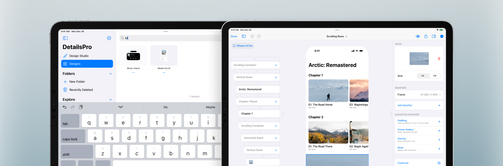
We added two new templates that were requested—one is called Store and you can use it as a starting point for designs that mirror the App Store, with a special scrolling row at the top and many smaller rows of content below. The other template is called Scrolling Rows and this is more of a detail page with horizontally-scrolling rows. As always, these templates are free and included with DetailsPro. Access all available templates in the “New From Template” row on the homepage or by selecting the “Start with Template” button after creating a new design.
We also added in files search so you can quickly pull up any files you’ve previously made. At the top of the Designs tab or in any opened folder, you can search for files by name.
New Templates
Store—use this as a starting point for designs that should have a featured row at the top with content that might have multiple kinds of metadata.
Scrolling Rows—use this for designs that need to catalog or organize many different sublists of content, like seasons of a show or categories of products in a store.
Large Navigation—this is a basic and empty template that features a large navigation title. Use this template for screens that might be at the start of the flow, before someone has scrolled, when their device would show this bigger, bolder title.
Fixes and Improvements
Added files search to the Designs tab and to folders
Added “place” as an alias for “New Item with Stack” along with “wrap” and “embed” when using ?K keyboard commands
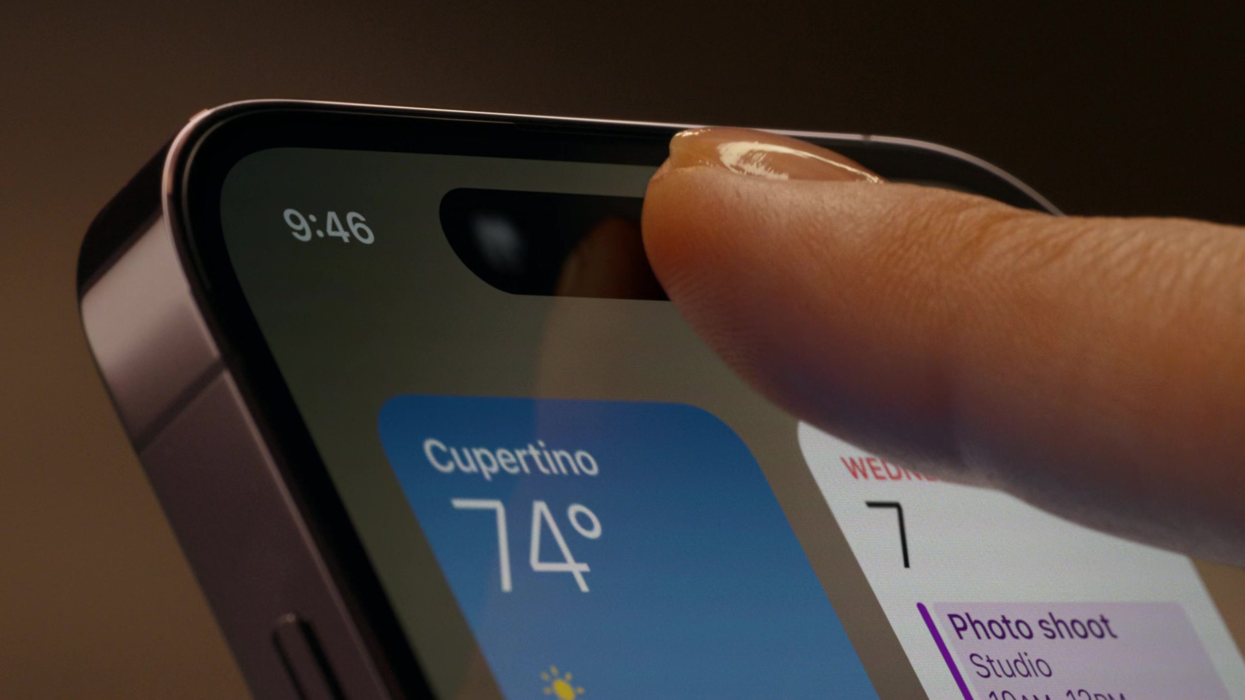
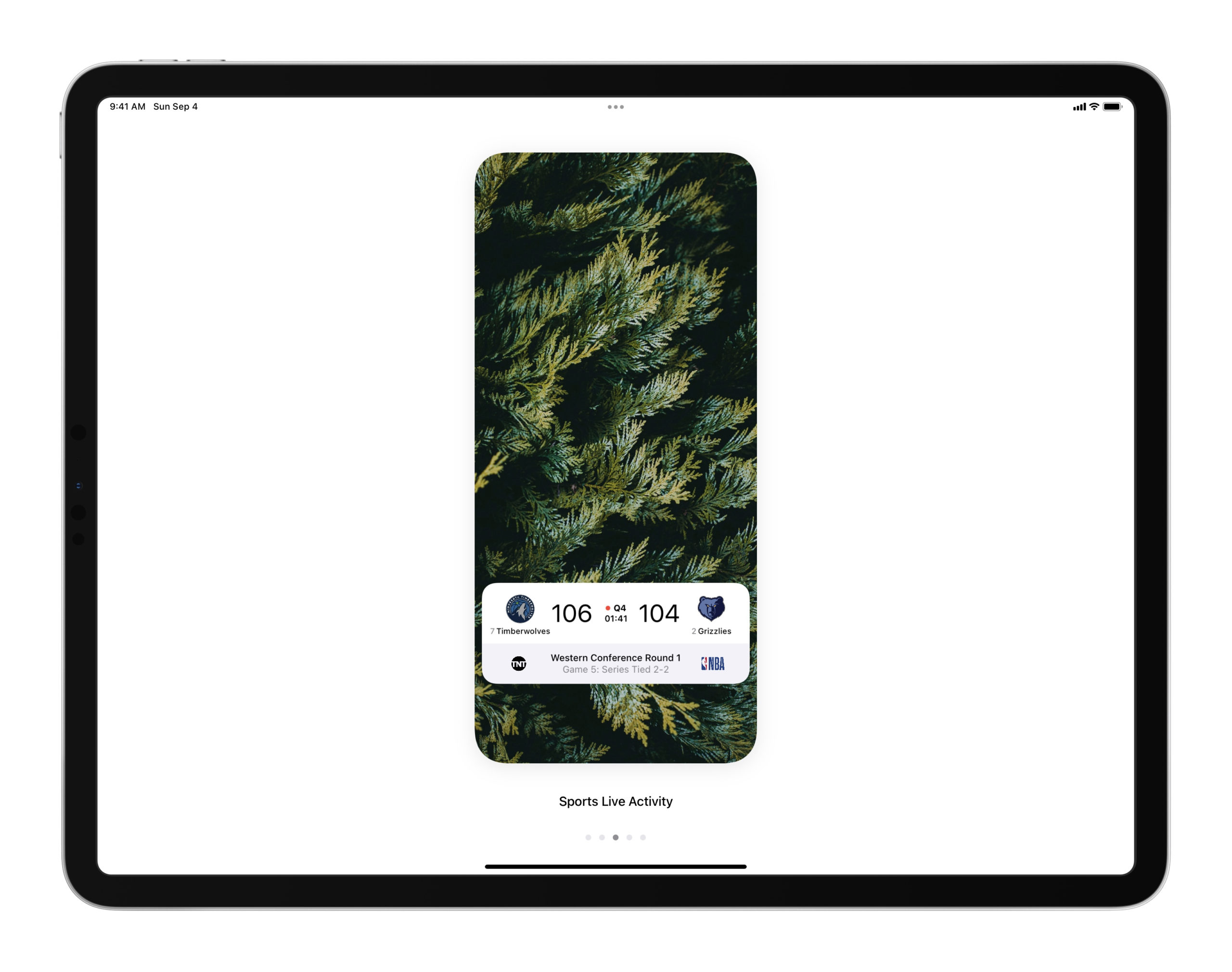
The status bar of your device is now hidden when previewing a design in full screen, so you can use DetailsPro to design new status bars and elements in the status bar area
Fixed a bug that was causing the tappable area of images to sometimes exceed their visible shape
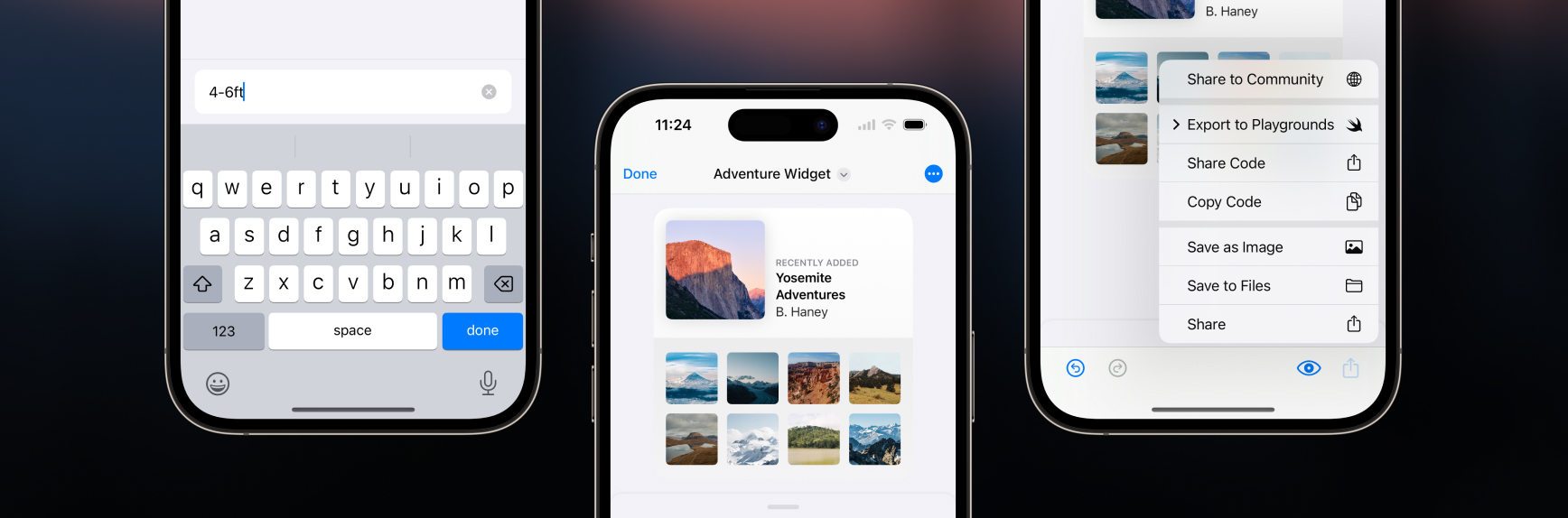
We made it easier to enter text when designing on iPhones with a new, compact text field that appears automatically. You can dismiss the keyboard quickly by tapping done or by swiping down on the text field.
We also made our sharing menus simpler, cleaner, and easier to use on all platforms. We’d received many requests for a Save to Files action, which has now been added, and also created new items in the sharing menu specifically for quickly sharing SwiftUI code. We also consolidated the sharing actions for Swift Playgrounds and Swift Playgrounds Apps into one.
New templates
Pricing and Pricing Tiers—use these templates as starting points for pricing pages, paywalls, and subscription pages.
Fixes and improvements
The Templates picker now shows a “Most Popular” list
Improved animation of design changes on iOS 16, iPadOS 16, and macOS 13
Improved designing on iPhone with faster and more ergonomic animations of inspectors and buttons
Added the Blend Mode modifier for beautiful vibrancy effects
Swiping to delete modifiers if now more reliable
Fixed a bug that was sometimes causing the Numpad to update slowly
Lowered app size of our macOS app on macOS 13
Fixed a bug that was causing ?D to sometimes not work for duplicating an element
Fixed a bug that was causing “Preview in AR” to sometimes not start on iPhone
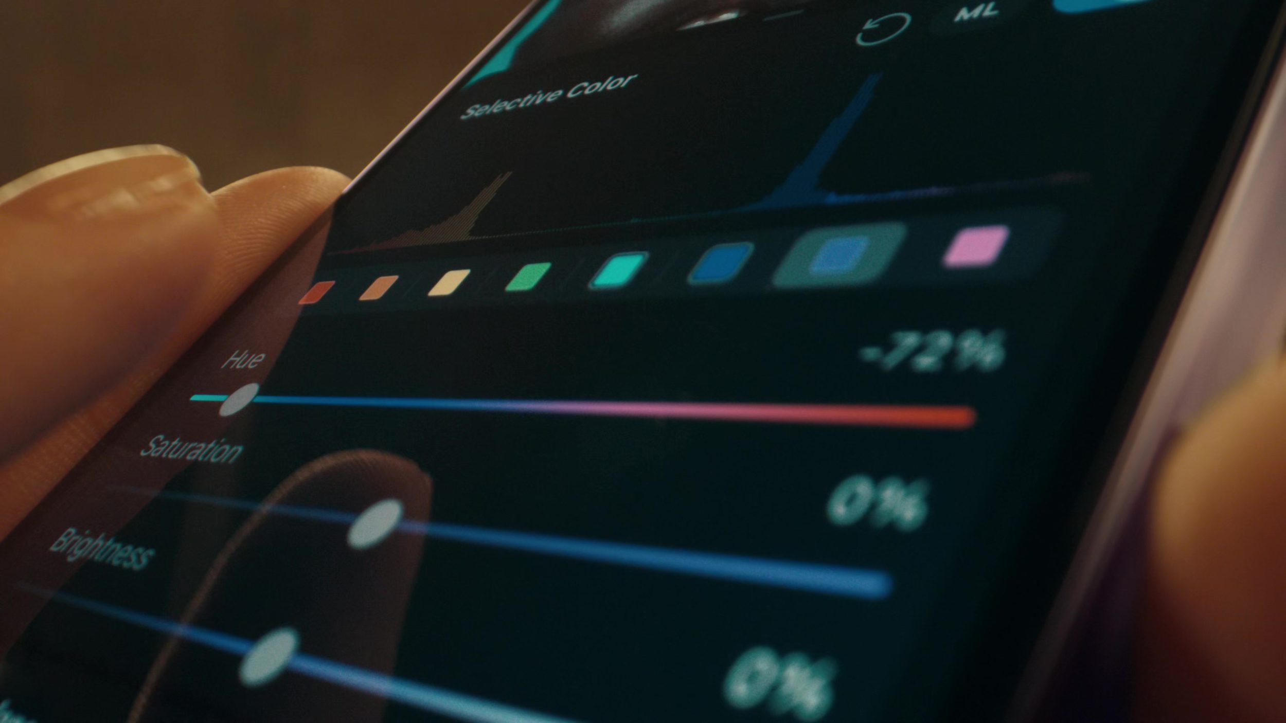
We added support for SF Symbols rendering modes monochrome, hierarchical, and multicolor. We also updated our SF Symbols UI to add an intuitive SF Symbols picker and browser that automatically shows only the available options for any given SF Symbol so you know which rendering modes are supported. When browsing through symbols, you can also change the preview for the entire grid with a new picker.
We also added support for SF Symbols with variable color so you can represent different values for a symbol’s capacity or strength, like a Wi-Fi signal strength symbol at different levels. Our new SF Symbols UI automatically shows a variable color level slider for any symbol that supports variable color.
New templates
Weather Widget—use this template for information-rich widget designs and to play with multicolor SF Symbols.
Fixes and improvements
Your last search in the SF Symbols picker is now persisted across picker opens so you are taken right back to the last results you were looking at
Your last rendering mode selection in the SF Symbols is also persisted across picker opens
Added opacity level to the preview that is displayed for shape colors
Added “flash” as an SF Symbols alias for “bolt”
Fixed a bug that was causing SwiftUI code export Overlays, Backgrounds, and Masks to sometimes not indent properly
Today I’m excited to introduce a new update to DetailsPro that entirely changes the way you can design with SwiftUI. This new way is fast, fun, and powerful. And best of all, it’s based on something you already know how to do: typing.
From the beginning, DetailsPro has been about making SwiftUI work for every Apple designer. Apps are made with SwiftUI, so why can’t designs be? That’s the question I’ve asked myself since the first beta of DetailsPro came out in 2020. And since then, DetailsPro has jumped the biggest hurdle that stood in the way. Back then, it was code. You had to know how to code if you wanted to make something in SwiftUI. So DetailsPro took that requirement out by introducing a visual interface for everything, with simple taps and drags to create beautiful designs that are ready to go as SwiftUI. No difference between a VStack made by a designer and one made by an engineer.
Now, two years later, I’ve been hearing something a lot, which is that designers want to go faster. They love that DetailsPro is easy to use at a beginner level, but now they know the app inside and out and want to go fast.
This update brings that speed, and it all starts with a simple shortcut: ?K.
Watch the Video
Smart, instant, and handmade for SwiftUI
When you’re designing elements in SwiftUI, you’re always working with something concrete—an image element, a stack of elements, a SwiftUI modifier, and so on. This is the foundation of what makes keyboard commands smart in DetailsPro: the keyboard actions you see are always relevant to what you’ve selected.
You can use keyboard commands that were made from the ground up for designing with SwiftUI, making actions feel quick and natural.
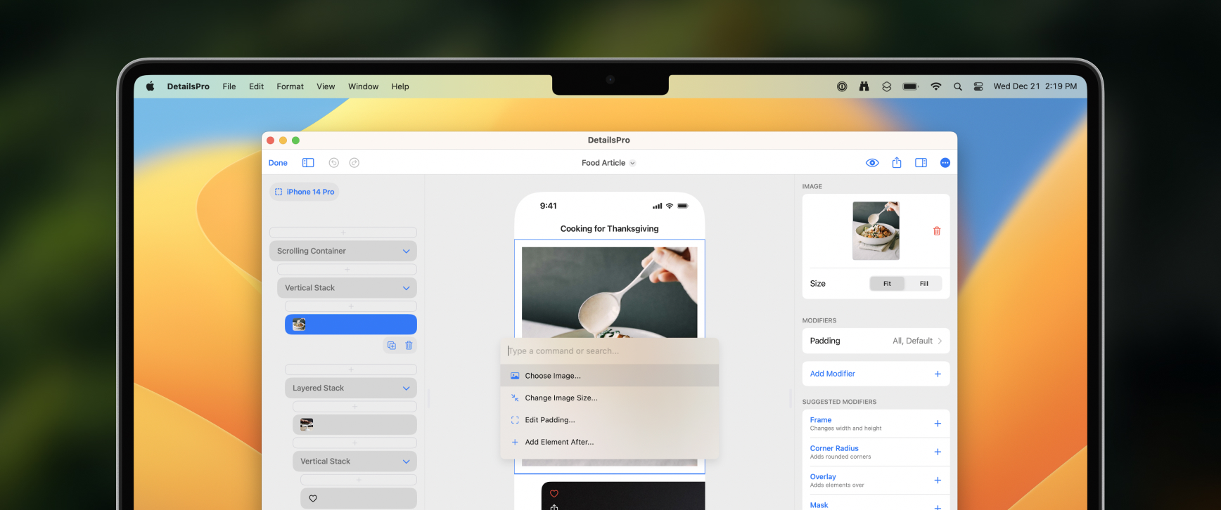
Simply press ?K and keyboard actions appear instantly. You can discover and filter through a range of context-specific actions. All from your keyboard, you can arrow up and arrow down to select an action, and then press return to complete it.
DetailsPro intelligently shows you only the actions that are relevant to your design selection
All the keyboard commands are accessible from a menu that appears after entering ?K on your keyboard.
Or, you can start typing to quickly filter the actions down to what you’re looking for. DetailsPro intelligently shows you only the actions that are relevant to your design selection, and can even show what you might’ve been looking for based on what you type.
Modify elements in no time flat
As you type into the keyboard actions, you’ll see a new version of Suggested Modifiers that makes the most common SwiftUI modifiers just one click to use. You can do things like instantly add a color modifier and set it to red all in one action by typing in “red”, or add a padding modifier with only one side selected by typing in “top”. You can even do things that take a few taps without the keyboard, like adding a frame with a custom-entered width and height by typing in “frame” and then entering “350×450” into the Add Frame action.
You can add modifiers and move between elements in your SwiftUI design all from your keyboard.
Designers who have transitioned to SwiftUI quickly become familiar with modifiers, Apple’s name for the things that make your design yours—from fonts to colors, paddings to sizes, you add the basic elements of your design onto the screen and then you customize everything with modifiers.
You can do things like instantly add a color modifier and set it to red all in one action by typing in “red”
DetailsPro made SwiftUI accessible to designers who aren’t at all interested in write code over two years ago, when the app was first released with an all-graphical interface for designing with SwiftUI. Now, keyboard commands take that a step further and let you keep designing without worrying about the code, but still taking advantage of the speed of the keyboard.
It’s easy to make changes
You can do things with the keyboard that you might not expect, like reordering modifiers. Sometimes you want a padding to before a background color, instead of the other way around. DetailsPro now has actions made just for this, with plain and easy language like “Move Background Color” and “Before Padding”.
In seconds, you can see your design in different layouts and alignments thanks to the speed and ease of the keyboard commands.
DetailsPro’s context-specific awareness only shows you actions that matter to you in that moment, based on your design selection, so it’s no sweat to give you options that show you plainly how you can reorder your modifiers, or convert a Circle into a Rectangle, or embed SwiftUI elements into a VStack.
Every action under the sun
You can visit this blog post for a list of every keyboard action available in DetailsPro at launch. More actions are being added all the time in new updates, and luckily you don’t have to worry about missing them because they will naturally appear in the list as you design with your keyboard.
See something missing you’d like to see added as an action? Let us know!
Whether you’re a beginning designer trying SwiftUI for the first time alongside Sketch or Figma, or a seasoned iOS developer with multiple apps on the App Store, the ease of use, discoverability, and efficiency of using your keyboard with DetailsPro will help you make more beautiful designs in less time.
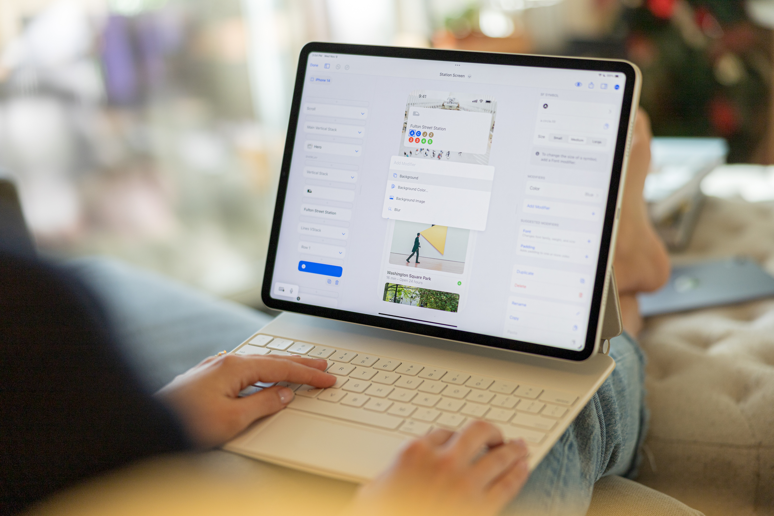
We added a new way to interact with your designs in DetailsPro from your keyboard called Keyboard Commands. Bring up the Keyboard Commands menu by entering ?K on your Mac or iPad, and then carry out actions ranging from adding new elements and fine-tuning modifiers to browsing SF Symbols and picking SwiftUI colors.
Keyboard Commands has been made from the ground up for SwiftUI design power users. There are actions for every SwiftUI element, quick presets for options like Spacing and Padding, and lightning-fast SF Symbols search. You can move elements from any position in your design to any other position, you can delete, duplicate, convert, copy, and paste elements, and you can even carry out multiple actions at once like adding a Frame modifier with a custom width and height in one move.
Fixes and improvements
Changed Corner Radius default corner style to smooth corners
Improved SF Symbols search speed and accuracy, especially when searching with periods or spaces
Pressing Esc now closes the keyboard commands menu
Added keyboard commands for preselecting a type of element and adding that element as a Background, Overlay, or Mask
Added a keyboard command for pasting copied elements when an insertion point is selected
Added keyboard command aliases for Apple HIG font families, like “Serif” for “New York” and “Sans Serif” for “SF Pro”
Added a new video tutorial, Designing from the Keyboard
Fixed a bug that was causing SF Symbols search to sometimes be hidden
Fixed a bug that was causing elements to stay collapsed after adding in a new element using keyboard commands
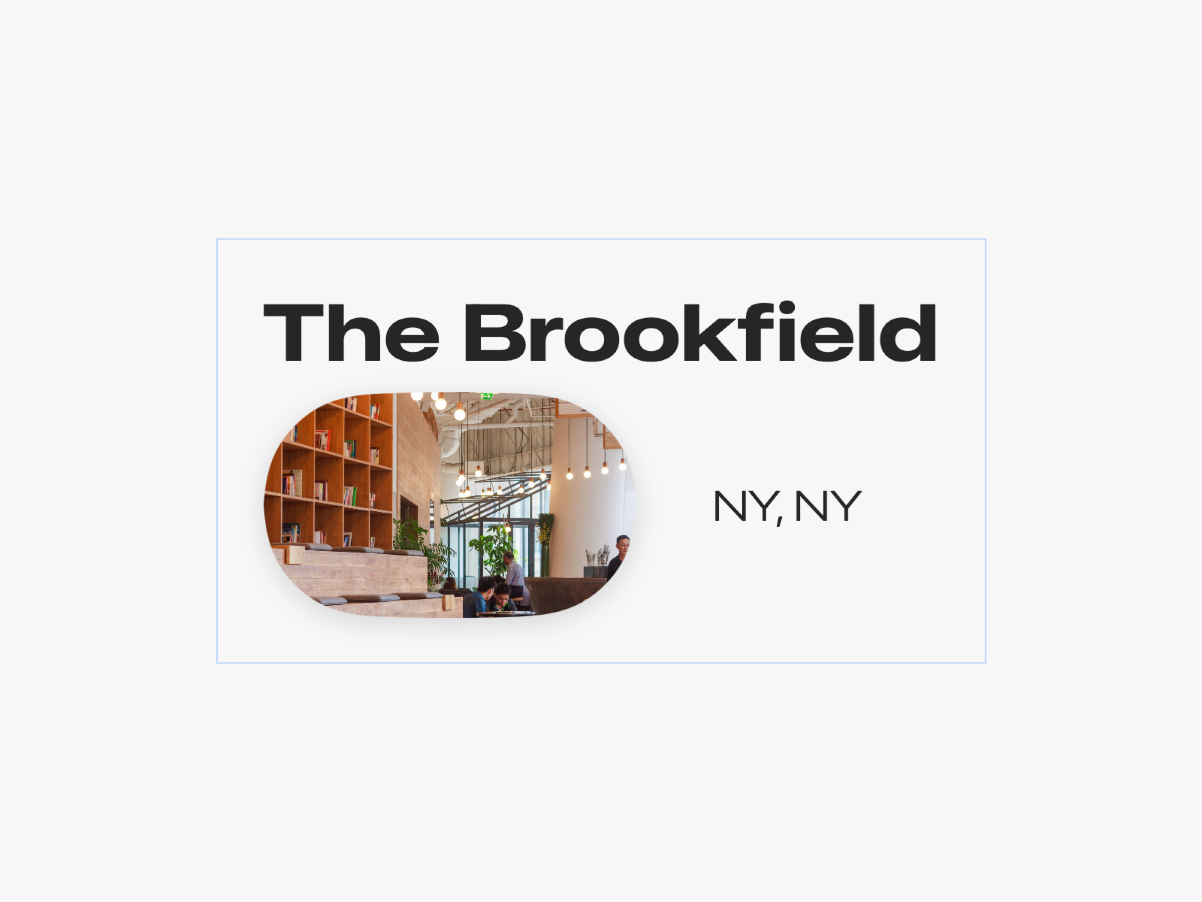
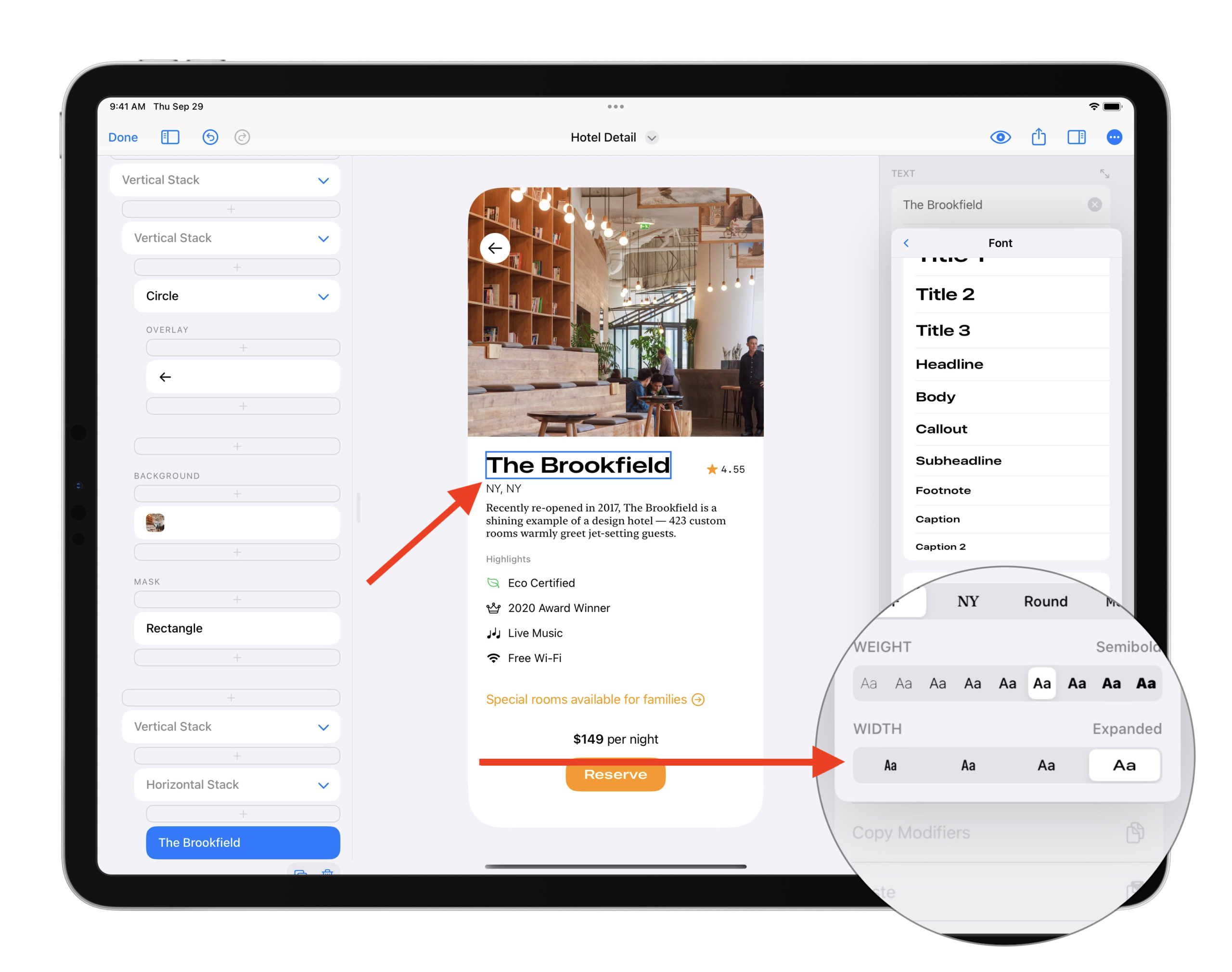
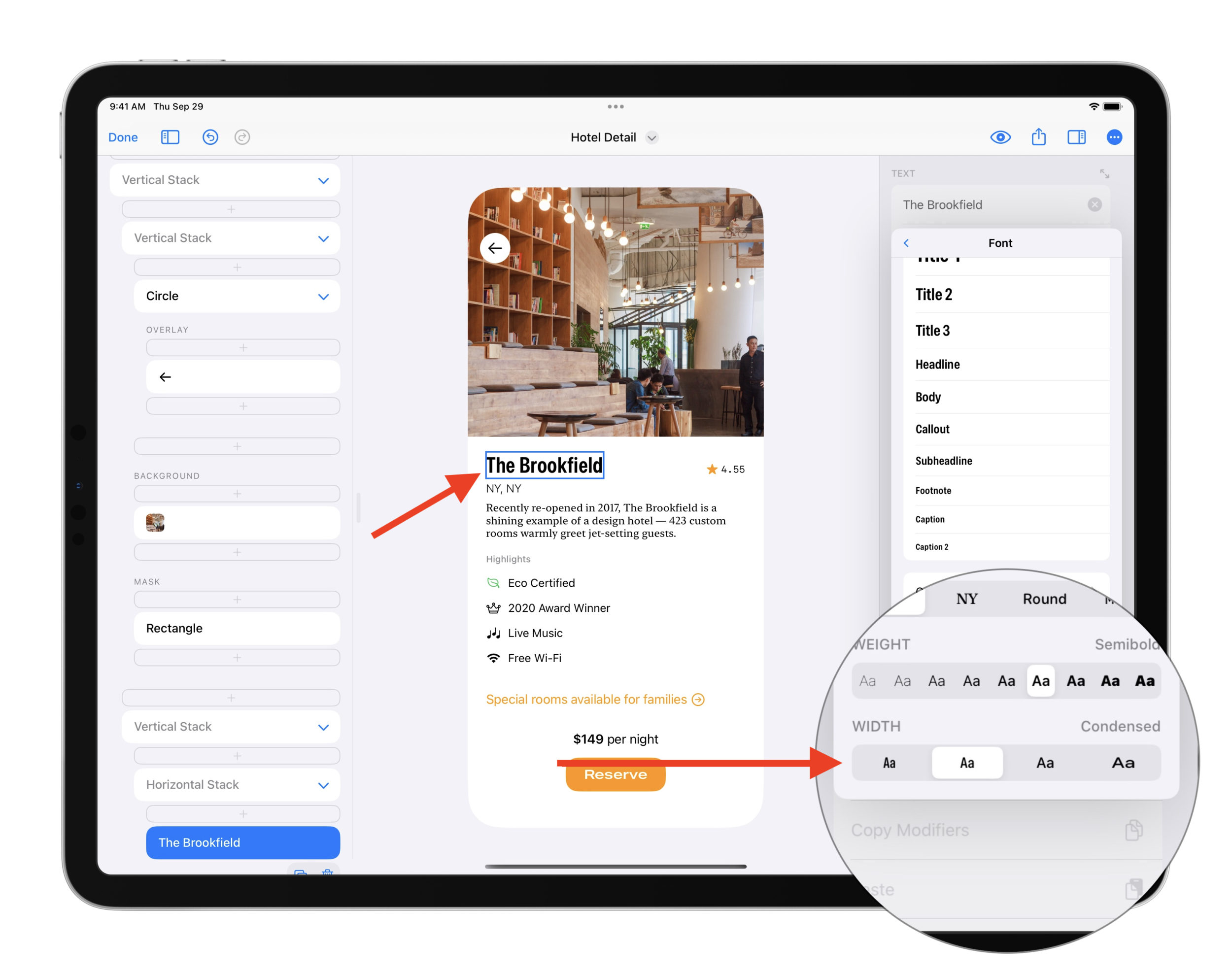
Apple announced three new fonts at WWDC 22 that make up the new and expanded San Francisco font family: Compressed, Condensed, and Expanded. I’m excited to share that DetailsPro now makes it easy for you to start experimenting and designing with these beautiful new fonts in your designs today.
From top to bottom: Compressed, Condensed, Standard, and Extended. Each is set in 39pt Semibold. Every “Opens at 10:00 a.m.” text is set in Standard 19pt Regular.
To use these fonts, you must be on iOS 16, iPadOS 16, or macOS Ventura and the latest version of DetailsPro. You can use these fonts anywhere you could use SF Pro before, and selecting these new widths is easy. Here’s how you do it:
How to try the new fonts in your designs
Open a design
Select any Text element
Add a Font modifier
Choose a width in the “Width” section
Try Compressed, Condensed, or Expanded
Select any Text element to start.Select the Font modifier to edit the font.Choose from Compressed, Condensed, Standard, and Expanded when using the SF Pro default font.“Condensed” is my early favorite. I think it gives text a wonderful fun feeling that is perfectly subtle.
From the WWDC Session
Export as SwiftUI code
DetailsPro fully supports exporting code for the new expanded San Francisco font family so you can take these designs with you for iOS 16 and up. When you design with DetailsPro, you can take the design you make with you as 1:1 SwiftUI that can be exported to Xcode, Swift Playgrounds and more. Export as SwiftUI code is available free to all DetailsPro designers.
Just the beginning
As I’ve been building in support for these new fonts to DetailsPro, I have been using them and I truly think we haven’t even seen 1% of how far these fonts will go. Condensed is straightway my favorite because it’s got almost a The Flintstone’s/The French Dispatch feeling of wonder to it. I thought Expanded would be my favorite, because it’s outwardly the coolest in my opinion, but I am loving Condensed and itching for an excuse to use it in something.
I can’t wait to see what you design with it. If you make anything you want to share, tag me on twitter @sahandnayebaziz and @detailsproapp!
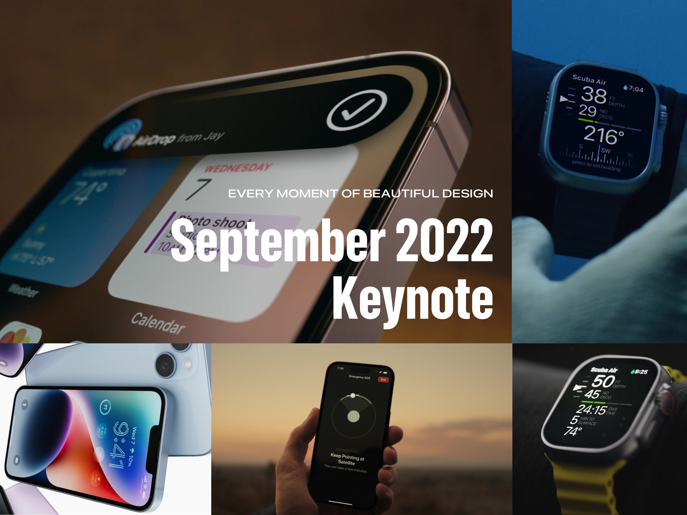
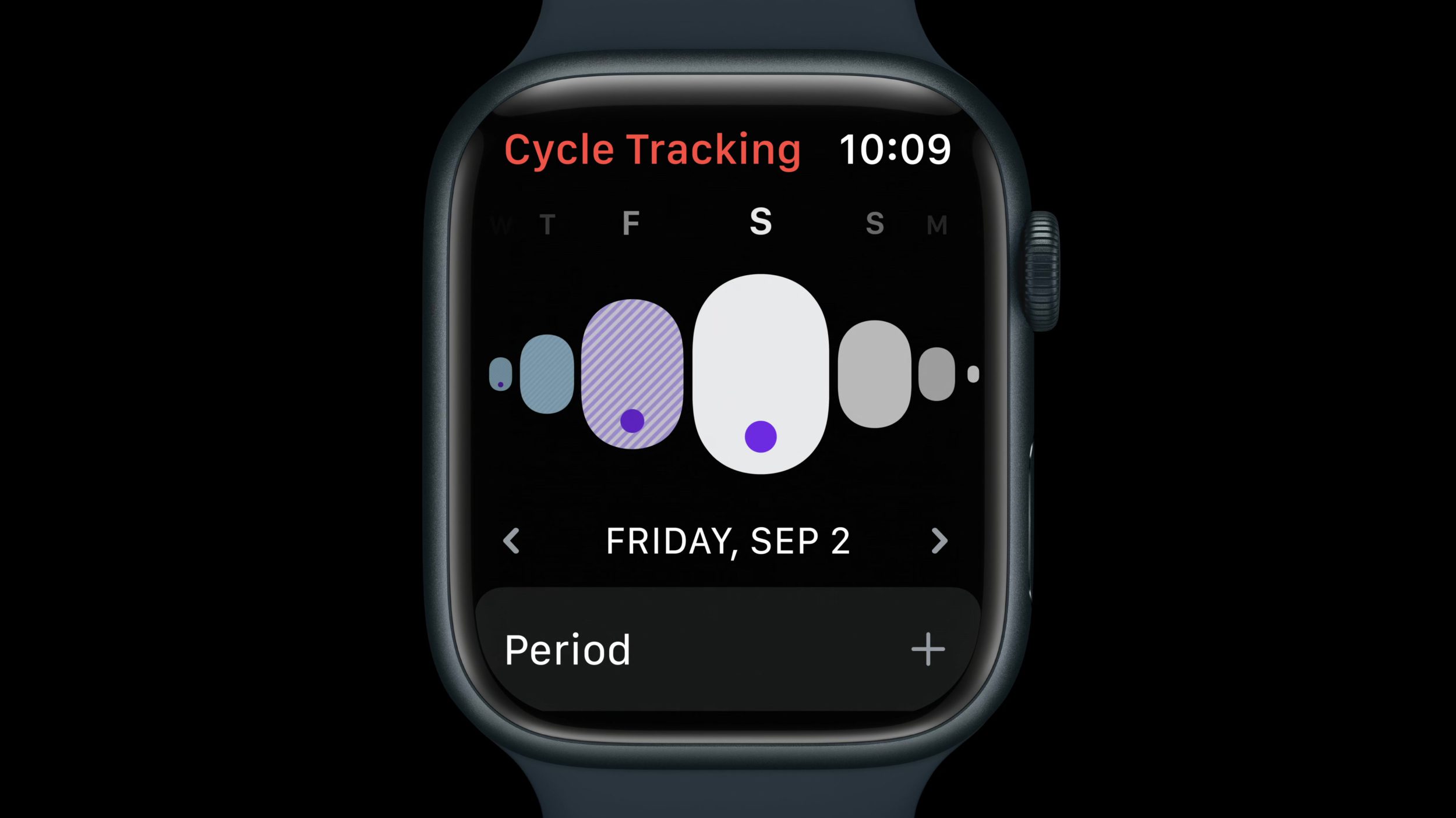
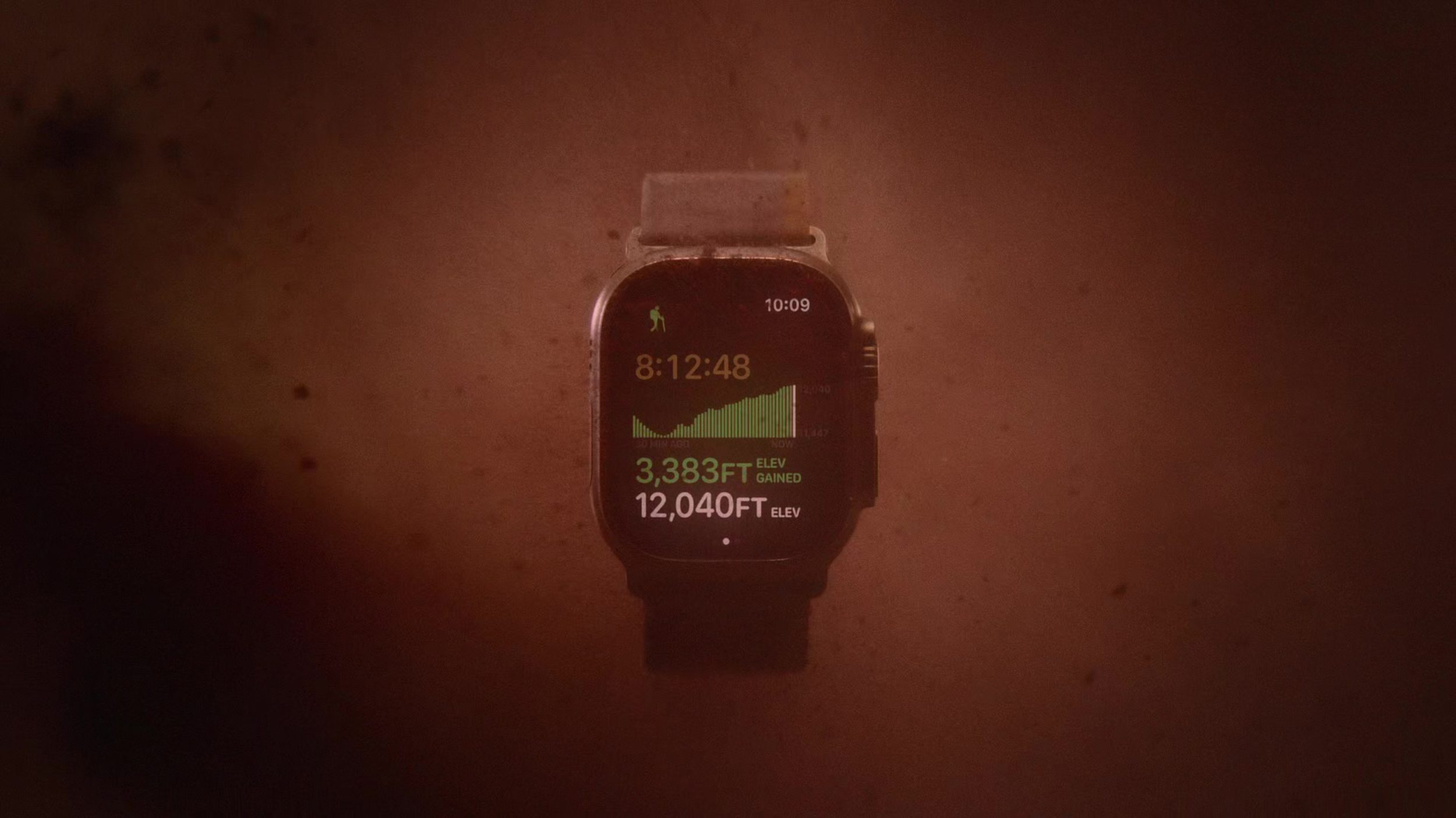
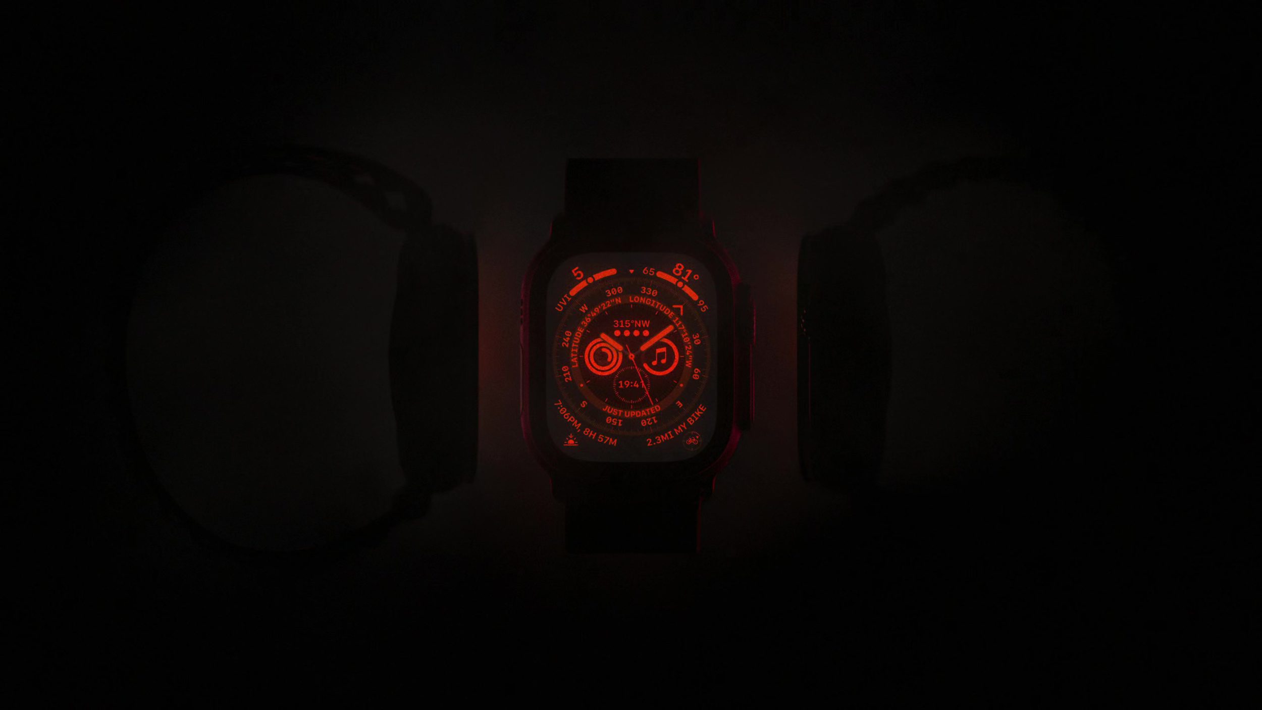
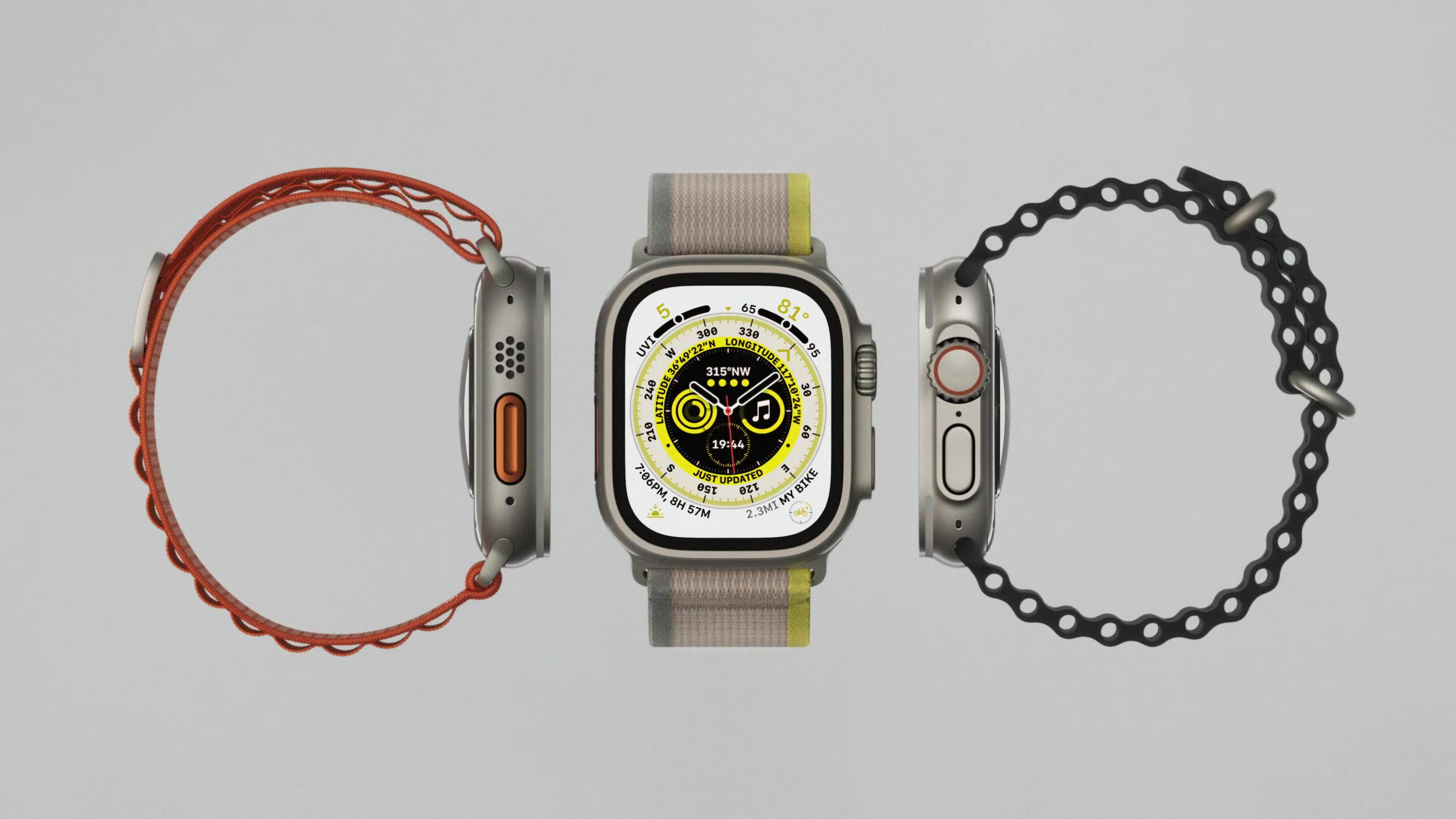
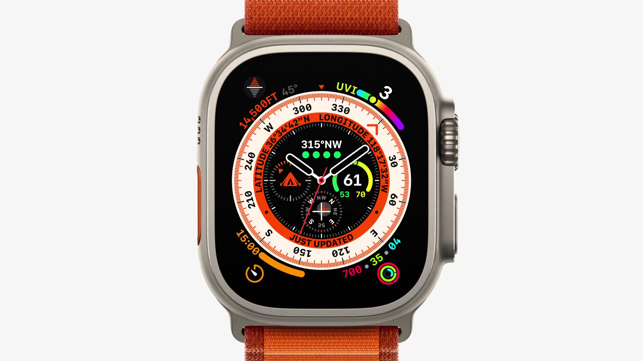
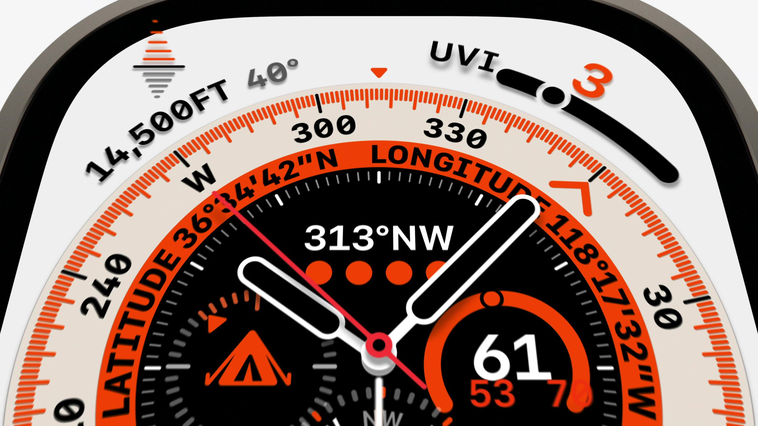
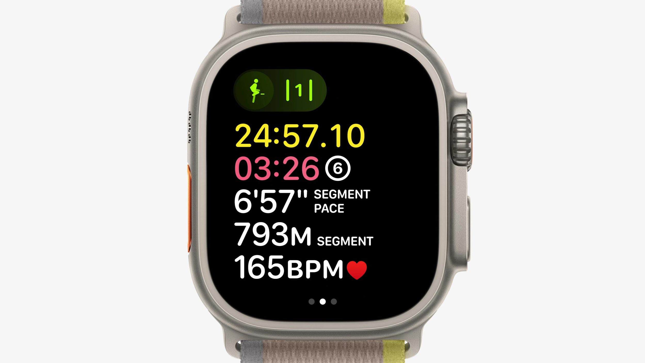
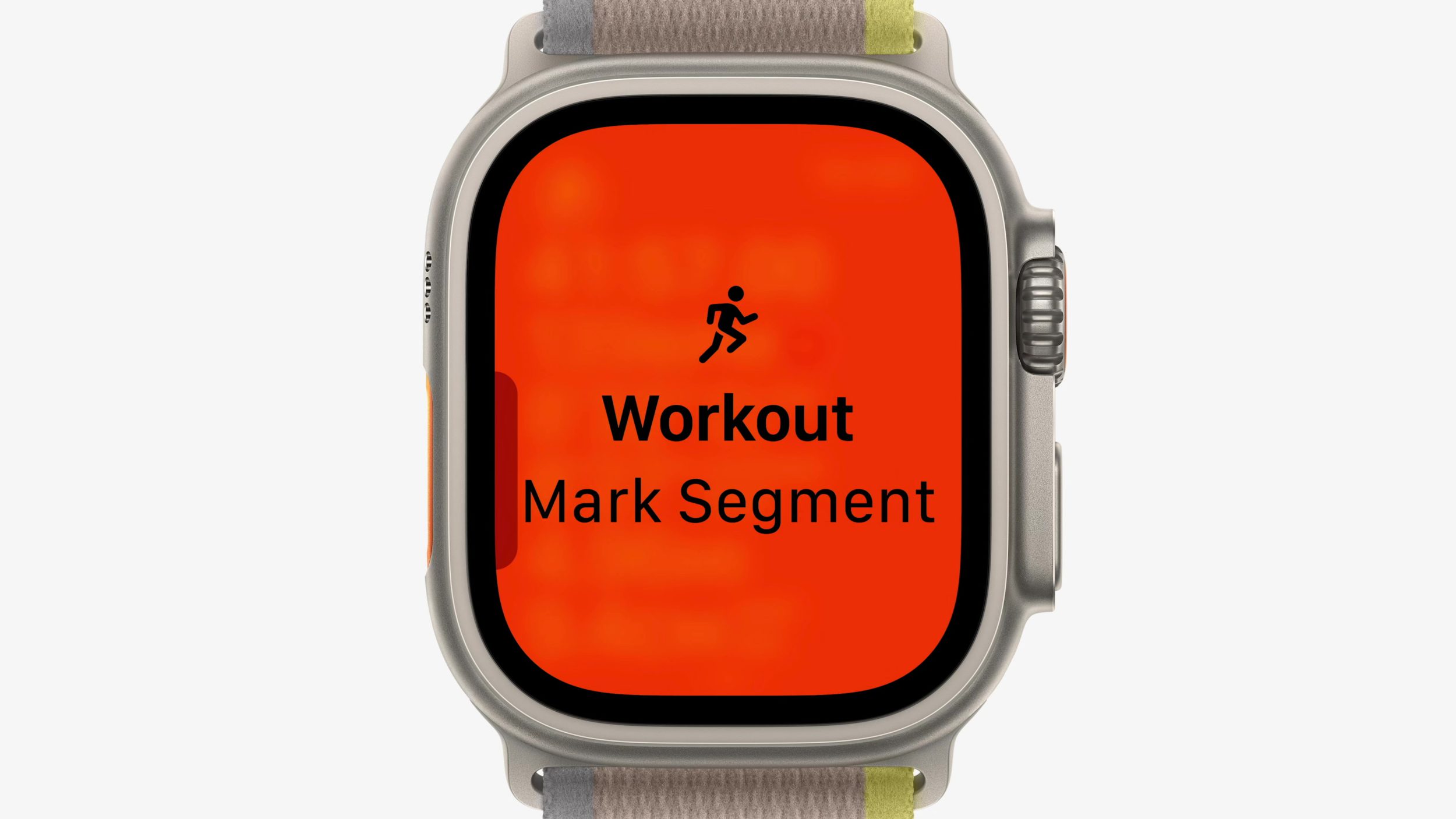
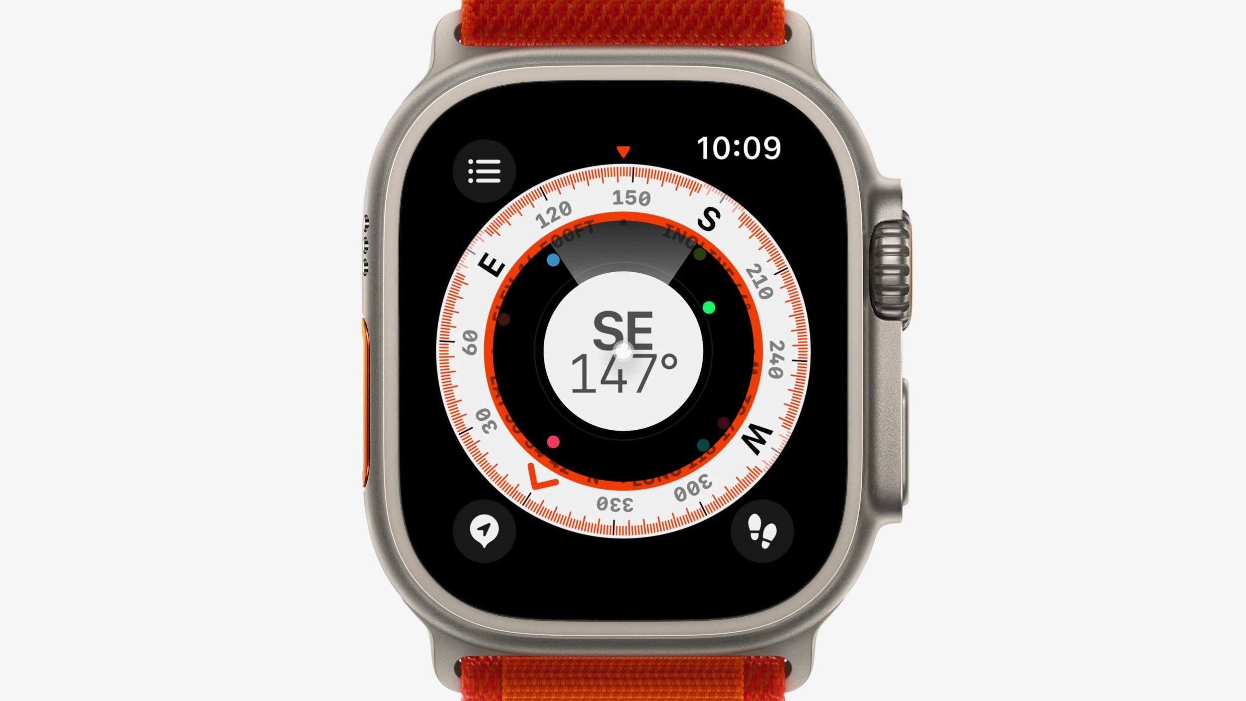
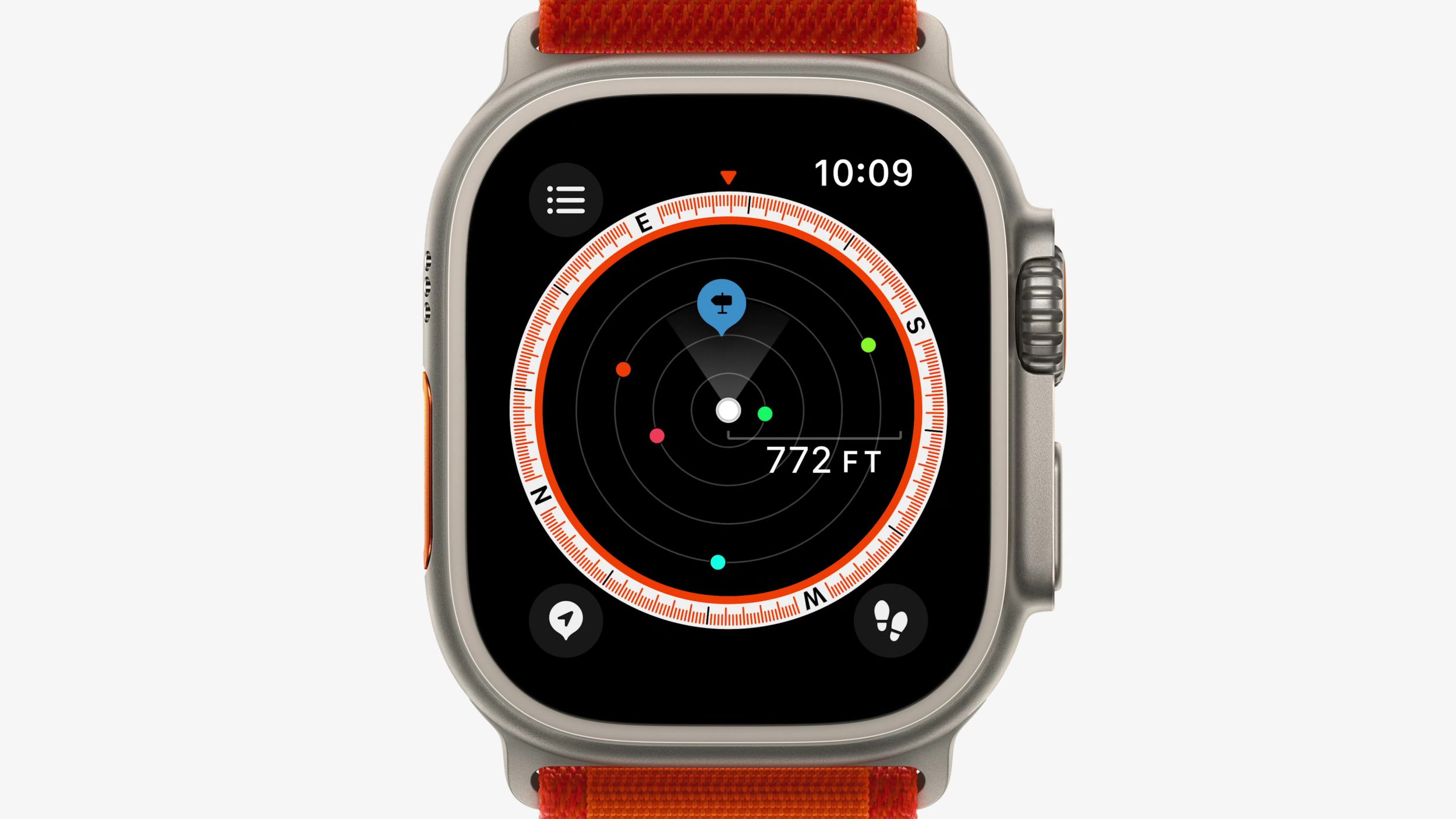
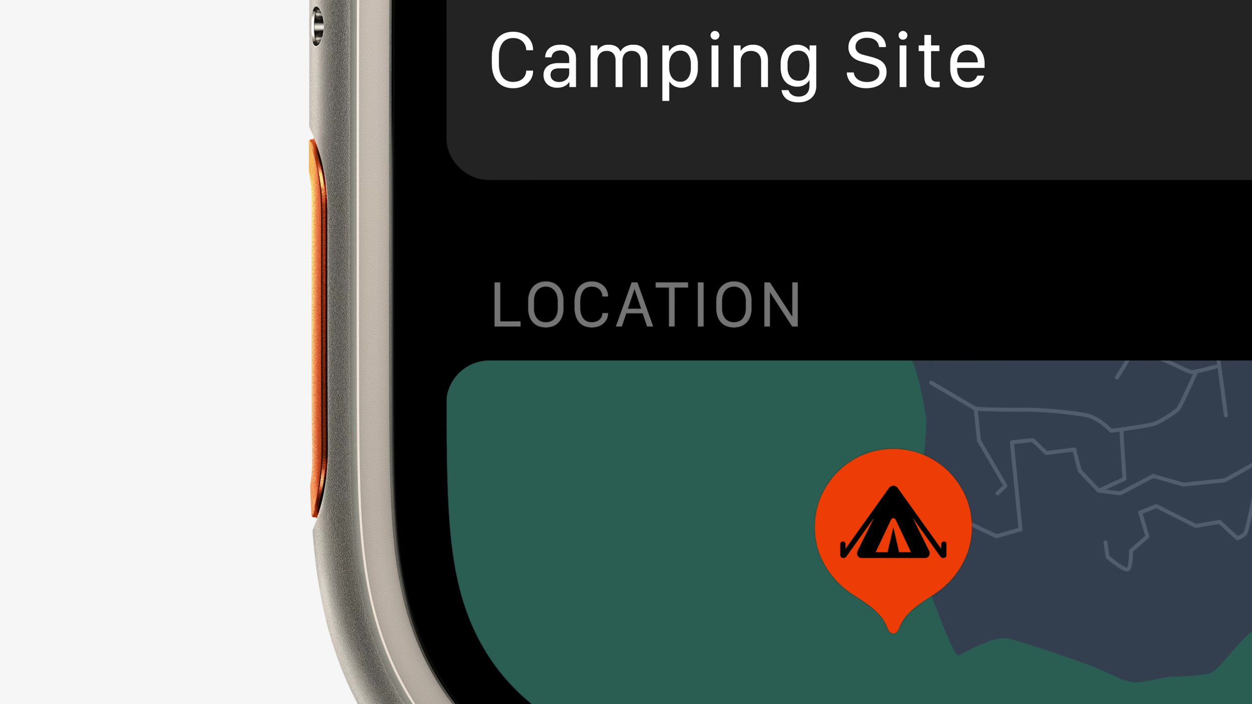
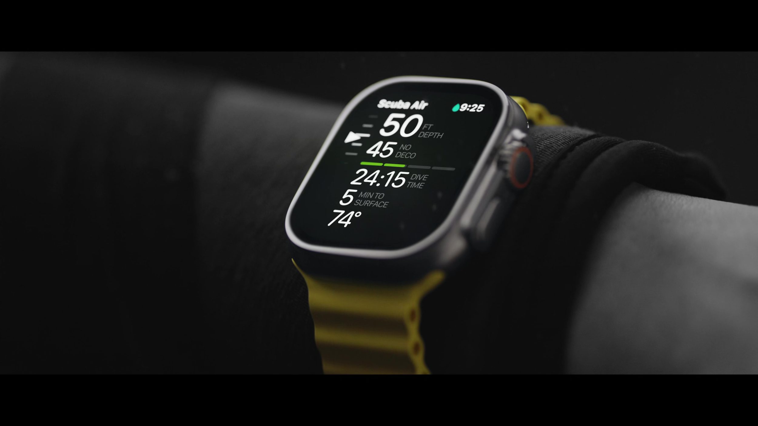
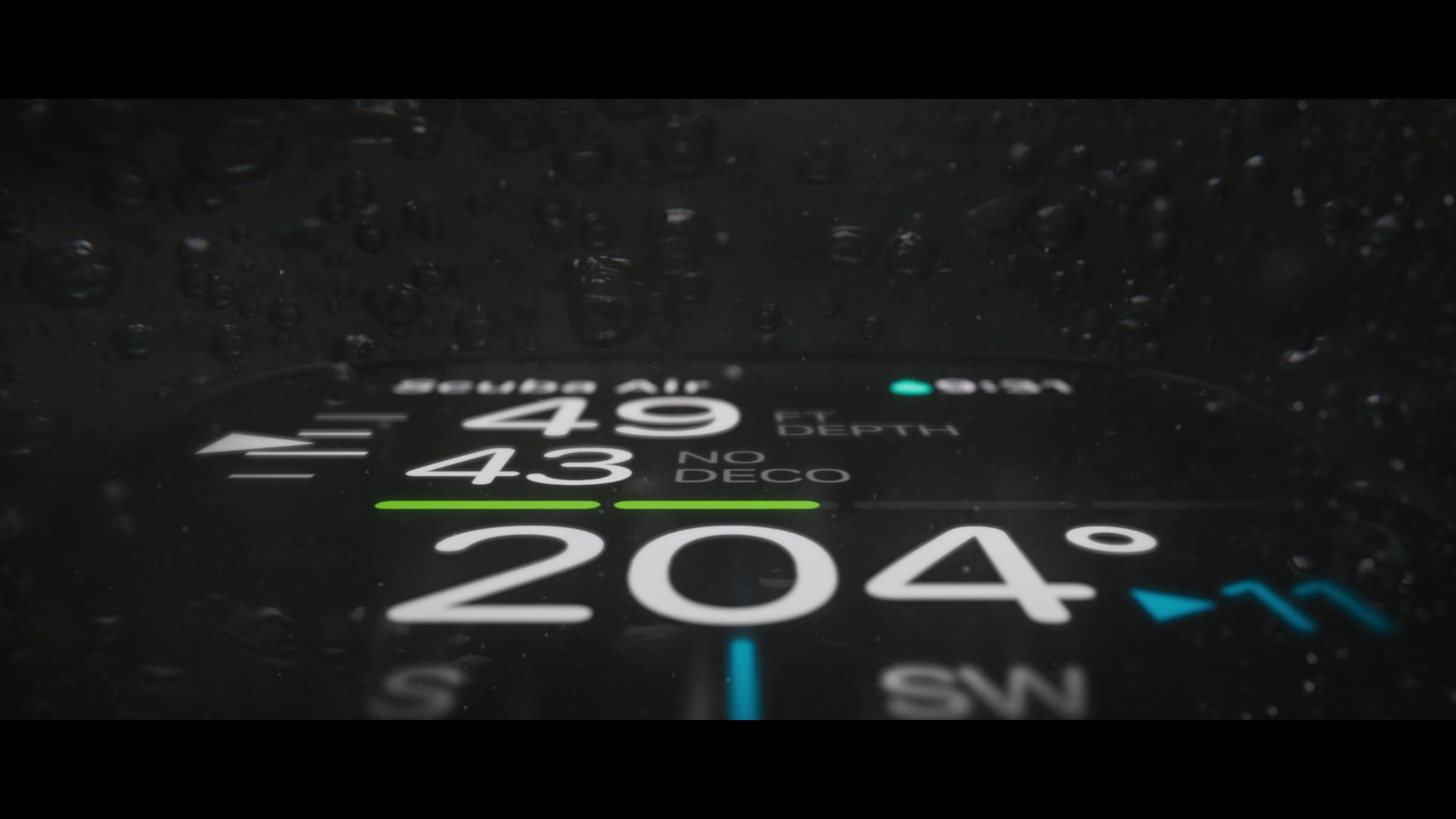
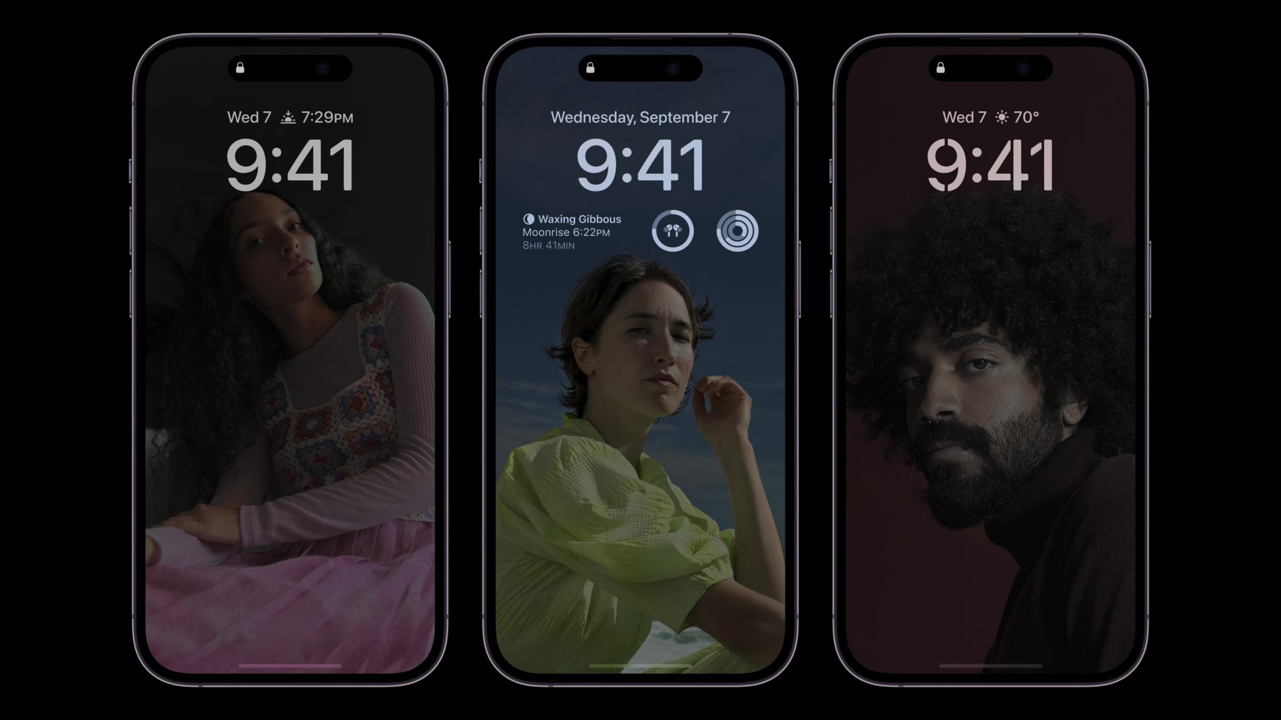
I’m writing this in early evening after the beautiful, inspiring, and exciting September 2022 Apple Keynote. Apple Design, and Alan Dye himself, came out with a dizzying amount of new designs and interfaces that are going to take weeks to appreciate and study. The Apple Watch Ultra, alone, introduced so many new designs and that’s even before getting to the new Dynamic Island!
I wanted to collect, in one spot, the beautiful moments of Apple Design that were presented all throughout the keynote. You can watch the full Apple September 2022 Keynote here.
I hope this post can serve as an inspiration point for you, a page you can return to throughout the iPhone 14 year to catch a glance at that one design you loved, and also as a moment of appreciation for the designers, thinkers, planners, and everyone at Apple who makes these creations possible.
And, if I missed any moment that you think should be in here, just let me know!
The newest DetailsPro update adds Presentation Mode, a built-in way to present your designs whether you’re at a meeting, on a screen share, or needing to compare several designs with somebody else. DetailsPro saves designers time because they no longer need to export images of each design, no longer need to create a separate Keynote or Powerpoint file just to present some designs, and makes it easy for designers to take notes from reviewers, collaborators, and more.
Presentation mode is built-in, making it a great quick option for designers who want to save time making separate presentations.
Great uses for Presentation Mode:
Present designs at a design review with your coworkers. You can take notes without having to leave your presentation, simply by tapping on the note icon at the top of the screen. From there, you can add or edit notes that are saved directly to your design.
Compare two designs that you’ve made. Presentation Mode is the easiest way to view multiple designs, quickly jump between them, and compare them.
Display a minimal view of a design. Perfect for Zoom meetings, screenshots, and social media posts, Presentation Mode gives you a beautiful and clean view of your designs.
Designers can take notes without leaving their presentation, and use those notes later to inspire their next round of designs.
How to use Presentation Mode from a folder:
Launch the DetailsPro app
Tap on Designs or any Folder
Tap the Present ?? button
How to use Presentation Mode with a selection of files:
Launch the DetailsPro app
Tap on Designs or any Folder
Tap the Select button
Select any number of files
Tap the Present ?? button
How to use Presentation Mode
Swipe between designs by dragging your finger or scrolling horizontally. You can also tap on the dots at the bottom to jump forward or backward.
Tap anywhere to hide or show Presentation Mode’s controls.
Tapthe note icon to open notes for any design. Notes are saved directly with the design, so you can view notes taken while in Presentation Mode even after your presentation, anytime, by opening a design and opening the notes in the “…” menu.
Tap the share icon to instantly share a design being previewed with somebody else or any other sharing destination.
Presentation Mode is great for hooking your device up to a TV to share in a meeting or on a Zoom screen share.
Kicking off a team meeting with a dazzlingly beautiful presentation can get everybody excited and inspired. Having to fumble through files, screens, and windows can turn people off and prevent you from getting your designs into the world. We hope that you’re enjoying the new Presentation Mode in DetailsPro! Let us know what you think!
It’s nice to see you for another issue of UI Designer Weekly. This week, you’ll find more beautiful, inspiring, and thought-provoking examples of design.
My hope is that you find something that you can mix into your own work. Thank you for joining me, have a great, restful weekend!
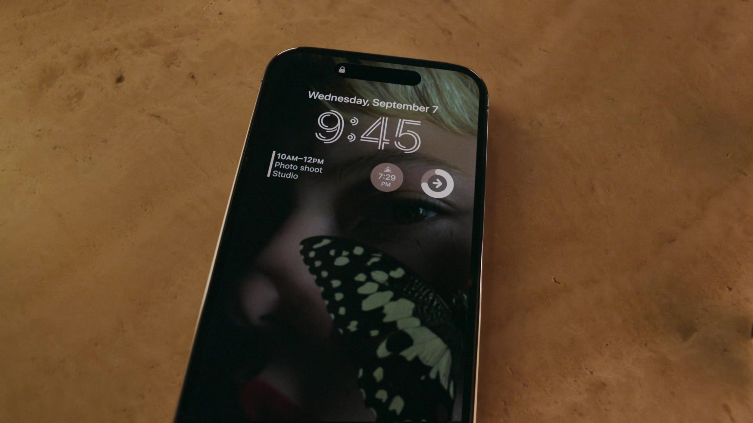
A row of purple elements in iOS 16 shares Focus filtering is on. I think this an amazing use of color. Purple has become the color for Do Not Disturb, and now Focus here. Making everything in the row the same color helps it feel separate and different from all the rows after it. It even has a quiet sort of feeling to it, with the purple. Did you notice the interesting alignment that’s shared by the all the icons on the right, or how the “Turn Off” button seems to be not so bold?
Inside Spotlight on macOS Ventura, the beautiful pop-up design with rounded corners, there’s a photo grid without rounded corners. This is maybe one of the best reminders that we don’t need to use rounded corners all the time on everything. The photo rows here feel big, easy to see, and like they have a lot of photos in them, and the tight spacing and no rounding are a part of that. Maybe we can use rounding a lot on the outsides of our designs, but on the insides we can find grids that can be great as regular rectangles (gasp!).
The menu bar extends across the top of the screen and has been a central piece Mac design for decades. Today, the menu bar is a vibrant blur of the wallpaper behind it. Just that blur is enough to create enough separation and foundation for icons, text, and colors to be placed on top. This struck me as beautiful and inspiring and made me wonder what other bars and interface elements could work better with a blur as their foundation.
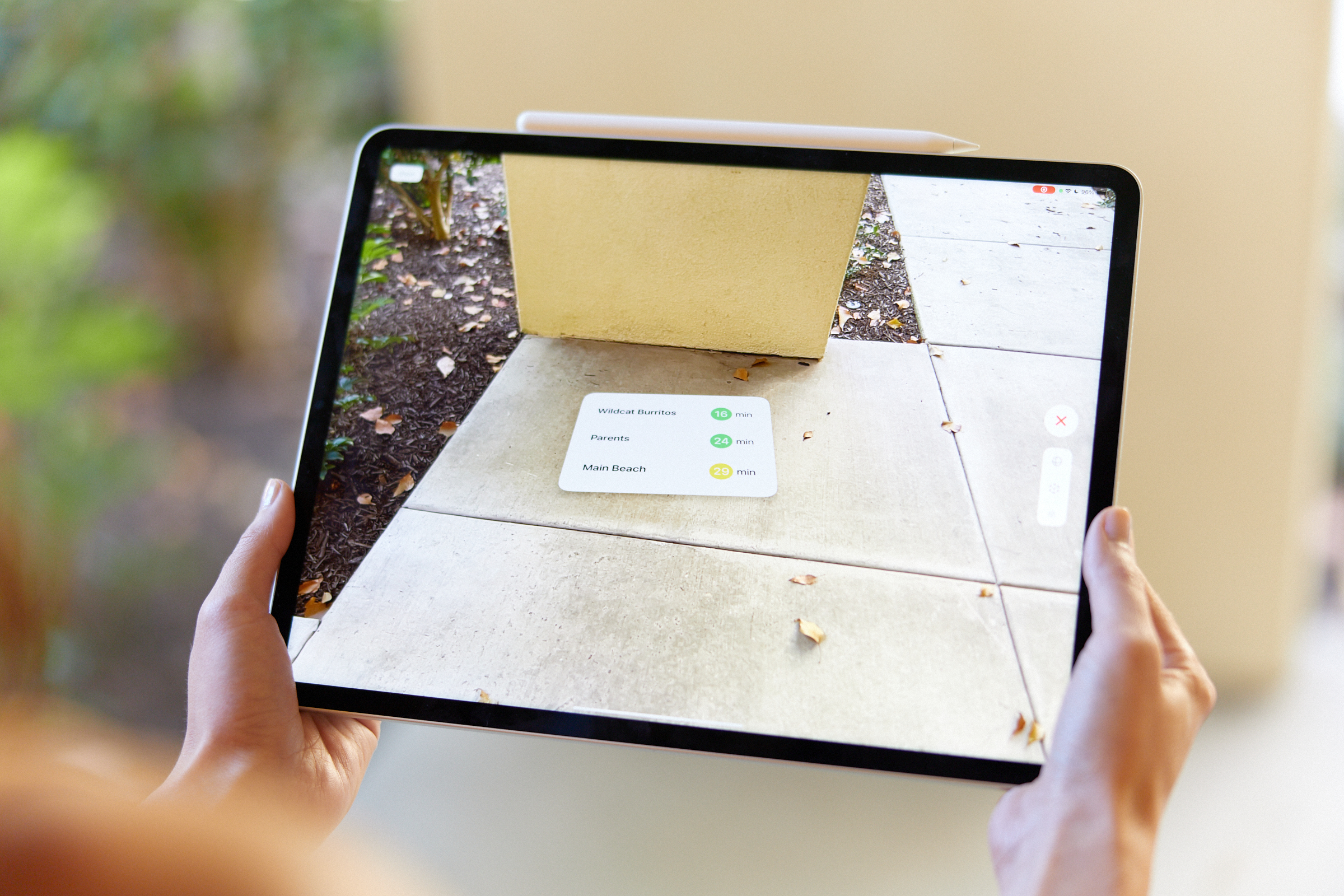
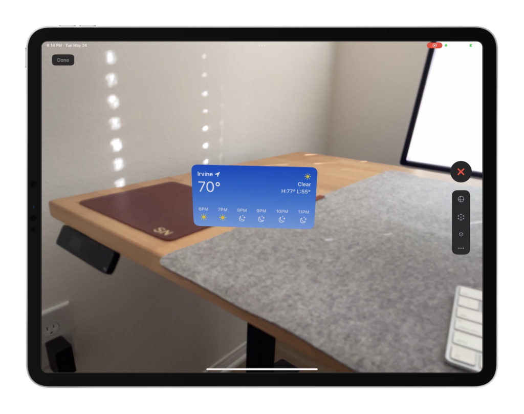
AR is an exciting part of the Apple world that’s growing by the day. Today, DetailsPro is announcing a new feature that lets designers take their designs into AR with no extra work required.
With AR Preview in DetailsPro, designers can preview their SwiftUI designs in AR, placing them on tabletops, walls, and objects in their own environment.
If you wanted to make a design in ARKit before, you needed a Mac, Xcode, time to learn and write code in SwiftUI, and time to write code that integrated it all together in ARKit. Plus, you needed an iOS or iPadOS device to preview your work on.
Now all you need is DetailsPro and a single device. You don’t need a Mac, you don’t need Xcode, you don’t need to know how to code, how to write SwiftUI, or how to write ARKit code. You can simply skip all of it and just create a SwiftUI design in DetailsPro and hit “Preview in AR”.
DetailsPro makes it easy to place a design in AR, automatically detecting surfaces, walls, and objects. Designers can rotate their designs and size them to their liking.
How to preview a design in AR
Open DetailsPro
Tap AR Preview on the sidebar
Tap on a design
Move your device around to place your design
How to open AR Preview from any file
Tap on the eye
Tap Preview in AR
Move your device around to place your design
Designs can be as simple as something floating above a desk.
Why AR?
AR is exciting. Designers around the world are already using DetailsPro every day to make new designs for their apps, expressing their ideas in the Apple design language. As more apps move into augmented reality and the future unfolds, we wanted to make it easy (in the DetailsPro way) for designers to take advantage of the latest Apple has to offer, all visually and on the devices their carry in their bags every day.
Just the beginning
We’re only getting started with AR. We’re already working on new interactions, new shortcuts, and new templates that help designers get even more out of SwiftUI and AR, all from the comfort of a GUI that’s easy to use.
About DetailsPro
DetailsPro was created with a mission to make SwiftUI accessible to as many people as possible. By making it possible to design in SwiftUI with an all-visual, intuitive interface and removing the requirement to know how to code, DetailsPro has brought SwiftUI to over 35,000 people and counting. The first version of DetailsPro was released in July of 2020, and in the years since has grown to be available on iPhone, iPad, and Mac. Almost half of DetailsPro users actually create SwiftUI designs all on their iPhones. Beginner-friendliness is at the heart of DetailsPro, with a belief that what helps the first timer get their idea onto the screen also helps the experienced professional. DetailsPro is made by Fun Focus Software, LLC, a company started by former Apple design prototyper Sahand Nayebaziz.