Hello and welcome to another issue of UI Designer Weekly!
My name is Sahand and I’m a UI designer that was hoping to find something like this. I’m always finding interesting new designs in newly-released products that keep me up-to-date on the latest interface ideas.
My hope is to collect these beautiful, informative, and thought-provoking examples of design, no matter how subtle, and share them with you so they help you see something new and give you ideas you can mix into your work.
Happy to have you here!
P.S. If you have any feedback or requests, I’d love to hear from you on Twitter!
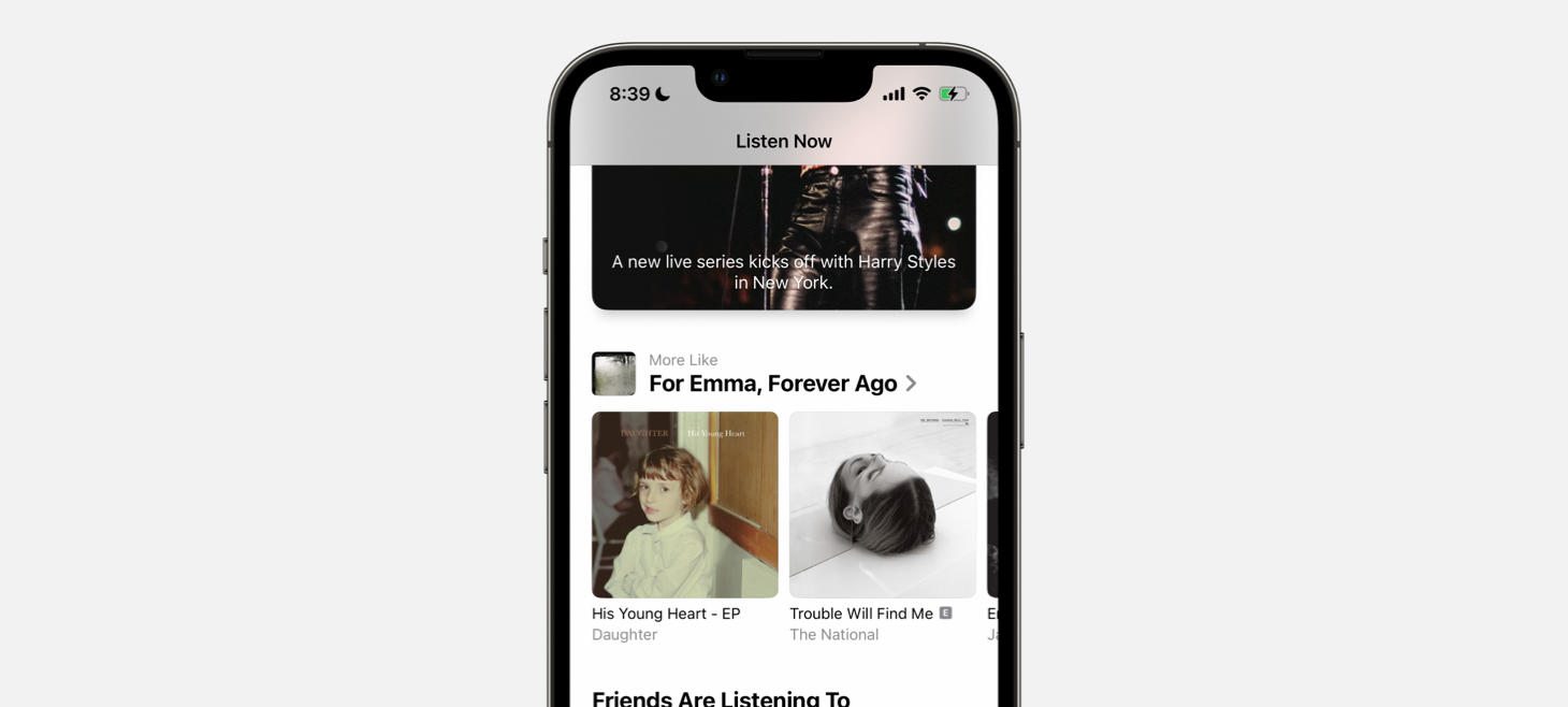
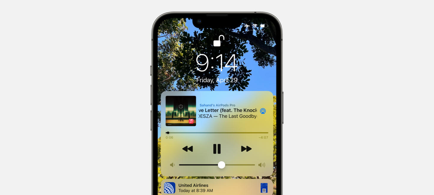
A beautiful rendition of section titles on the Listen Now tab of ?Music. Bold text, clean pairing of an album cover on the left with a smaller title and subtitle on the right. It looks fun, if I may say. This is perhaps an example that shows you can use left-aligned text without it being all the way to the left to make room for an exciting visual. (If you were displaying a section title for a news section, for example, a standard title with text only would probably be more appropriate, whereas here each recommendation row is getting significant theater.)
The audio stories highlighted on the page for Apple News+ show an amazing way to design repeated content across the screen. Here, you quickly figure out there are a lot of choices without even reading each one. Each one has its information in the same layout, which makes it super easy to scan. Imagine how much harder this would be to read if each tile had the text and the logo in different places. The faded options on both ends tell you that there is even more.
A big artist photo and the idea of animating Apple Music across the bottom to represent the new releases on Instagram Stories. Note the album name is set in a slightly tighter font. Also a reminder that you can put elements across from each other and they can still feel related, like “Surrender” and “MAGGIE ROGERS” here.
I’m writing this on the last day of what has been a mind-blowing, inspiring, and joyous week. The teams at Apple came out Monday with so many new announcements that it’s truly hard to keep track of them all and I’m sure I’ll be finding things all summer long that I haven’t heard of yet.
I wanted to collect, in one spot, the beautiful moments of Apple Design that were presented all throughout the keynote. You can watch the full Apple WWDC22 Keynote here.
I hope this post can serve as an inspiration point for you, a page you can return to throughout the summer to catch a glance at that one design you loved, and also as a moment of appreciation for the designers, thinkers, planners, and everyone at Apple who makes these creations possible.
And, if I missed any moment that you think should be in here, just let me know!
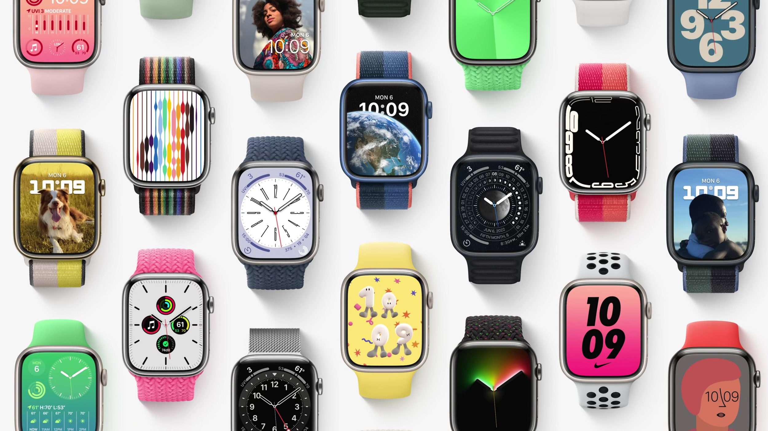
WWDC22 kicked off today and wow. Apple Design was everywhere and every part of Apple Design felt more expressive.
Overall, this was definitely iOS 16. We are not in iOS 15 anymore. The design is moving ahead, it’s getting deeper, it’s branching out, and overall I think it was a huge year for design.
Below, my first impressions of what I remembered most on day one of WWDC22.
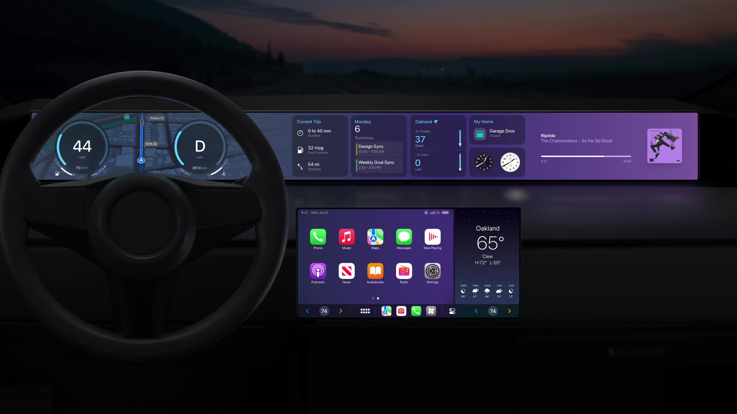
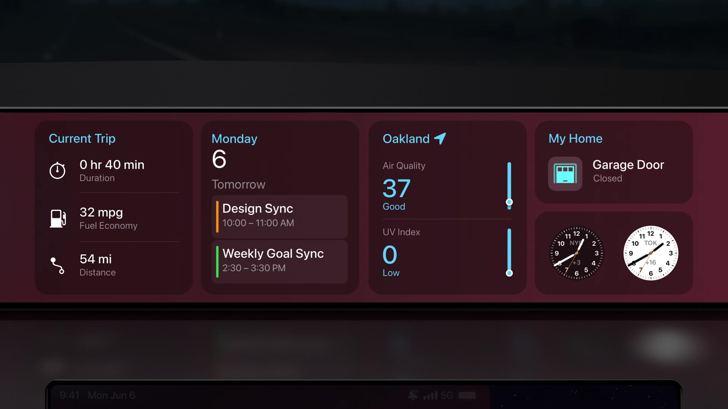
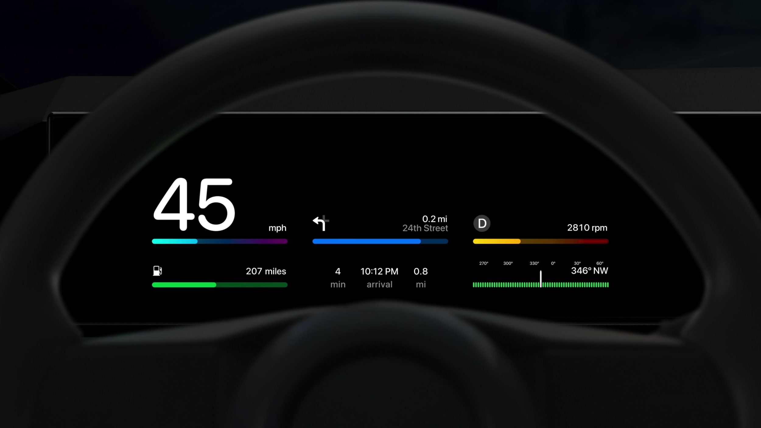
I felt like I was dreaming at this point. I still can’t believe we got to see this much footage of future CarPlay designs, and all of it was moving. These designs looked beautiful, clear, and familiar but I really need to watch more to start to understand what’s happening.
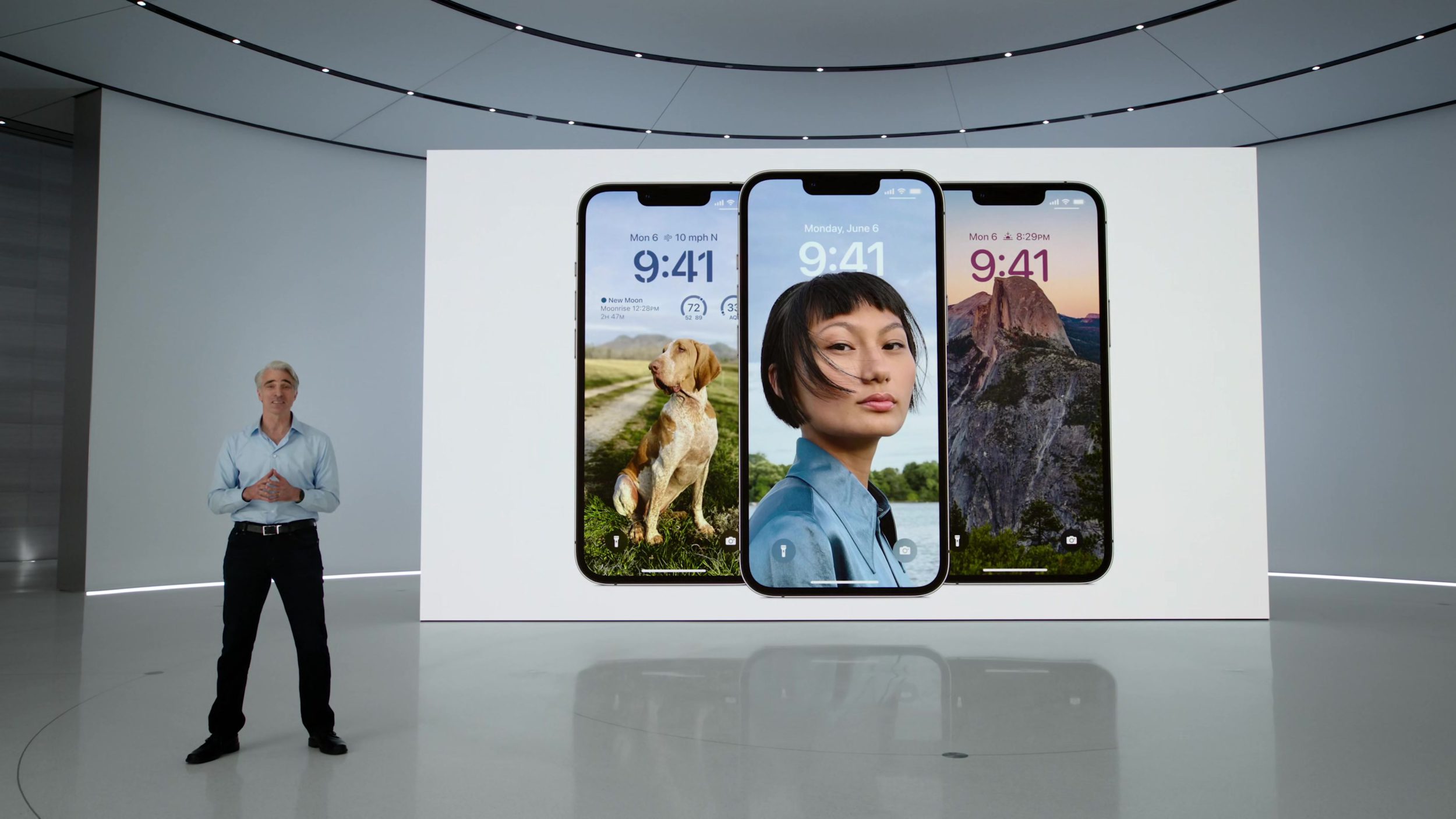
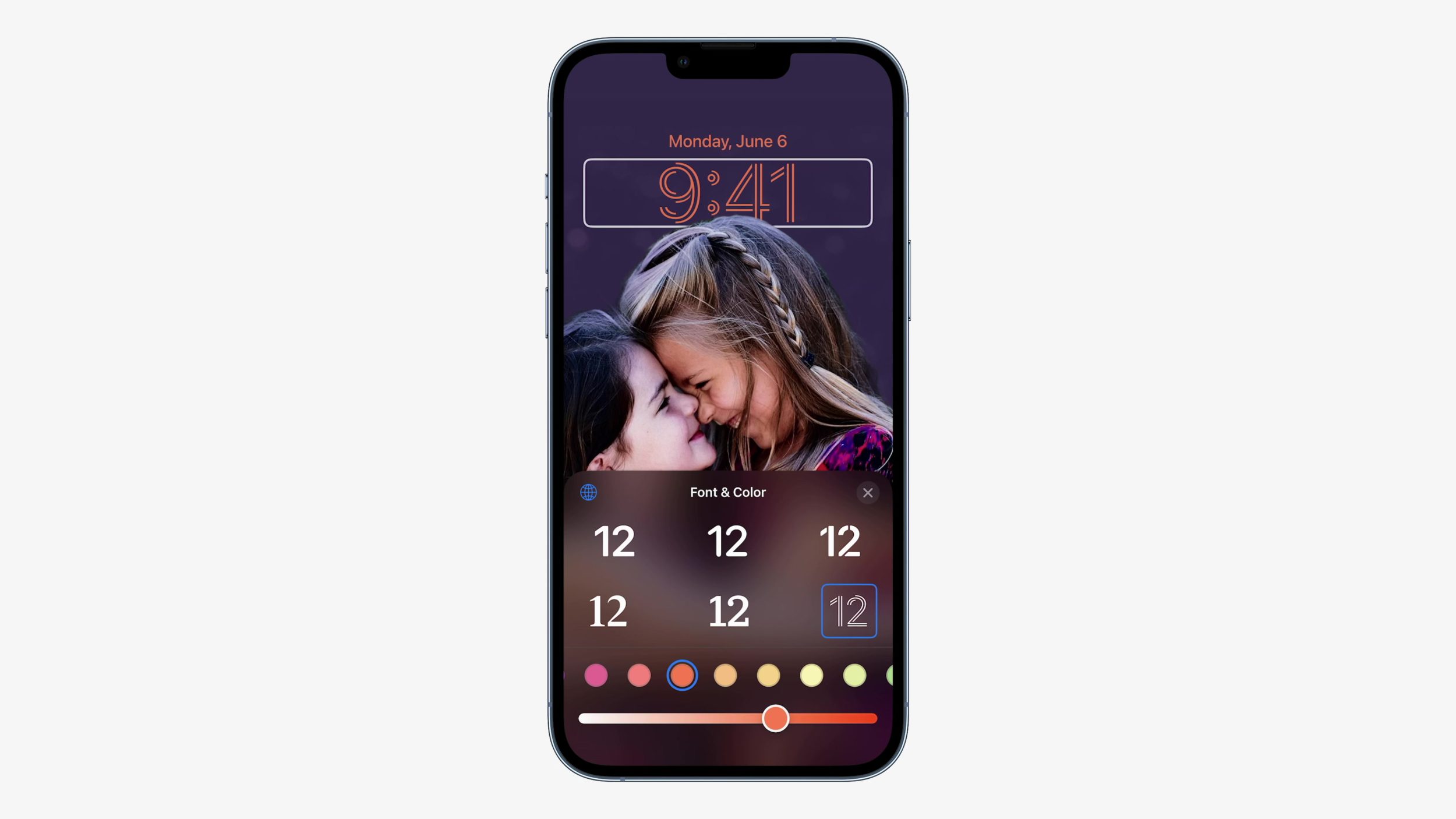
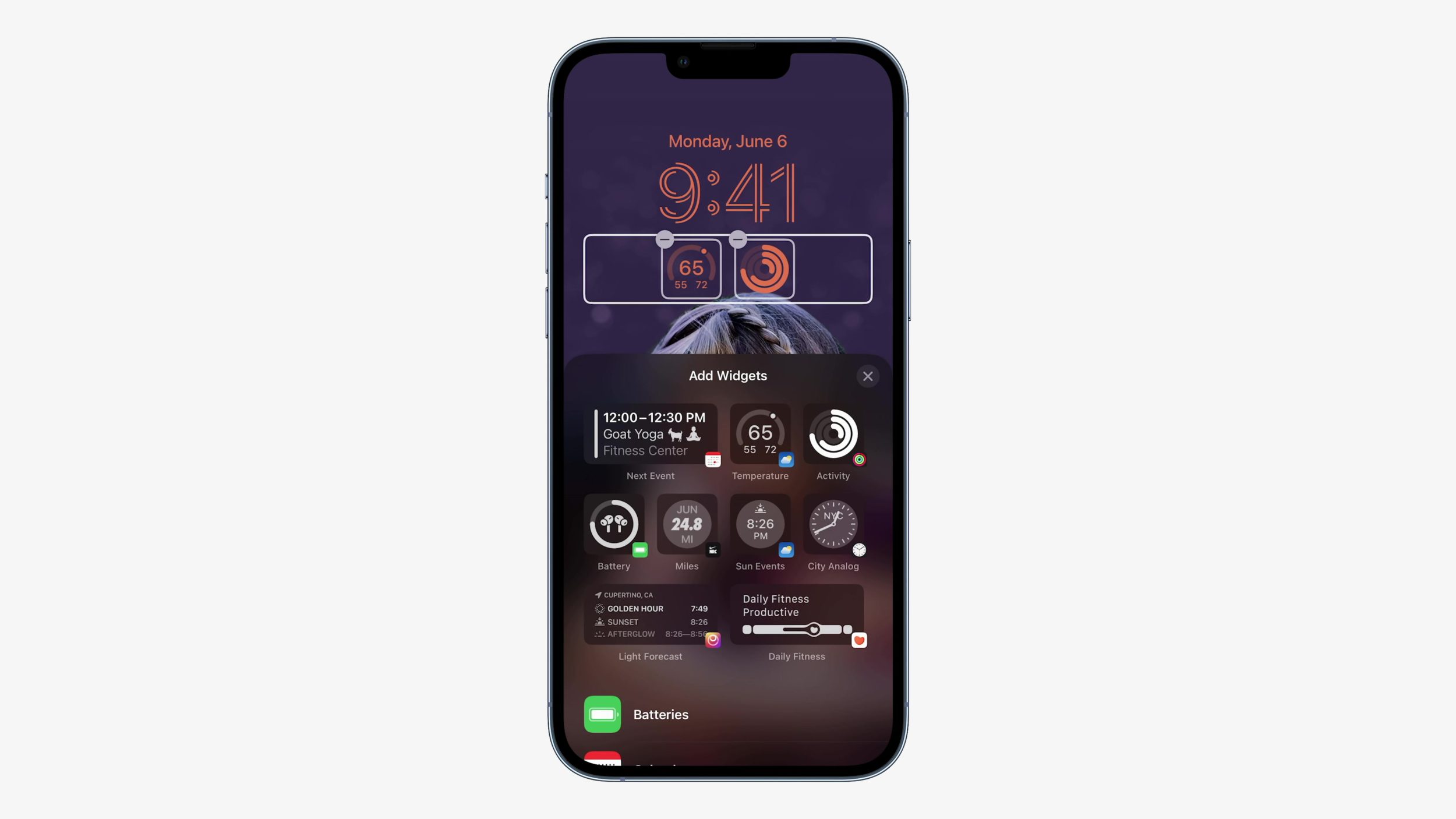
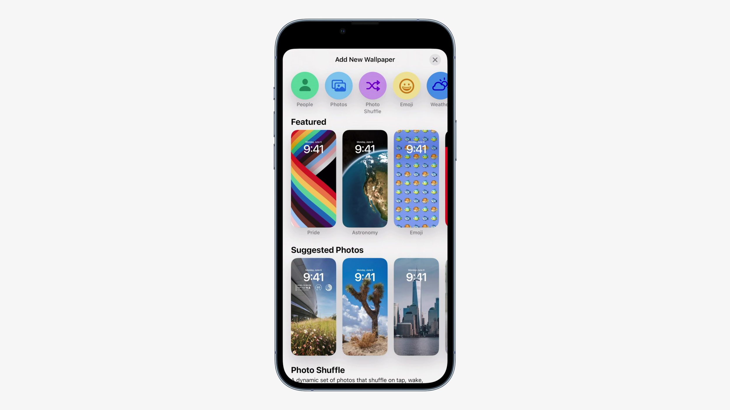
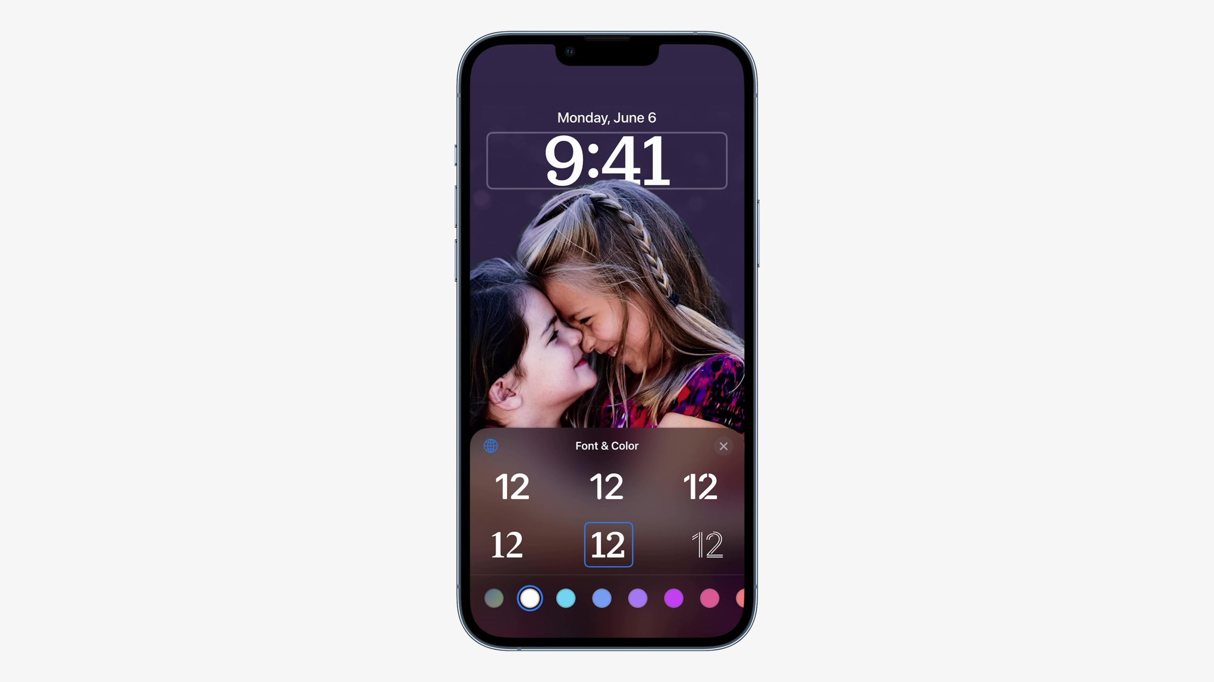
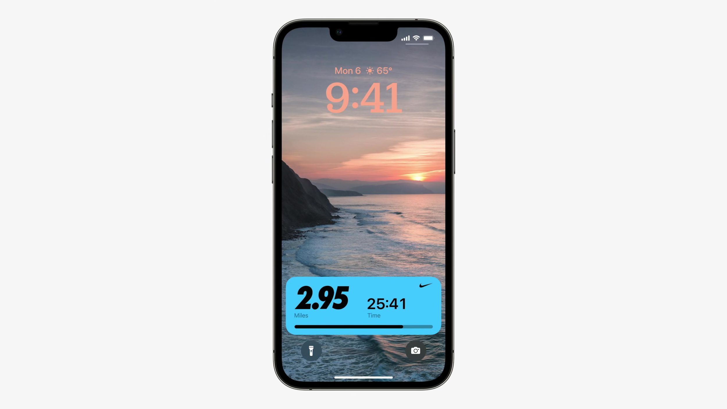
Lock Screen
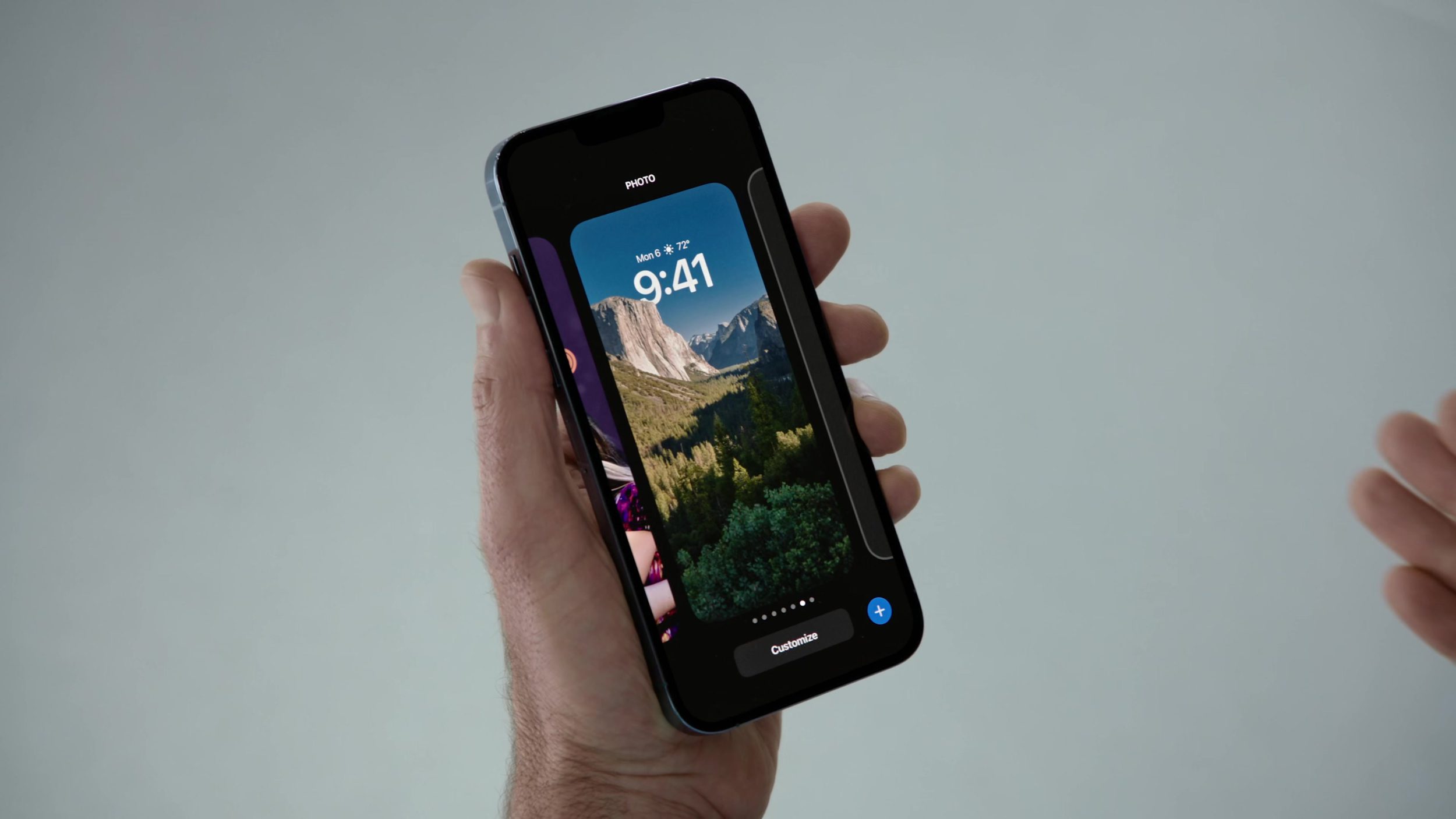
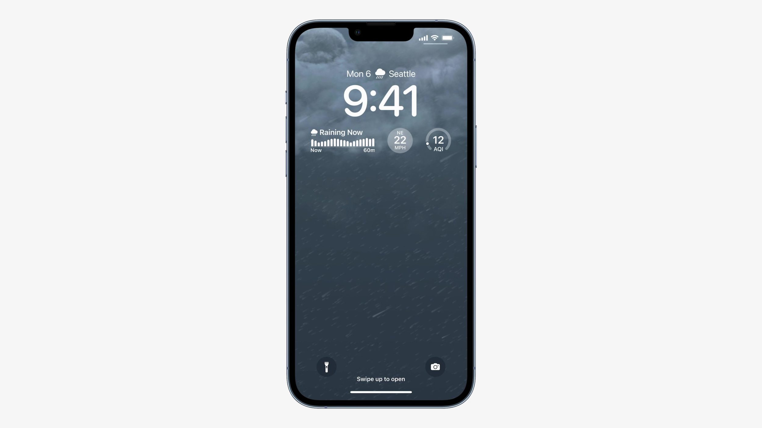
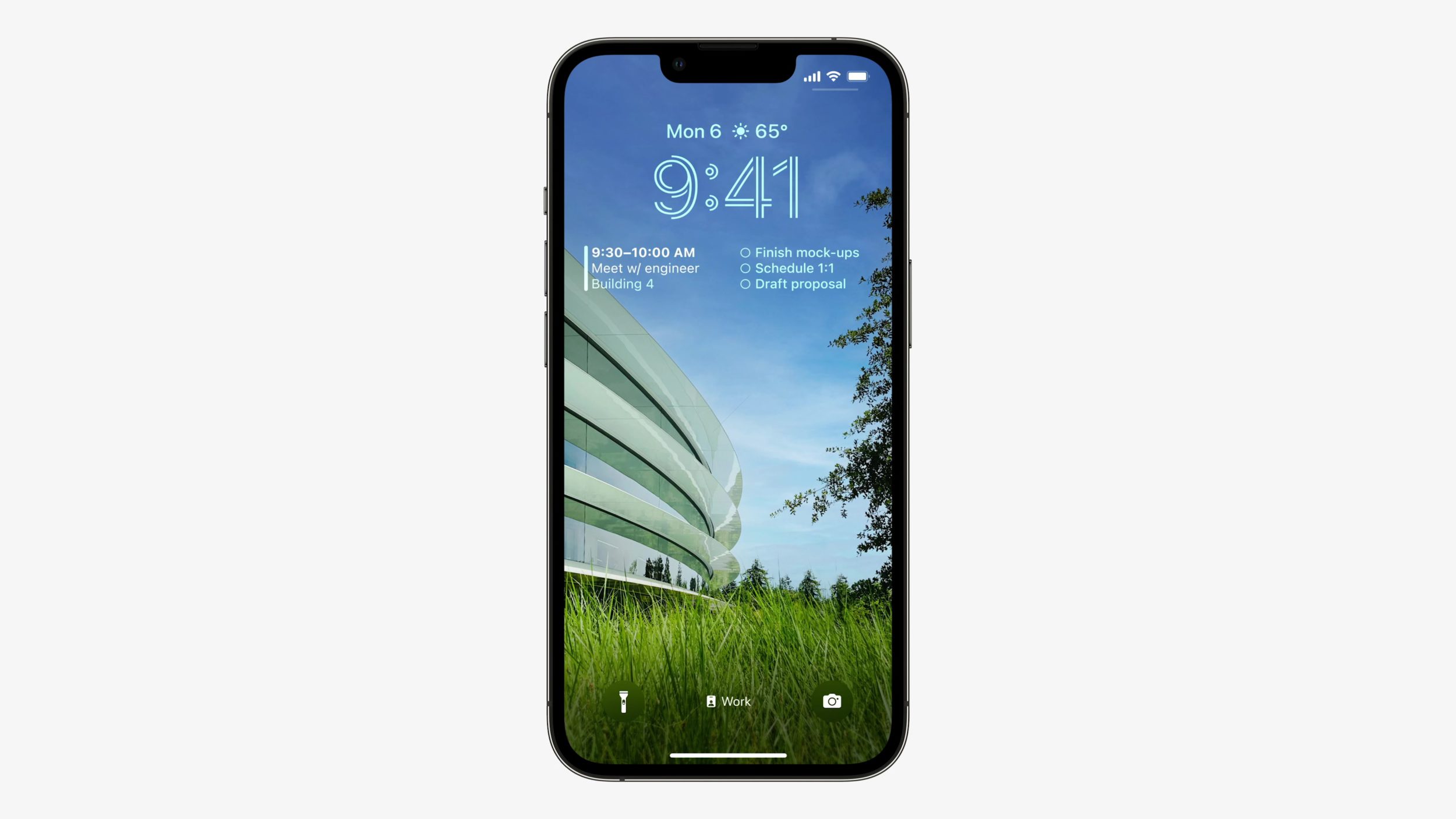
Being able to customize the Lock Screen, not only from the fonts and the layered wallpaper that puts the time behind elements of your photo, but also to be able to add widgets in any order. This was all amazing. First impressions: Apple style abound, looks super easy to use, and really fun.
The editing look reminds of editing watch faces on an Apple Watch.Sliding between Lock Screens… gorgeous. Hoping this Yosemite wallpaper is included with the operating system.Live Activities sort of feel like Super Widgets™?.Doesn’t get better than this.
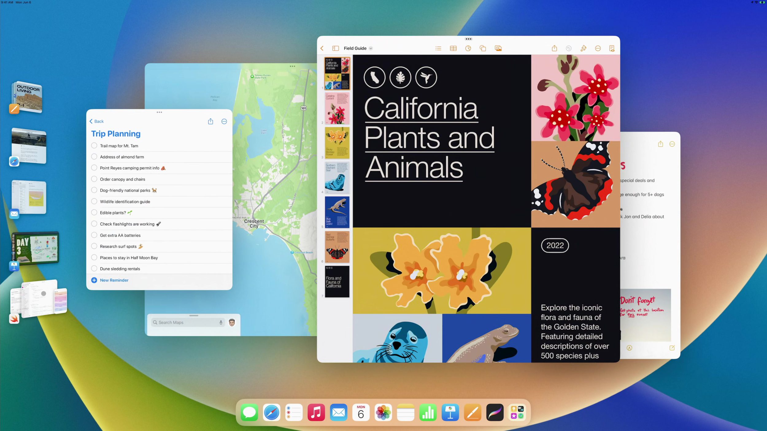
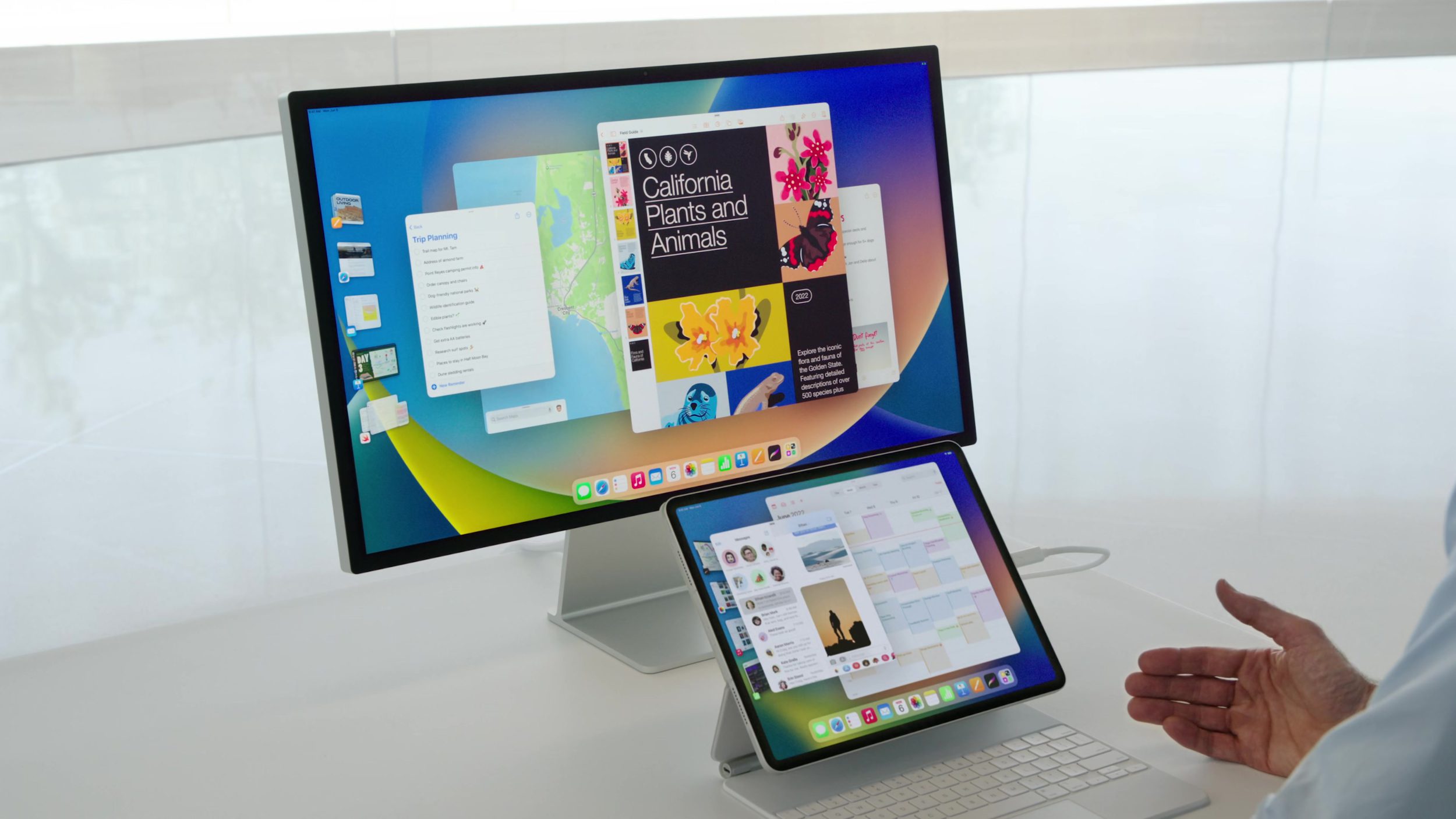
Stage Manager
This was the other big thing and oh my is it amazing. Stage Manager feels like the futuristic window management that we’ve always imagined could be possible, and here it is for real. This just looked like it was the answer to better window management, and it’s beautiful to look at. I am really excited about this and already from using it on my iPad, I’ve had a great time with it.
Colors
Just another look at the colors here. The colors around iOS 16 felt great to me and matched everything that was happening around this logo—the blending, the expression, the growth.
And that’s just the beginning
I am so excited to dive into more this WWDC22 week and to learn more about the designs of the other features I didn’t mention here that still looked amazing, like Freeform, macOS Ventura, new iPadOS Desktop-Class apps, etc.
Stay tuned to the DetailsPro blog and Twitter for the next articles! Have a great WWDC22!
Nice to see you, here we are for another issue of UI Designer Weekly!
This is the last issue before WWDC22, and as you can surely imagine, I am really excited. We’re going to have a lot to talk about next week and I can hardly wait for it.
In this week’s issue, you’ll find more beautiful, inspiring, and thought-provoking examples of design to maybe help you see something new and give you ideas you can mix into your work.
I hope you’ve had a chance to design something new, something interesting, perhaps even something challenging over this past week.
In Apple’s preview of upcoming accessibility features, Apple Books has a new sheet that shows buttons for selecting a theme in a grid along the bottom, with always-visible buttons for increasing and decreasing font size or switching from page flips to page scrolls. I think this is a great example of how we can make the interactions in our designs visible, so when someone arrives at the first screen related to something, they get a good sense of everything they can do. Maybe, if some of these buttons were behind another tap in a menu, many people wouldn’t ever see them.
Sound Recognition on iOS presents a row of empty circles that fill with a sound icon as a sound is being learned. This design is a great reminder that we can communicate progress in our designs to help people know how close they are to completing something. This design uses a simple row of elements to communicate both how many steps are left and to represent how progress is made.
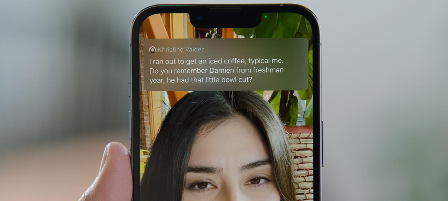
Live Captions on iOS shows a floating panel that uses a mix of vertical and horizontal layout to display the conversation with Apple design conventions throughout. The conversation itself uses a primary color to stand out against the dark background, while names are written in a quieter secondary color. A photo of each person sites beside each of their lines in a small circle. No divider lines, just padding throughout to make this design easy to read.
And here, Live Captions shown over a FaceTime call between two people, we see a dedicated panel that uses a blurred background and a large space for the text of the conversation to flow in a white font. I think this design is a great reminder that our designs don’t need to be wildly different as we design for new uses. Here, this design is doing something brand new in showing the words spoken on a FaceTime call, and the design works wonderfully with just a regular font in a full-width layout. There is nothing inherently new about the design itself, it’s the overall context of where and how this design appears that will delight people.
Apple Cash on iOS 15.5 features two new buttons on the very first screen. With a beautiful half-and-half, full width balance beneath the card (notice how the padding between the card and the buttons is a little more than the padding between the buttons themselves), the buttons feel easy to tap. I think this is another great example of making the elements of a design visible without having to do anything first. They are right there so that people can discover them more easily.
Safari’s bottom bar that was introduced with iOS 15 features a beautiful row of five elements along the bottom. The back and forward buttons automatically dim when there is no page to go backwards or forwards to. The Share button sits directly in the middle, in a vibrant blue color, and the entire row of icons along the bottom sits slightly wider than the floating address bar above. There is a shadow under the address bar, and two elements in primary color inside.
Maps on iOS 15 can understand a “place near another place” and displays a row in the design to highlight this understanding and show the option back to us. I think this is a great example of how our designs can confirm understanding and give people confidence as they interact. Maybe if this design was simply showing a list of Starbucks locations near the beach I searched for, I would wonder whether it was really working or only sort of working. But that row at the top, with Starbucks in bold primary and “near Three Arch Bay” highlight below, makes it a sure thing that Maps is doing a search for Starbucks locations near where I’m trying to look.
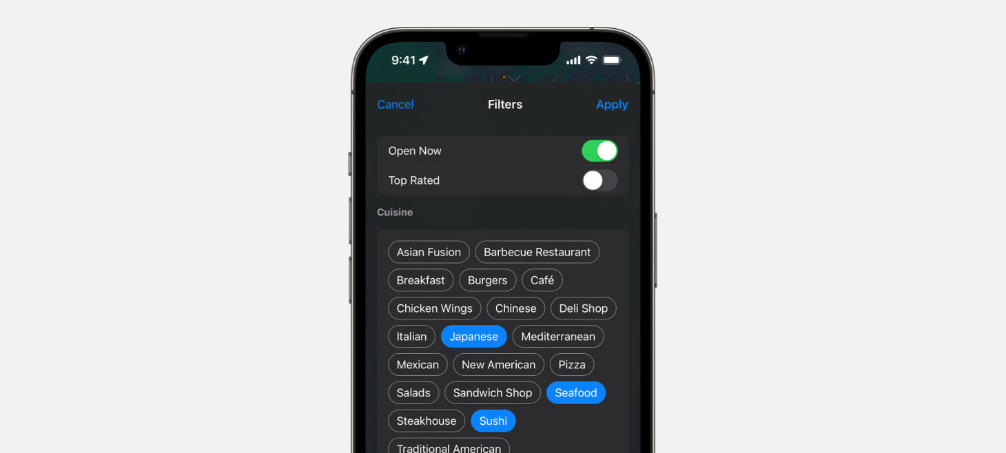
Search filters in Maps on iOS 15. Buttons are grouped together and turn blue for options you’ve selected, letting you quickly see both the large list of options and the selections you’ve made. This full-screen sheet is another example of a design that makes its buttons and interactions easily visible without having to tap into any menus.
Take this week’s conversation with you and try changing up this week’s design. You can download this design free as a SwiftUI design file and open it up on your iPhone, iPad, or Mac with DetailsPro.
Every Friday, we post curated links for user interface designers interested in iOS design, macOS design, and more on our newsletter UI Designer Weekly. You can read each post here or sign up for the weekly email.
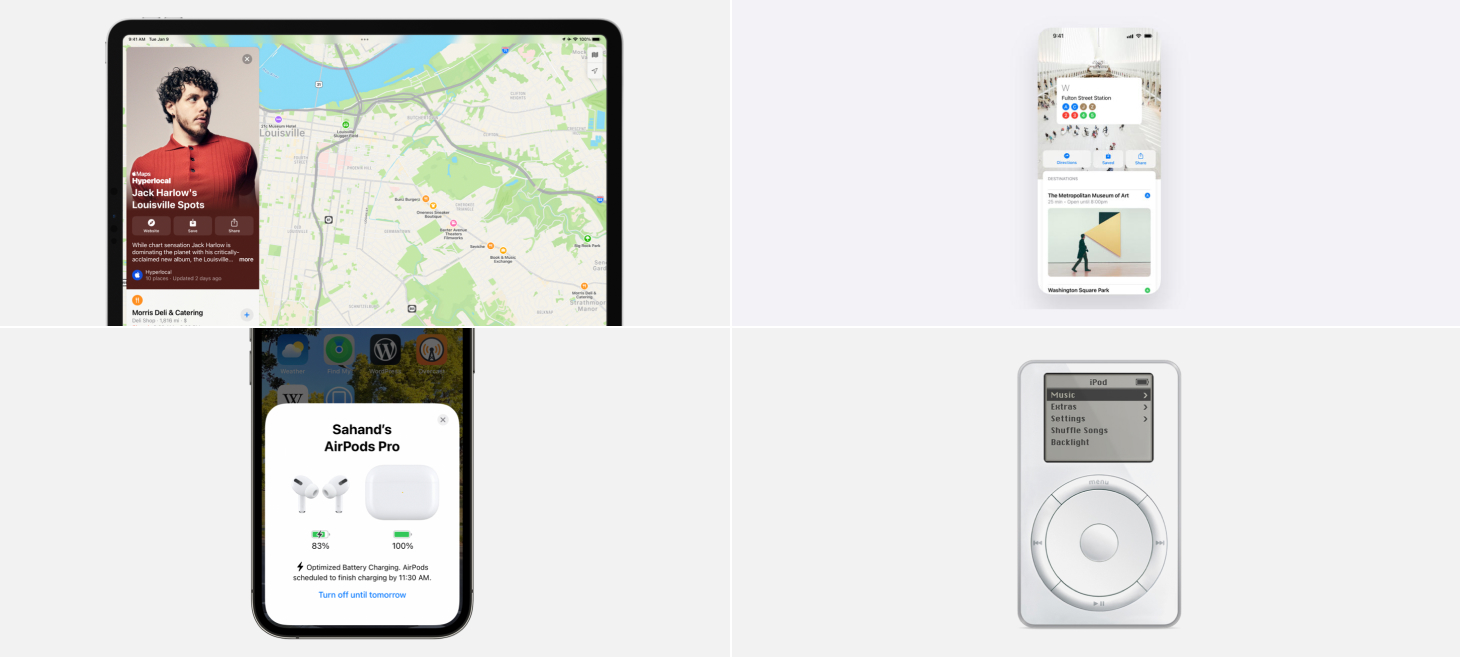
Guides in Maps on iPadOS 15 create a beautiful side-by-side layout where you see locations perfectly framed next to the guide’s card. This is a great example of building on the iPad’s wider screen. When we look at how we design for the iPad, we can ask ourselves if there are any two separate screens that would benefit from being shown together with the added space the iPad provides.
Maps on iPadOS 15 presents each place in a Guide with an image, text elements, and an SF Symbol aligned on the left. Normally, you might expect to see the restaurant symbol and the place’s name on the same line in a close horizontal stack, but here each element is stacked vertically and the restaurant symbol even gets its own line. This separation gives the design a fresh feeling of space, and maybe more importantly, helps keep the list easy to scan.
When iOS 15 tells you that Optimized Battery Charging is enabled for your AirPods, there is a single button displayed at the bottom in the color blue. This button doesn’t have any other shadows, backgrounds, or decorations, it’s just sitting there in blue. I think this is a great example of how we can use color to make elements in our designs really stand out and feel interactive. Even on this AirPods card, with the 3D AirPods renders, rounded corners, and all the other design elements, this blue button stands out.
On iOS 15, you can drag your finger across the page indicator dots on the Home Screen to quickly navigate through your pages. This new interaction, where what was previously only an indicator has becomes a control, might feel familiar to another recent iOS change: on any page that scrolls, you can touch and drag your finger on the scroll indicator and scroll through the rest of the page more quickly. This a great reminder that our designs may have room for being directly interactive in places that we hadn’t previously thought of.
In celebration of the last iPods being sold, Apple shared this image of an original iPod. As you scroll the wheel on an iPod, the highlighted menu item is shown with a filled background, light text, and a light chevron on the right. The bar at the top, with the iPod title in the center and the battery on the right, might remind you of the status bar on iOS 15. This is a great reminder that we can look back at elements in previous designs to find great inspiration for our work today.
Take this week’s conversation with you and try changing up this week’s design. You can download this design free as a SwiftUI design file and open it up on your iPhone, iPad, or Mac with DetailsPro.
Every Friday, we post curated links for user interface designers interested in iOS design, macOS design, and more on our newsletter UI Designer Weekly. You can read each post here or sign up for the weekly email.
A beautiful rendition of a news card on Apple Newsroom. The photo feels endless, going all the way to the top corners where the card itself is rounded, and going from edge to edge on the sides. Without any horizontal padding (like the padding given to the title and subtitles below), the image element of this design has all the theater and emphasis that can be given in such a small space. This is a great reminder that we can use edge-to-edge elements in our designs to make them feel like the biggest, most beautiful areas of a design.
A shadow on the volume slider on iOS 15 feels like the star of the entire show. Not to mention, every other element is dark, and this element is light. This is perhaps a great reminder that on smaller elements in our designs, a shadow can make them feel more interactive if we really want something small to jump out. Did you notice the current time marker element has a little shadow too?
Hearing on iOS 15 presents a beautiful SF Symbol with a live indicator of volume safety, using a color and an icon to make it easy at a glance. Beneath the ear symbol, a horizontal volume meter shows the live volume level and even includes a single notch that is larger than the other ones, right at the point where volume may start to become unsafe. Maybe this is a great reminder that we can use the symbol indicator colors (like red, yellow, and green) to great effect in our designs, especially if we can make them appear inline in our designs where we want to communicate something about a “good”, “bad”, or “warning” state. And that single notch in the meter being bigger than the others, that is a classic Apple reimagining of an existing element to get more information across.
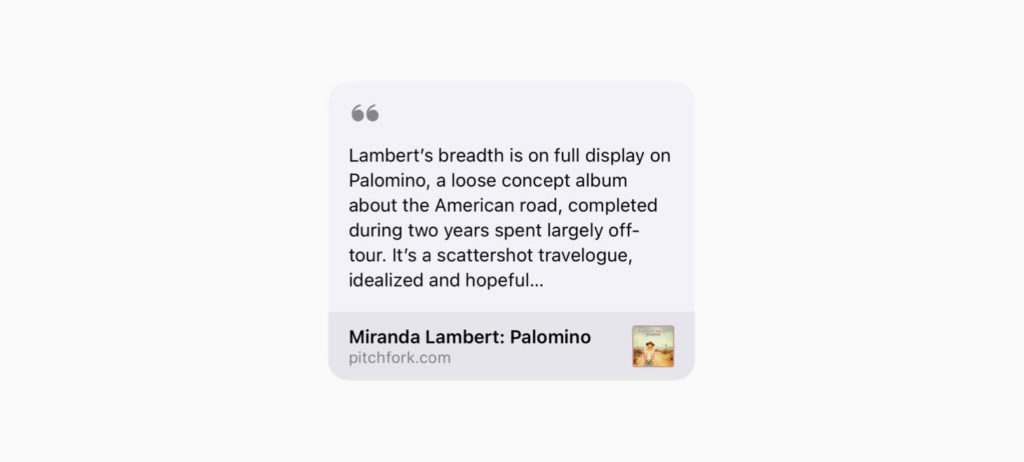
A light rounded rectangle and an SF Symbol in a secondary color make this article preview in Messages feel at home with nearby elements. These designs in Messages, across all other content types, are a great reminder that we can benefit from making our designs match their surroundings. It’s true, we may want our designs to stand out, but if we first make them at home and then add little details to help them stand out, we may go a long way. (Thank you, Jordan Borth!)
Apple Support videos on YouTube show scenes from macOS that are made up of simple shapes and colors. Maybe, if we are trying to help people learn how to use an interface that has many different things in it all at once, it can help make it easier to find what you’re looking for by showing everything else in a less specific, more abstract way. The next time you’re looking for an abstract interface illustration style, check out this video.
Take this week’s conversation with you and try changing up this week’s design. You can download this design free as a SwiftUI design file and open it up on your iPhone, iPad, or Mac with DetailsPro.
DetailsPro’s mission is to make designing with SwiftUI accessible to as many people as possible, and on macOS and iPadOS part of that mission is supporting the great keyboard commands and interaction patterns that people are used to.
DetailsPro supports a powerful range of keyboard commands that are all accessible from ?K, and on top of that supports a range of other keyboard shortcuts.
Read on below for a list of everything. For more information, you can also read our blog post announcing keyboard commands in DetailsPro.
Keyboard Commands
Open Keyboard Commands — ?K
Select Next Element — ??
Select Previous Element — ??
Select Next Insertion Point — ???
Select Previous Insertion Point — ???
Numpads
Enter a number — 0-9
Delete — delete
Clear the numpad — c
Enter a decimal point — .
Return from the numpad — return
Decrease by the nudge amount — -
Decrease by the larger nudge amount — ? Shift-
Increase by the nudge amount — =
Increase by the larger nudge amount — ? Shift=
Keyboard Support
DetailsPro’s keyboard shortcuts work on iPhone, iPad, and Mac with any Bluetooth keyboard connected, including the iPad Smart Keyboard and Magic Keyboard.
Stay tuned for more!
We’ll be updating this post with all keyboard shortcuts in the app. Stay tuned for more!
Every Friday, we post curated links for user interface designers interested in iOS design, macOS design, and more on our newsletter UI Designer Weekly. You can read each post here or sign up for the weekly email.
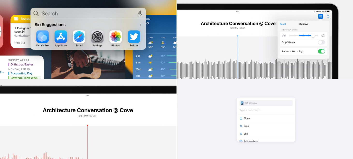
A text field for searching, a microphone for dictation, and a row of app icons for opening all gather into a compact bubble for Spotlight on iOS 15. This design is a great example of adding optional paths that people can take. Also, even though this may sound so basic, it’s great seeing the apps in the row looking like normal app icons—maybe when you see an app with the title under it at this size, you know you can definitely tap on it to open the app. Perhaps if these were appearing in a list form or some other form, it wouldn’t feel so familiar.
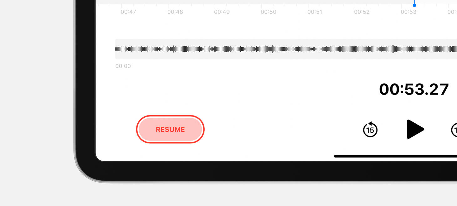
A beautiful rendition of a title area in Voice Memos on iPadOS 15. The name of the recording is biggest at the top, and just below that in secondary text are the time the recording started and the length of the recording. The proportions make the title feel so big and so important, and the text-only representations of the time and duration feel clear and dependable.
A red fill, a red border, and red text make the Resume button in Voice Memos feel just like a record button. This button resumes recording when you tap on it, and all the red features help this button say “record” without saying “record”. This button is also a great reminder that, sometimes, we may want to make in-place changes to the elements in our designs—if we have one button that really should turn into another button, like this one does after you pause a recording, we can actually design that element to change.
The playback speed slider in Voice Memos shows you where the default speed was with a blue line between where you’ve placed it and where the default was. This charming detail feels physical, feels universal, and does it all by reusing an element that was already there. In the top left corner, the Reset button that appears is another great indication that you’ve changed something from the original settings and encourages you to jump back with a single tap.
Take this week’s conversation with you and try changing up this week’s design. You can download this design free as a SwiftUI design file and open it up on your iPhone, iPad, or Mac with DetailsPro.
Every Friday, we post curated links for user interface designers interested in iOS design, macOS design, and more on our newsletter UI Designer Weekly. You can read each post here or sign up for the weekly email.
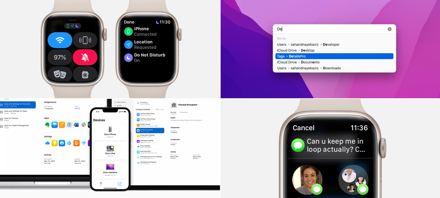
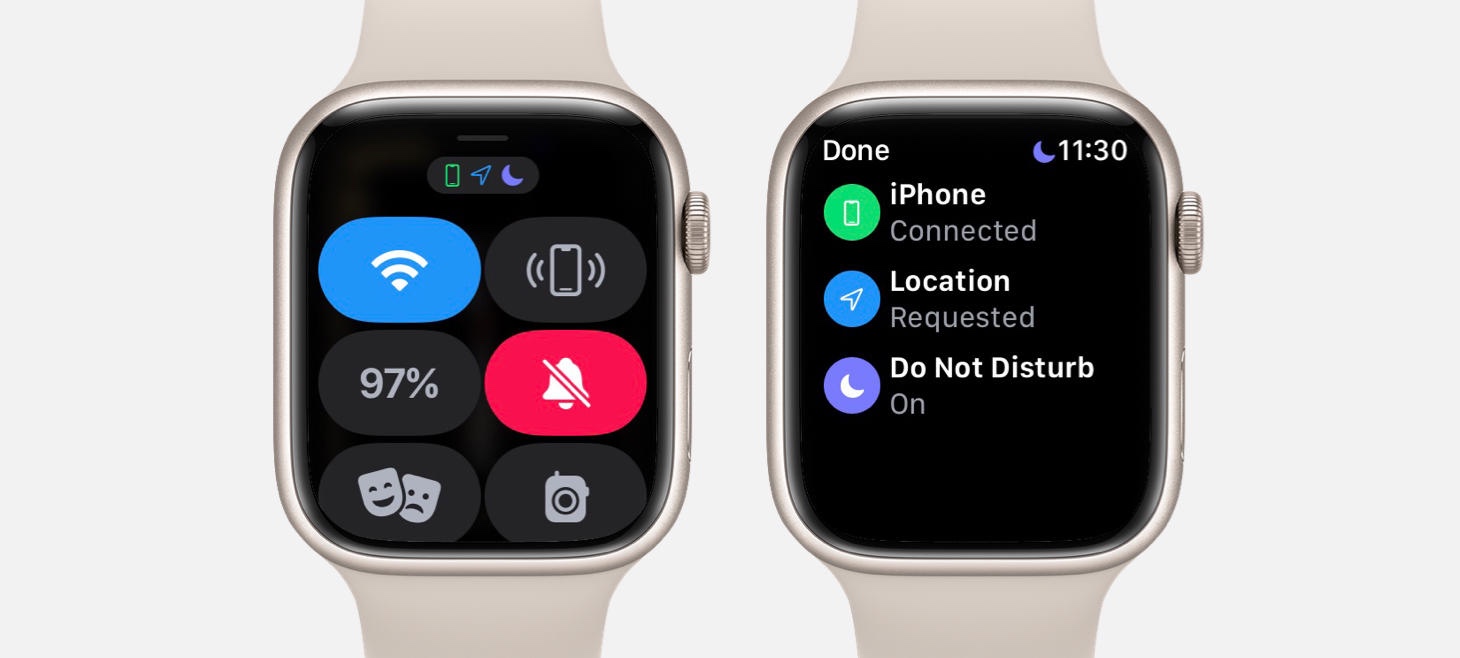
Symbols shown at the top of Control Center on watchOS 8 can be tapped to open a details screen. This screen shows the symbol again (with the matching color) and adds a title and a subtitle that tell you what that symbol means. This is a great example of how our designs can help people by adding in information where our design might be using a shorthand for an idea. Also, notice how the symbols at that top are also on a small gray rounded rectangle, broadcasting a hint that they can be tapped.
A list with only a few elements in Apple Business Essentials still feels beautiful, full, and grounded. Each device on the Devices screen is given padding, a full width, and a shadow and uses centered alignment to add a little more theater and presence. This is a great example of how a design that will maybe always have only a few elements in it can use that knowledge to give each item a big feeling, both to make navigating the app easier and to keep the design from always feeling empty.
Oh, The Designs You’ll Go
??G on macOS Monterey opens a beautiful Go to Folder modal. The text field is a lighter gray than the list area below, and subtle rounding and padding throughout (like on the highlighted item) makes this design feel light and airy. This design is perhaps a great reference for the modern macOS aesthetic.
Show Me That Again
Sharing in Messages on watchOS 8 displays the message you are about to share right at the top of the screen. Even though this is a message that you were interacting with just a moment earlier, seeing it waiting here confirms that you tapped on the right message and aren’t about to send a message you weren’t meaning to. I think this is a great example of how an interaction that needs multiple steps (like selecting a message to share and then selecting who to share with) can be designed in a way to help people feel more calm and confidence with each step they complete.
Take this week’s conversation with you and try changing up this week’s design. You can download this design free as a SwiftUI design file and open it up on your iPhone, iPad, or Mac with DetailsPro.
Every Friday, we post curated links for user interface designers interested in iOS design, macOS design, and more on our newsletter UI Designer Weekly. You can read each post here or sign up for the weekly email.
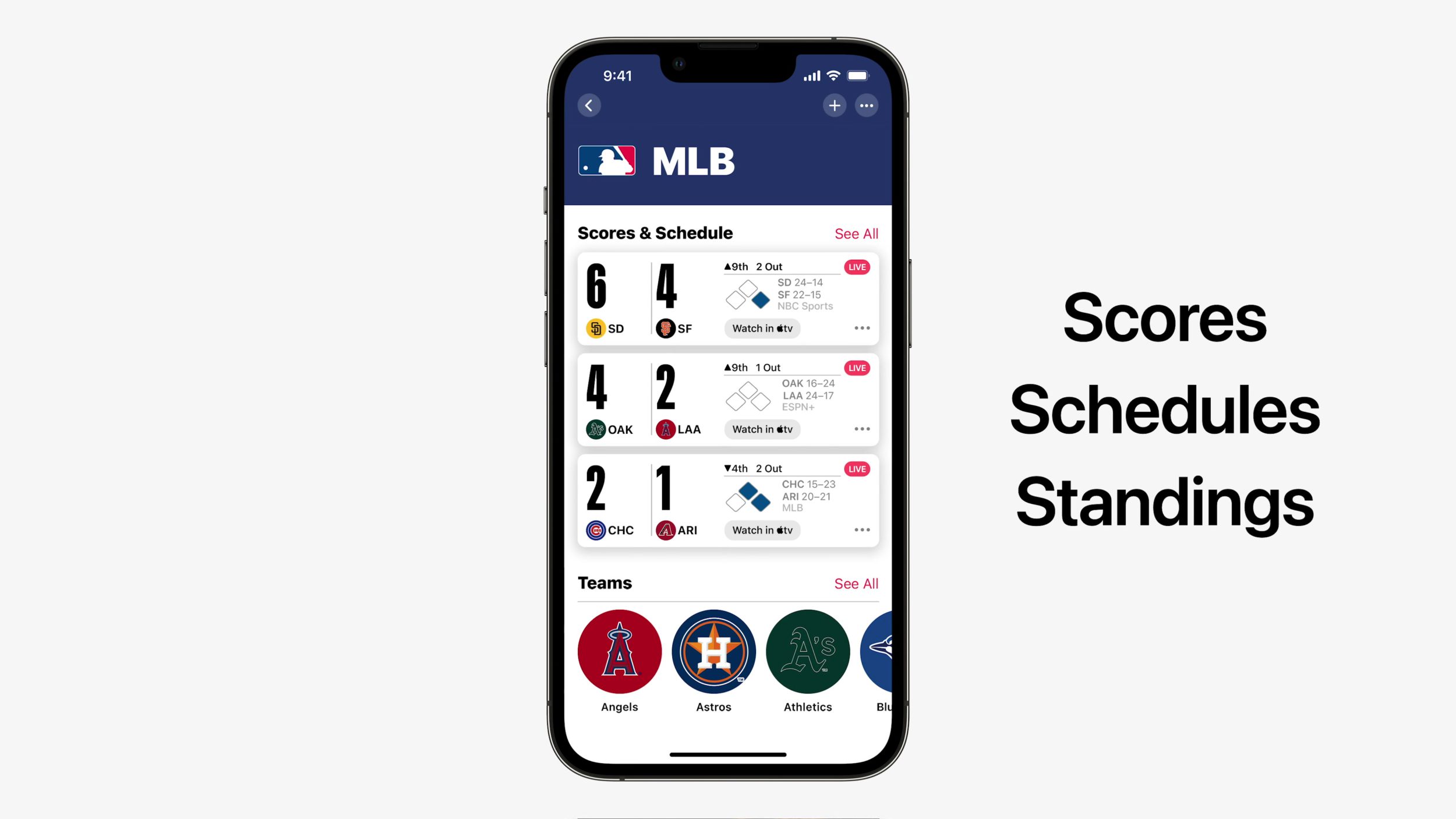
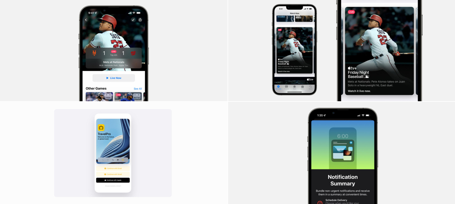
A live score is displayed in the corner overlay of a preview in the Apple TV app. I think this is a great example of how some elements in our designs can be shown earlier and save people time. Maybe if our design shows something after a few taps, but it’s something small that someone might want to check often, we can bring it out to an earlier screen to save them the need to go in and out. Did you notice how the scores here look like a little scoreboard too? The layout is so natural it blends in perfectly.
On the page for an MLB game in the Apple TV app, a beautiful, wide panel gives glanceable info about the game, with everything from the score to the location. I think this is a great example of how elements in our designs can call for an extra bit of spacing, theater, and shine. You know you’ve made it to the right screen when you see what you’re looking for presented in a big, beautiful way like this.
A beautiful stack of text elements, almost identical to the one in our March Apple Event issue, make this card pop in the Apple TV app. The padding around the sides feels smaller than the usual, and the inside gaps between each element feel great. When designing cards like this that have images as their backgrounds, you can try adding a gradient underneath the text elements that starts as a dark color and fades up to a fully clear color to help keep your designs legible (notice how the player’s uniform fades to black with the rest of the image the further you go down the card).
In the Apple News app, you see the cover image of the magazine you’re reading and can tap it to navigate between articles. I think this bar is a wonderful example of accommodating different navigation styles that people might prefer. The arrows on the right side of the bar give readers a way to go from article to article, one-by-one, to see the whole issue straight through. The cover image on the left, with a helpful “Contents” text element displayed next to it, gives readers a way to jump specifically to any other article, in any order. When our designs can be used multiple ways, we can add buttons and create our layouts to accommodate the multiple ways so at any moment, people can do what’s best for them.
A new intro screen for Notification Summary on iOS 15. Here, the charming miniature design uses familiar elements, like the general shape of an iPhone and the design of the time on the Lock Screen, to explain where a Notification Summary would appear. If our design can’t point directly to an element on the screen, we can use basic elements together to point to something outside of what is on the screen, like a wide rectangle resembling a TV or a spinning circle representing a tire.
Take this week’s conversation with you and try changing up this week’s design. You can download this design free as a SwiftUI design file and open it up on your iPhone, iPad, or Mac with DetailsPro.