Every Friday, we post curated links for user interface designers interested in iOS design, macOS design, and more on our newsletter UI Designer Weekly. You can read each post here or sign up for the weekly email.
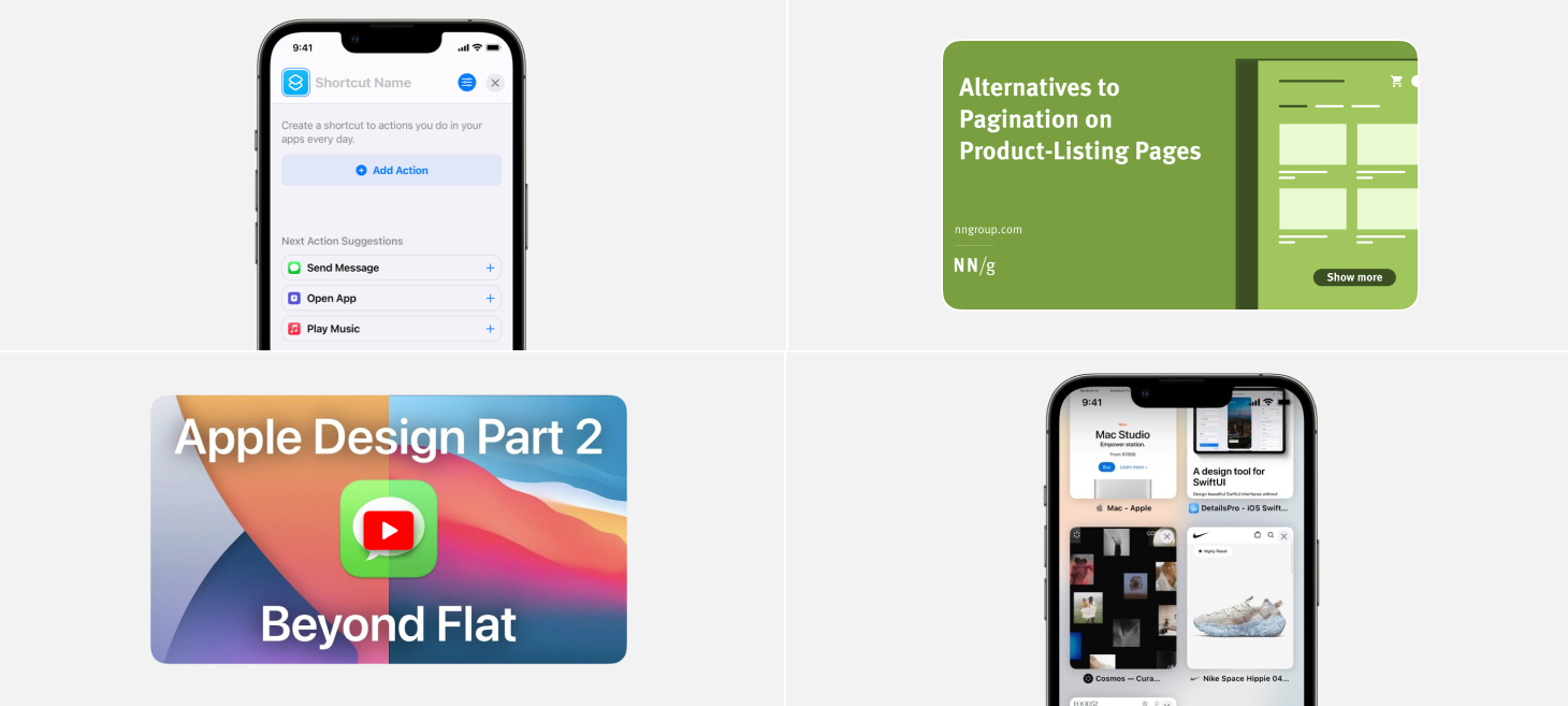
A big blue button and tappable suggestions in Shortcuts on iOS 15. Starting something new can be hard, especially when you’re worried about making a wrong move at the beginning. Designs like this make starting much easier because your first move is sitting right there waiting for you.
Close buttons appear over every (beautiful) tab preview in Safari on iOS 15. As you go from tab to tab, there is always a close button there, ready to be tapped. Designs like this help common actions like closing a tab become so fast, so easy, and so without thinking that we never get stuck wondering how to do something.
An inspiring design for Tab Groups in Safari on iOS 15. All it takes to make a button is a title and a rounded rectangle. This design can be seen throughout iOS, from Settings to Safari, from Shortcuts to Share Sheets. If you can include these elegant interface objects (with a descriptive SF Symbol at the beginning and a checkmark at the end if something is selected), you can make your design relaxing and familiar at first sight.
One more from Safari. From the last open tab, swiping over actually creates a new tab and fades it in slowly as you go. Even though there are other ways to create new tabs, this way is a natural extension of the interaction that makes going from tab to tab possible. Why shouldn’t that same interaction let you go from tab to new tab?
The reminder, the date, the hashtags, and the images are all visible in iOS 15 Reminders. You can tap any image to open it quickly, without having to open the reminder itself. This is a great reminder that we can always look for ways to bring the most important information in our designs out and into easier to find places.
Take this week’s conversation around visible buttons and actions with you and try changing up this week’s design. You can download this design free as a SwiftUI design file and open it up on your iPhone, iPad, or Mac with DetailsPro.
Every Friday, we post curated links for user interface designers interested in iOS design, macOS design, and more on our newsletter UI Designer Weekly. You can read each post here or sign up for the weekly email.
One beautiful button after another on Apple Newsroom. I think this is a great 1-2 punch of Apple design—something you’d want to do is possible and doing it is easy. The titles on the left announce loud and clear what each row is about, so you can find what you’re looking for, and the buttons make use of both text and an SF Symbol. This is a great example of helping people do what they need to do with your design, and helping them do it as easily as possible. Another design might have hidden the “Copy text” in a smaller icon or a smaller location, but here it’s given a whole row and room to breath.
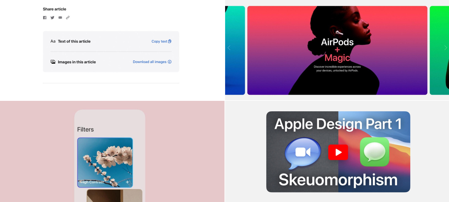
AirPods experiences are highlighted in a carousel filled with movement, color, and contrast. As you go from slide to slide, the plus button even rolls over from feature to feature. This design has theater, centered text, and a beautiful primary font pairings like those we discussed last issue. This is a great reminder that we can always share our features and designs by breaking them down into one-by-one visuals that give each moment their own space. This was sent in by one of our readers, thank you @jonmuzzi!
A beautiful, earthy background color and dark primary font give the IDs in Wallet page a unique feeling all its own. White, black, and gray are perfect as background colors for so many of the designs we make, but this one is a great example of using a background color to give the entire design a new feeling. For example, if a design had an area that displays a big success message when something great happens, that design can use green to make that feeling come across in a bigger wave than green text alone might have been able to achieve.
Also on the IDs in Wallet page, features are shown row-by-row with a paired color and primary text stack and a big icon on the side. This one jumped out to me the way that it clearly communicated the idea of each paragraph with just the icon. Anywhere in our designs where we are saying something that takes up more than a few short words, maybe we can also make it even easier to understand by putting something as simple as a large icon (or even an SF Symbol) next to those words.
Take this week’s conversation around background colors and gradients with you and try changing up this week’s design. You can download this design free as a SwiftUI design file and open it up on your iPhone, iPad, or Mac with DetailsPro.
Every Friday, we post curated links for user interface designers interested in iOS design, macOS design, and more on our newsletter UI Designer Weekly. You can read each post here or sign up for the weekly email.
Triple the Fun
In the App Store on iOS 15, cards display with a stack of three text elements. First, a high-level category is written in a smaller, uppercase, secondary-color font. Then, the headline is written bold, primary color, in titlecase and given room to expand to two or three lines. Finally, a subtitle to that headline is written in an in-between color, still smaller, and with a regular font weight. This style is a great example of a layout that can fit on a card and represent the content underneath it—it’s also very photo-background friendly if you also add the gradient as seen here.
On the website for iPad Air, this example can take us all the way back to the very basics, somewhere I’m not at all upset to go. Let’s drop all the fancy stuff, let’s put aside our material backgrounds and uppercases and lowercases, and enjoy this masterclass for the 101-level. To describe the features of the iPad Air, a large, breathable three lines are set in a larger, but not-too-bold font. This is a great example to absorb the line spacing and proportions from, because after just the right amount of spacing below this title, there’s a smaller font used to tell two sentences of information. The pops of color are probably what make this design so fun to look at, but perhaps the best thing we can learn from this example is that you can get a lot out of splitting your idea into a headline and a description and laying them out together with plenty of breathing room.
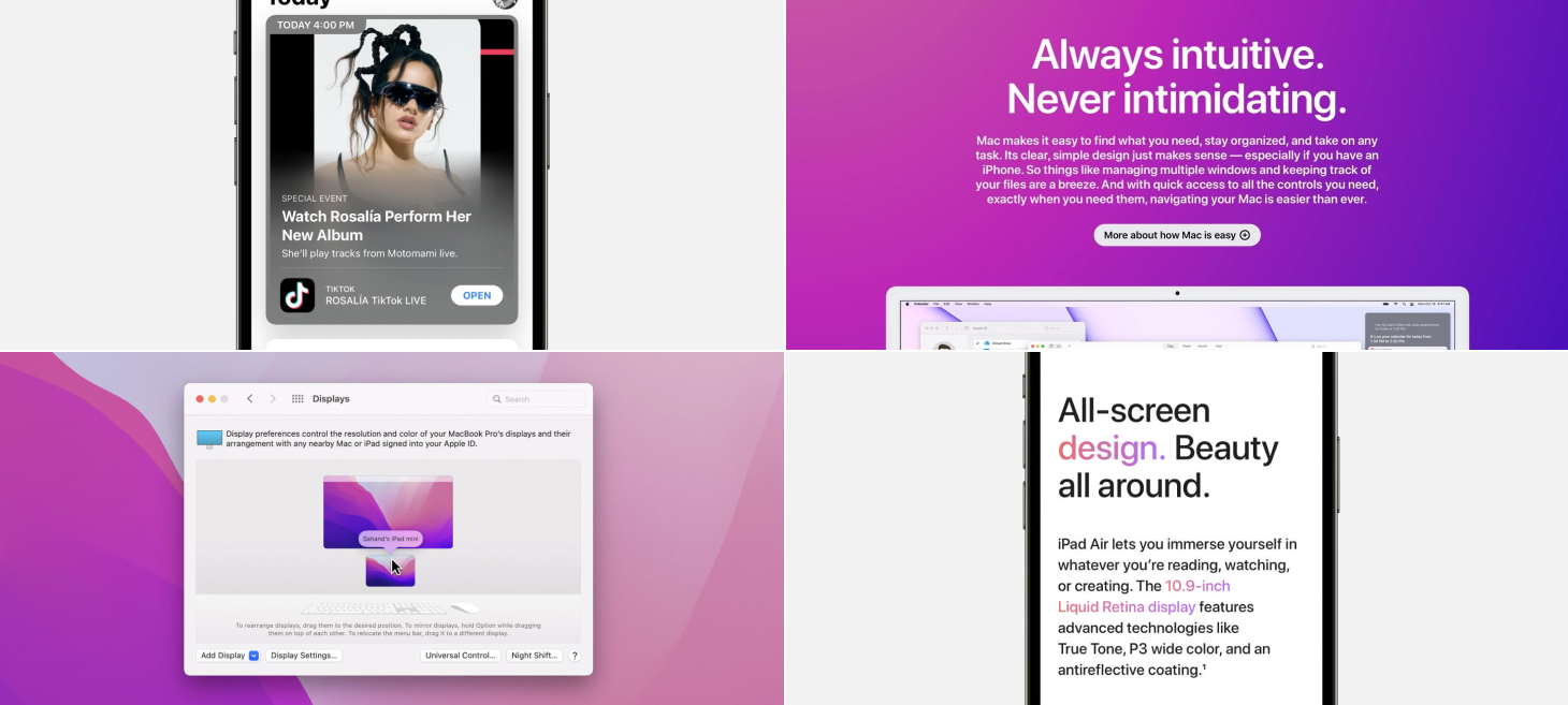
On the page for “Why Mac”, a stack of text elements presents a more reserved, quiet look. This design jumped out to me because it feels like an excellent counter example to the fun, the bold, the more stand-out looks that work well in other situations but maybe aren’t what you want when you want your design to feel serious and straightforward. There are two other lessons I think we can takeaway from this design. First, this is a nice reference for designing text elements without much spacing between them, which feels like it works here because a majority of the message is inside the description, so having the title and the description so close helps to lead the viewer to those sentences. Second, actionable elements can be designed to stand out and be seen. The link here is clearly a link and even leaves room for another couple links below it if needed.
macOS Monterey’s Displays window, with its new support for Universal Control, is perhaps a great example that new ideas can be introduced into existing designs with great success. The Displays window has done this cool thing for many years where it shows your current display and any external displays and lets you drag them around in 2D to tell your Mac which screen is actually on the left on your desk or which is mounted above, and so on. Now the Universal Control experience, which could have led designers down a path of making a completely new window that would open somewhere else and be separate from this one, has instead landed in the same familiar place working in the same familiar way. And, just like that, this design reinforces what you know about the Mac and the way it handles displays. On top of that, recent design additions like the perspective-accurate keyboard and mouse below have added charm and flair in the Apple way.
Also on the page for “Why Mac”, a tried-and-true stack of text elements tell a big story, with lots of room for description, and a rounded, beautiful button design that makes clicking look fun. This is perhaps that opposite end that I was mentioning in the section above (about the “Environment” text elements) because it’s all about the big effect and the large letters here. This is a great design style you can use across a native app design and a web design, or anywhere you want to have a big element that people will notice and maybe click for more. The proportions are similar to the “Back to Basics” example above, but the centering and the even smaller description text make room for the button below and effectively attract more attention to the the words here.
Take this week’s conversation around text stacks with you and try changing up this week’s design. You can download this design free as a SwiftUI design file and open it up on your iPhone, iPad, or Mac with DetailsPro.
In this week’s issue, you’ll find more beautiful, inspiring, and thought-provoking examples of design to maybe help you see something new and give you ideas you can mix into your work.
I hope you’ve had a chance to design something new, something interesting, perhaps even something challenging over this past week!
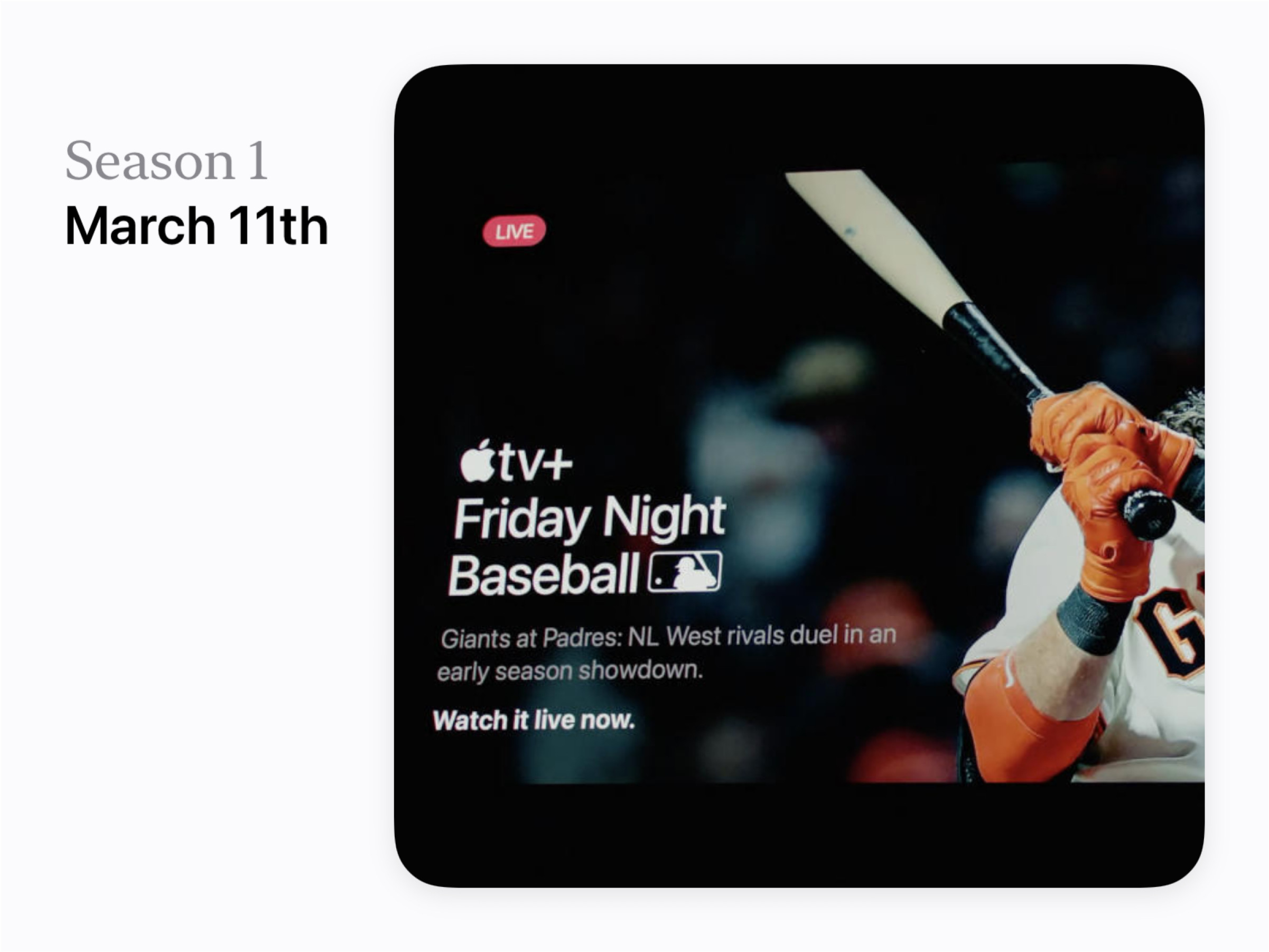
A beautiful stack of text elements in this moment announcing Apple TV+ Friday Night Baseball. There is a great example here of hierarchy between the big title, the “Giants at Padres…” lines set in gray, and then finally the “Watch it live now” line that returns to a bold white. And, up at the top, all you need to convey that live feeling is the red capsule behind the text. Here in this example, these lines feel bold, theatrical, and compact because of the spacing and the colors.
This one is a little bit more interesting, but hear me out. Apple has been making and showing these line illustrations of their chips that make it easy for people like me (who don’t know much about chips) to count along with the screen. I see the chip drawn in colorful lines and easy boxes, and suddenly I notice the different regions of the chip and can see how they relate and get organized together. And now, after a few of these presentations, it’s easy for me to imagine in my head the way the M1 family goes from M1 to M1 Pro to M1 Max and now to M1 Ultra (which I know is two M1 Maxes put together). When I hear the phrase “two M1 Maxes put together” I think of the colorful image that’s been in the presentations that shows the two sections connected together. Maybe this shows us that it can be worth it to imagine and created simplified images for the advanced concepts you want to communicate, and to use those as a representation of the more complicated ideas. If people who use your design can leave with just the most important parts of your information, without having been turned off by the details or complexity, then maybe that is a great way to give people a way to really understand and then be able to explain their understanding to others.
Large and colorful SF Bold shares an impressive number in a moment for the iPhone SE. It may seem like there’s not a lot going on here, but in fact I see this as a reminder that if our designs have some number or statistic to share, we really can make that number feel special and feel like a big deal by putting it on a line by itself and displaying it in a larger size. Maybe one of your designs currently shares a “big deal” number, like “24 runs completed this month”, and there’s some room to make that “24” feel a lot more special by giving it a similar treatment.
White tiles with an image and primary text on the page for Mac Studio. This is a great example of a very simple layout you can use to organize a collection of features or ideas you want to call out. Consistent titles make each title easy to read and understand and the rounding on the whole container gives each tile a little extra feeling of refinement, like what we are looking at is on a small digital billboard.
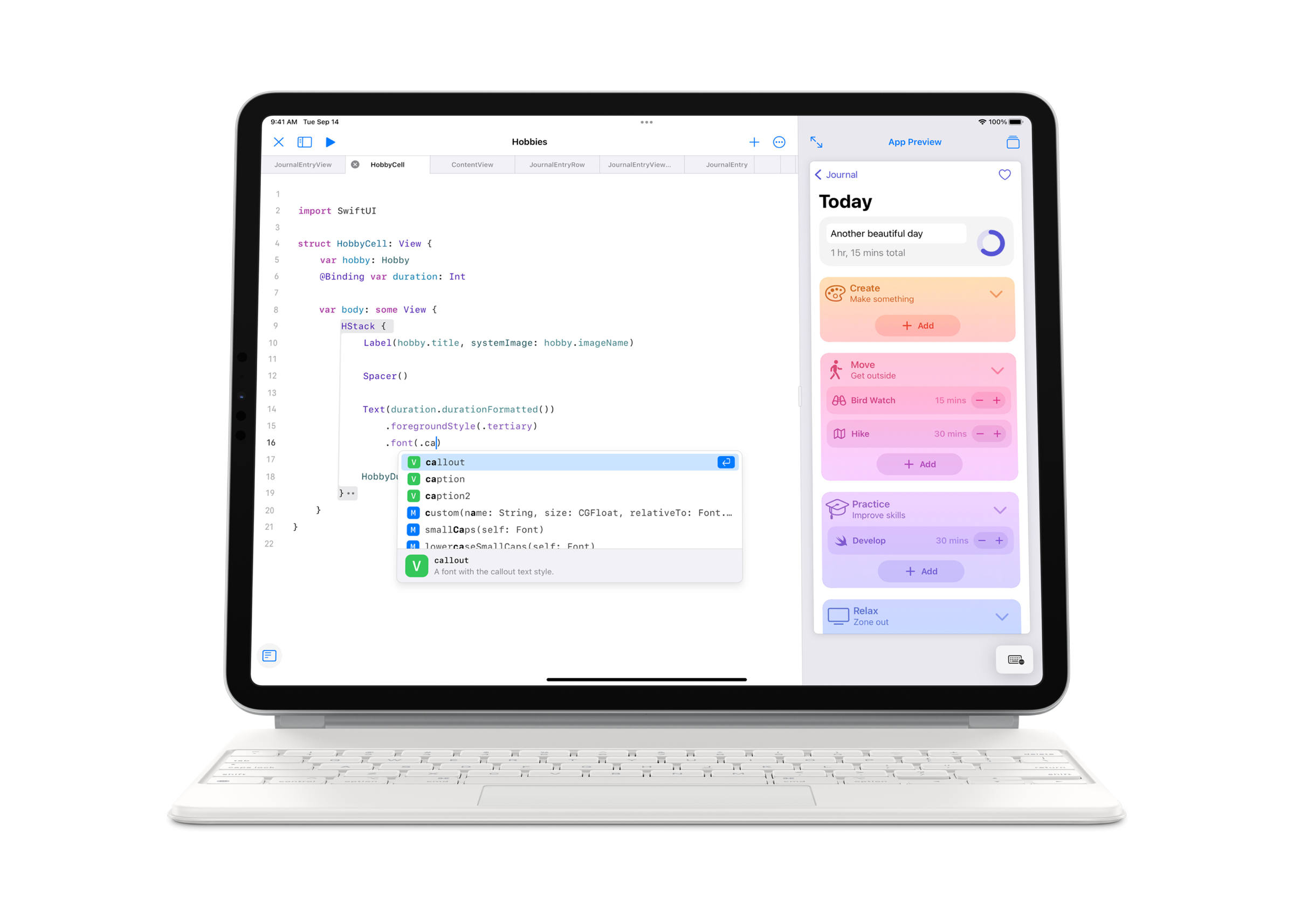
With SwiftUI, you can design beautiful interfaces. Each design element in SwiftUI is like a building block that you can use to build up any design you can imagine.
A great first step you can take is looking at all the different SwiftUI elements you can use. Here’s a guide that shows you every element in DetailsPro, with a short explanation and a basic screenshot.
Vertical Stacks are one of three stacks total that exist in SwiftUI (the others are Horizontal and Layered). They let you vertically stack any other elements. They are essential to the design process.
Here’s an example showing a Vertical Stack with a Text element and an Image element:
A Vertical Stack on it’s own doesn’t actually look like anything—it’s invisible. It’s only when you add elements to the Vertical Stack that you start to see anything.
By default, Vertical Stacks align their items down the center. Vertical Stacks can also be configured to align their items to the left side or the right side.
Vertical Stacks also have a “spacing” option, which decides how much of a gap to put in between each element in the stack. By default, SwiftUI has some smarts to give you pretty spacing values between different elements. You can also set your own spacing value, like 0 or any specific number.
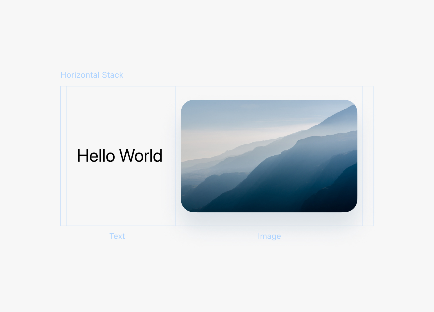
2. Horizontal Stack
Horizontal Stacks work very similarly to Vertical Stacks, except they let you put elements together horizontally. They too have an alignment option, which here actually works to align elements at their tops, bottoms, or the middles. There is also a spacing option to configure the gap between each element inside.
Virtually every design you can think of will use Vertical Stacks and Horizontal Stacks, so if you’re starting off a new design with either of these, chances are you are doing everything absolutely right.
Here’s an example showing a Horizontal Stack with a Text element and an Image element:
3. Layered Stack
Layered Stack (also known as ZStack) is the third and final kind of stack and it lets you stack elements in layers on top of and below each other. You can use Layered Stack to create backgrounds and overlays.
Just like Vertical Stack and Horizontal Stack, Layered Stack has an alignment option which controls how the elements in the stack are aligned. You can use this option align elements in the center, on the sides, or in the corners.
Here’s an example showing a Layered Stack with a Text element and an Image element:
4. Spacer
Spacer is a design element that you can use with Vertical Stack and Horizontal Stack. When you add Spacer to one of these two stacks, it takes up all of the remaining space.
You can use Spacer to push design elements over to a side of a stack, since the Spacer will occupy all the remaining space left over. If you use two spacers, they will each take half the space.
Here’s an example of a Spacer inside a Vertical Stack, pushing a Text element and an Image element to either side.
Spacers are always invisible. When you add them to your designs, you only see the effect they have on the other design elements in a stack.
5. Text
Text elements are one of the most basic useful elements in SwiftUI. You can use them to display any amount of letters and words. You can also change their fonts, colors, and other typography options.
Here’s an example showing a Text element by itself.
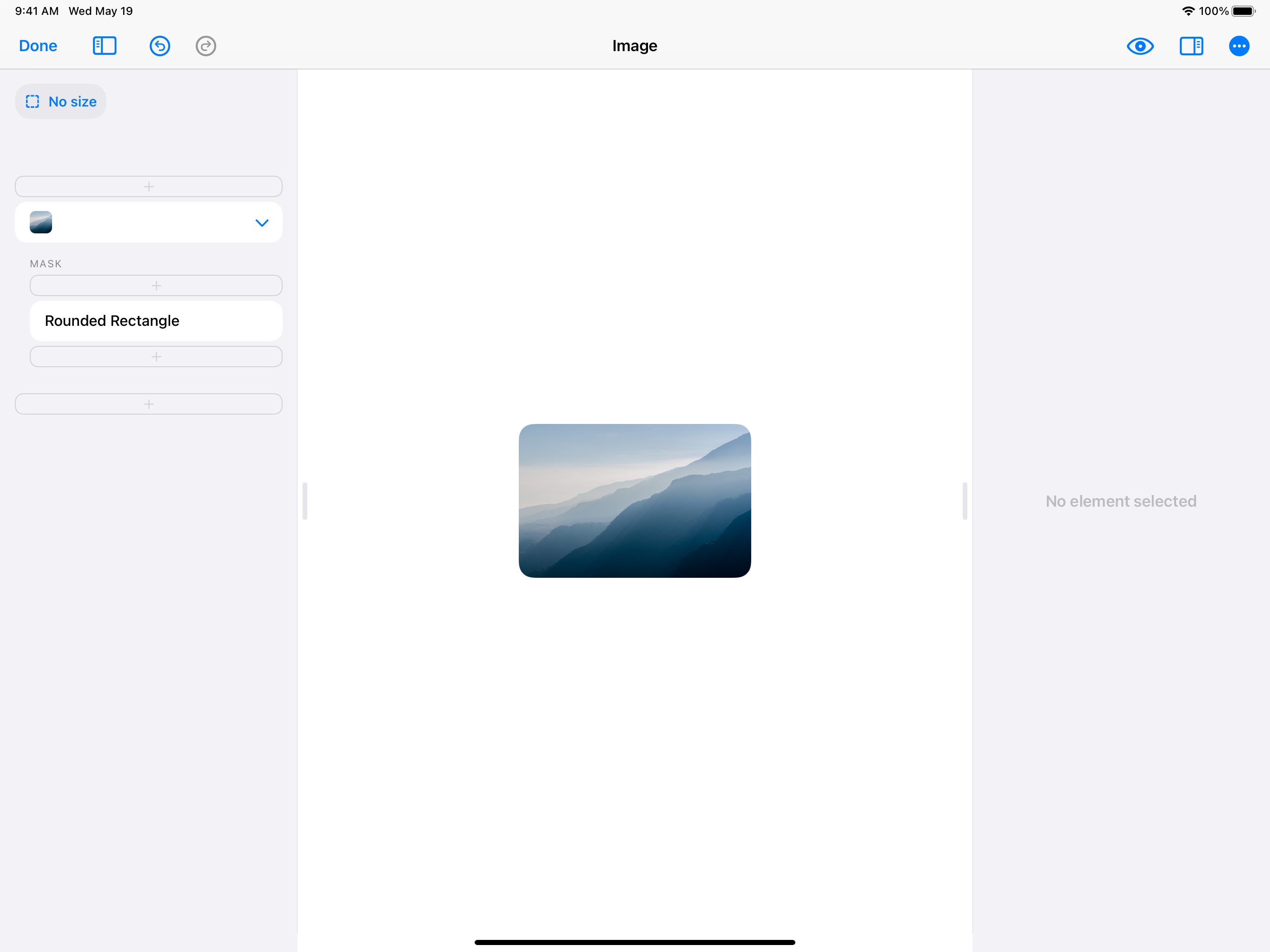
6. Image
Images are the other super useful and basic element in SwiftUI. Images can show any any picture, including transparent .png files or .jpeg and .heic images.
Here’s an example showing an Image element:
7. SF Symbol
SF Symbols are icons from Apple’s built-in icon library for iOS. You can select from a wide of built-in icons that were designed by Apple to look great next to Text elements, on top of Image elements, and in other common design layouts.
You can change the color, size, and thickness of an SF Symbols icon.
Here’s an example showing an SF Symbol by itself:
One quirk about SF Symbols: You set the size of an SF Symbol by specifying a font size. This is because SF Symbols were tailor-made to pair well next to Text elements. A Text element and an SF Symbol element will look best next to each other if both have the same font size. SwiftUI will even make sure they are aligned properly.
8. Rectangle
Rectangle is one of four shape elements that exist in SwiftUI, along with Circle, Rounded Rectangle, and Capsule. Rectangle is simply a rectangle. You can change it’s color, border, and size.
Rectangles can be placed into stacks, used as backgrounds, or used any other way you can imagine.
Here’s an example of a Rectangle:
One quirk to know: all shapes in SwiftUI expand to fill the stack they are in by default. So, if you want to have your shape stay under a certain size, you have to set that size on the element.
9. Circle
Circle is simply another shape element similar to Rectangle.
Here is an example of a Circle:
10. Rounded Rectangle
Rounded Rectangle is just like Rectangle, with the only difference being it has a built-on option for changing the corner radius. You can also select a corner radius style, choosing between a standard corner radius or the Apple-specific “squircle” style that offers a smoother rounding.
Here’s an example of a Rounded Rectangle:
11. Capsule
Capsule is another SwiftUI shape element that is basically a convenient shortcut. Capsule is just like Rounded Rectangle, but it automatically uses a perfectly-rounded corner radius.
So if you want to do a rounded rectangle that had perfectly round radius on the sides (left and right, or top and bottom) you can use Capsule.
Here’s an example of a Capsule:
12. Divider
Divider is an element that acts as a divider line in any of your stacks. You can simply add a Divider to your Vertical Stack or Horizontal Stack and it will add a faint, Apple-designed divider line.
Divider is super easy to use and adds an elegant line to your design.
Here is an example of a Divider in a Vertical Stack:
13. Scrolling Container
Scrolling Container is one of the more advanced elements. You can add any oversized, really long Vertical Stack or Horizontal Stack into a Scroll Container to make it scroll.
You can also choose whether to hide or show the scroll bar.
Here is an example of a Scrolling Container with a very long, oversized Vertical Stack.
14. Blur
Blur is an element similar to Rectangle. When you design with a Blur element, the element will blur any elements behind it. You can use Blurs in your designs to make elements easier to see over other elements.
Here is an example of a Blur over an Image:
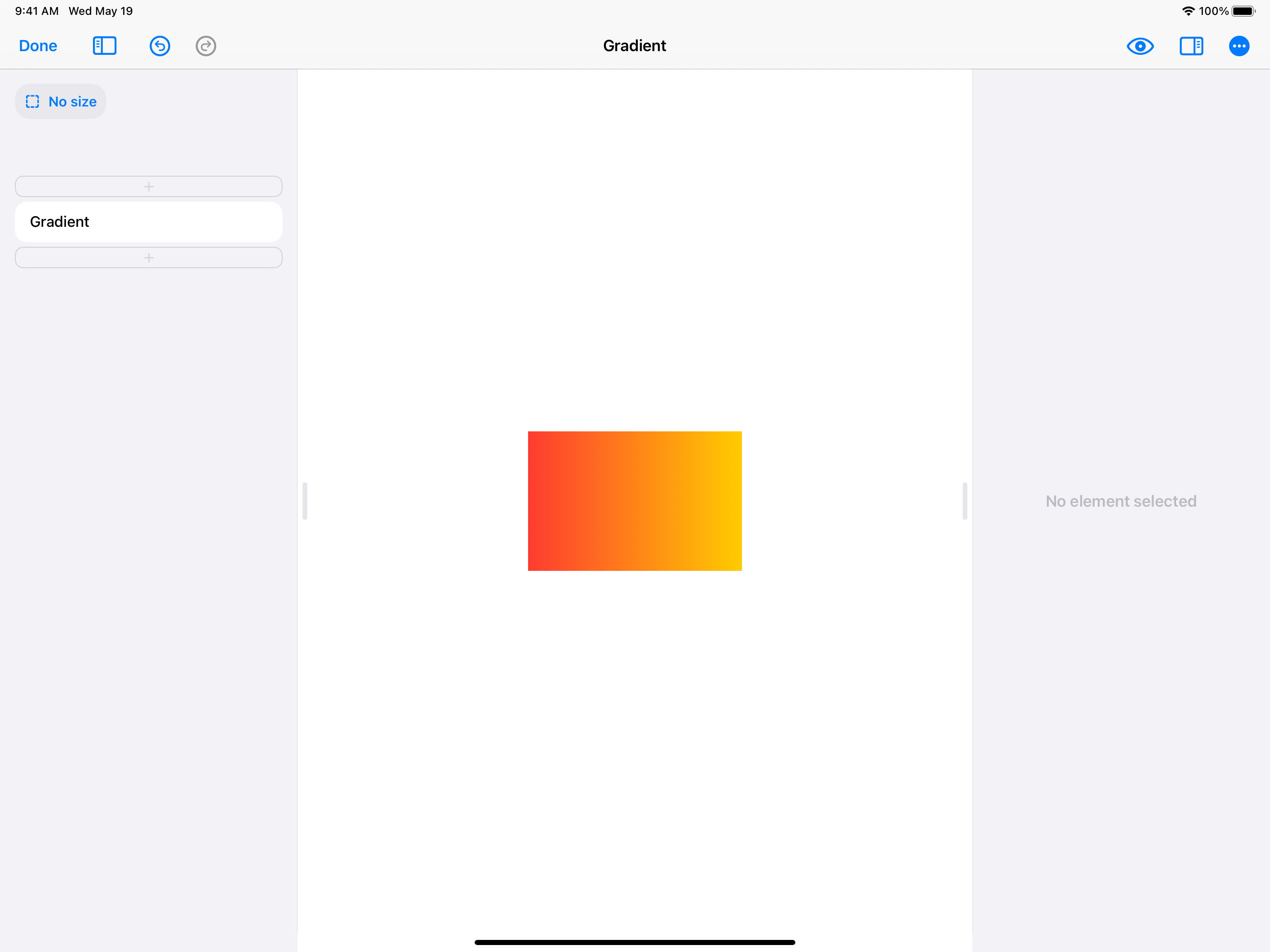
15. Gradient
Gradient is an element similar to Rectangle. When you design with a Gradient element, you can choose between three types of gradients: Linear, Radial, and Angular.
With each gradient type, you can choose the colors you want and the direction you want the gradient to go in.
Here is an example of a Gradient with a Linear gradient style:
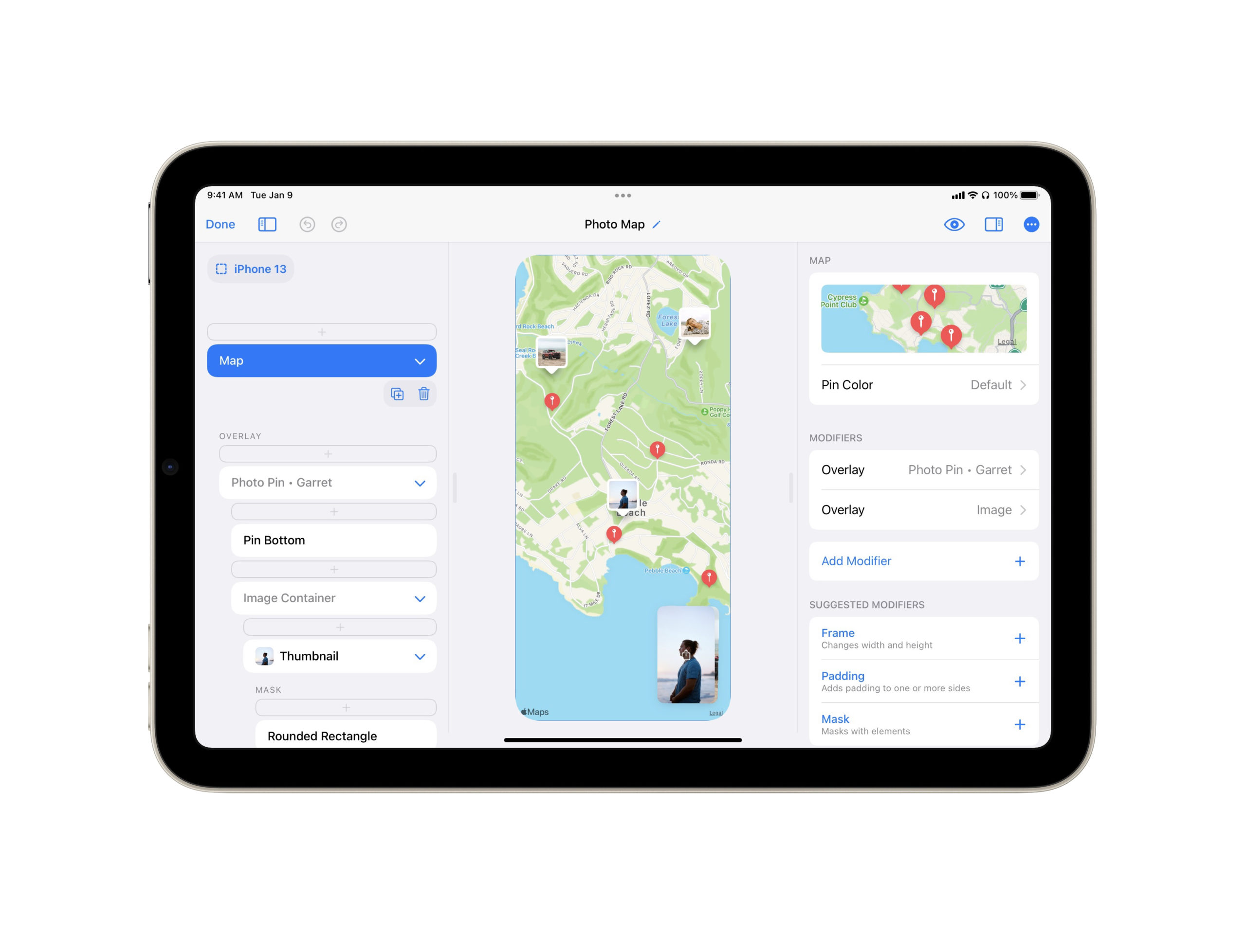
16. Map
Map adds a MapKit map to your design. When you design with Map, you can search with Apple Maps for a place to center your map with. You can also search for places to add as pins, and customize the pin color.
Note: Map is available for in the upgraded version of DetailsPro. The free version of DetailsPro can display Map elements, but doesn’t allow editing them.
Now you’re ready to design!
This is only the beginning! Now that you’ve seen the basic elements, you’re ready to put these elements together to create your very own SwiftUI designs. If you want more inspiration, take a look at the inspiration section of our blog or at the community designs made by other DetailsPro designers!
Every Friday, we post curated links for user interface designers interested in iOS design, macOS design, and more on our newsletter UI Designer Weekly. You can read each post here or sign up for the weekly email.
Elements That Color Together Stay Together
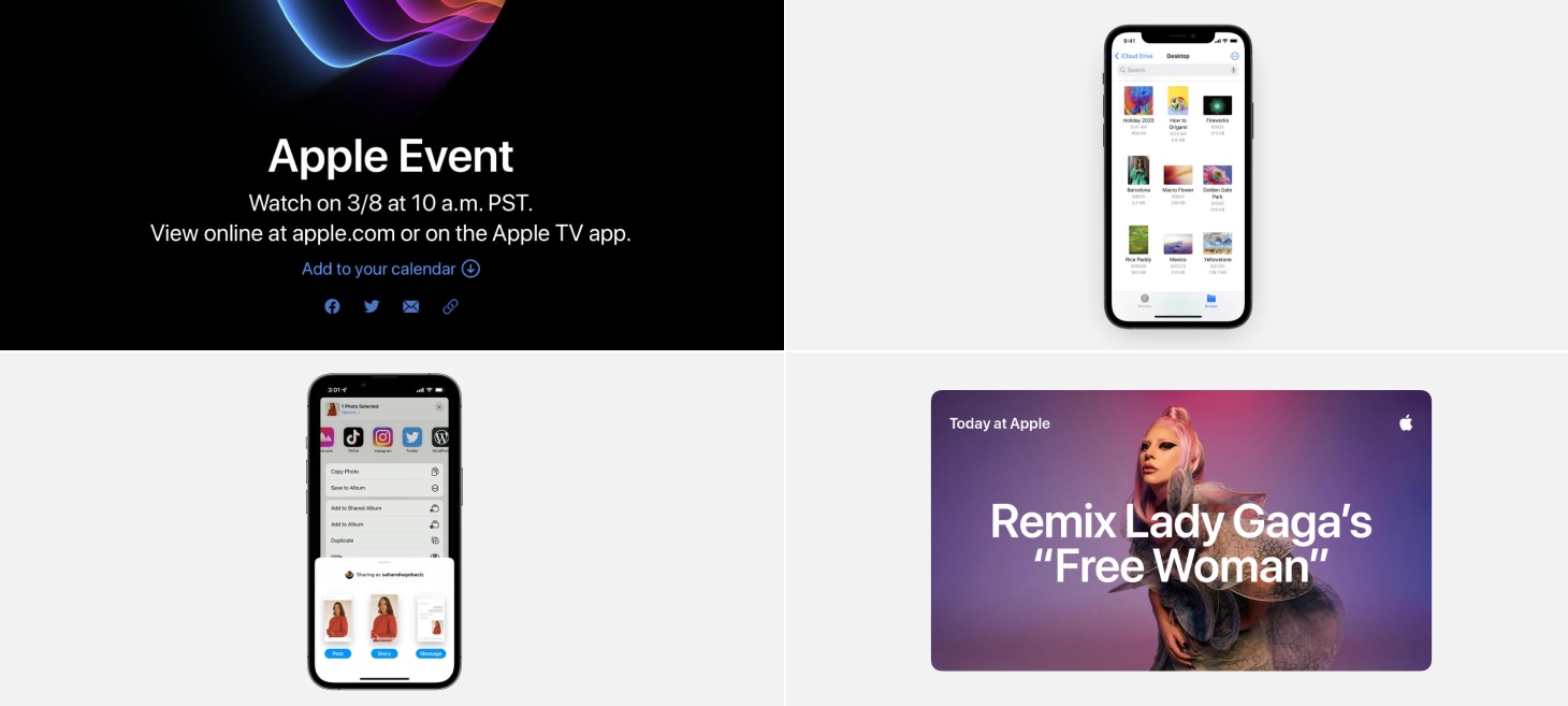
A beautiful, compact stack of elements about an upcoming Apple event. Elements you can interact with all colored blue. This is a perhaps a great example of how you can group together elements in a design that have the same possibilities. “Add to your calendar” and the email icon can both be tapped and so they share the same color. This design might have worked if they were different colors, but making them both blue makes it easier to apply what we learn about one element to the other elements, all with a quick glance.
Gravity
Files on iOS 15 presents pictures within a folder in an airy and inviting grid. You can see here that two alignment styles are used: bottom alignment for the thumbnails and top baseline alignment for the names. With bottom-aligned thumbnails, each picture feels like a work of art that’s real and sitting on a shelf. Almost like gravity brought each thumbnail down. Text, on the other hand, keeps the top baseline alignment (“baseline” here refers to the term baseline used in typography) so that each filename starts at the same height, no matter how many lines it needs. This makes it easier to scan filenames while looking from one side of the screen to the other. This is a great example of how you can use alignment styles in your designs to emphasize parts of your content and make collections easier to browse.
What You See Is What You Are Looking For
Sharing to Instagram presents a charming design with miniature screens that resemble and preview each choice. These previews feel light and useful, especially if you are already imagining how you want your story or post to look. This makes the long distance to travel from Share Sheet to Instagram feel like a connection that is intelligent, well-made, and reliable. It’s also appropriately visual for an app that is itself so built on visuals. Perhaps, even, this helps remind of you of all the different ways you can share an image on Instagram.
A Harmony of Light Text and Color
Another example of light text looking amazing over a colorful image. There is something about this pairing that feels like it wouldn’t work on paper, but in reality, truly helps draw you in and see both the message and the imagery clearly. If there is a part of your design that you want to make with this bold, attention-grabbing feeling, try starting with a colorful gradient or an image that lets light text stay readable.
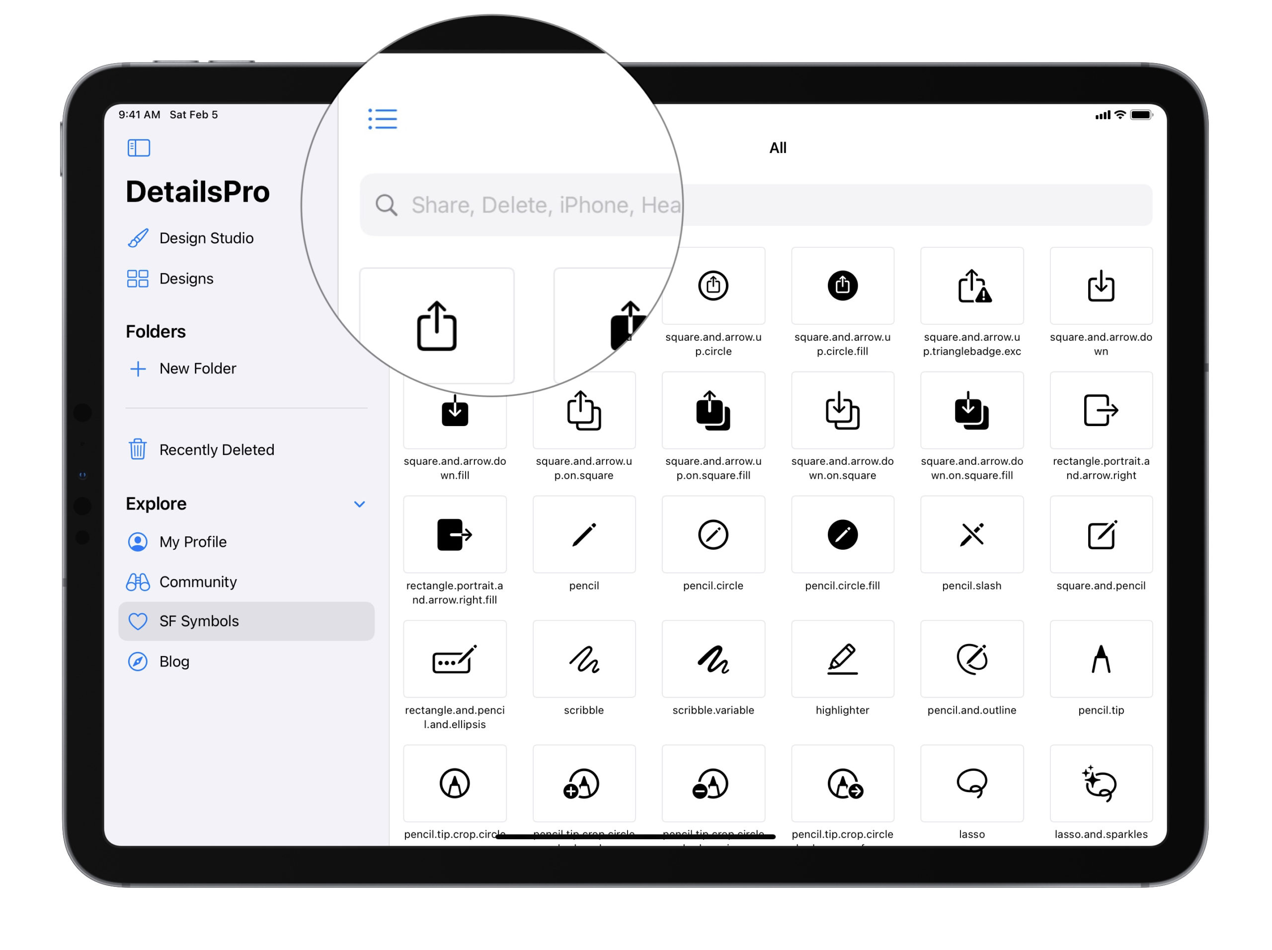
You can easily browse through the icons in Apple’s SF Symbols 3 collection on your iPhone or iPad using the DetailsPro app.
Apple introduced SF Symbols at WWDC 2019, making Apple-designed iconography available for designers and developers that was easy to use, included in the iOS SDK, and designed to integrate seamlessly with Apple’s current system font San Francisco.
How to find the SF Symbols browser in DetailsPro
Launch the DetailsPro app on your iPhone or iPad.
Tap on SF Symbols in the main navigation.
Not only can you browse through the entire collection of SF Symbols, but you can also explore SF Symbols by category or search them by name.
How to view SF Symbols by category
Launch the DetailsPro app on your iPhone or iPad.
Tap on SF Symbols in the main navigation.
Tap on the list icon next to “All”.
Tap on any category to see its icons.
How to search SF Symbols by name
Tap on the search field
Type in a partial name like “heart”, “delete”, or “iPhone”
Tip: You can also view more SF Symbols on screen at a time by hiding the sidebar in the DetailsPro app.
How to browse SF Symbols on a Mac
You can use these same steps on the DetailsPro Mac app to browse SF Symbols, but if you’re on a Mac, the best way to browse SF Symbols are with Apple’s own SF Symbols Viewer which can be downloaded from their SF Symbols Apple Developer page. With this app, you can make custom collections, learn about the backwards compatibility of each icon, and more.
What do you think?
Do you search for SF Symbols often? Does being able to browse through the vast library of icons on-the-go help in your workflow? We’d love to hear from you!
The next time you’re creating a design that needs to lay elements over or behind other elements, you’ll have two methods you can choose from, each with their own benefits. You can use the Layered Stack (ZStack) or one of the Overlay or Background modifiers.
Here’s a simple example. Let’s say you are designing something with:
One image
One SF Symbol over that image
Let’s say it’s supposed to look like this:
The Layered Stack Way
Your first option would be making this design with a Layered Stack. Here are all the steps:
Add an Image
Add a Frame modifier
Add a new Layered Stack with that image
Add an SF Symbol
Select the Layered Stack and change the alignment
You should end up with something that looks like this:
Layered Stack is perfect for layered elements like this (hence, the name ?) and can handle designs, from the simple to the complex, with ease.
When to Use Layered Stack
We recommend using Layered Stack whenever you have a clean slate and know from the beginning that you want a design to be layered. Whether at the top of your design or somewhere deeper down, Layered Stack is great for the job.
When Not to Use Layered Stack
The only time we don’t recommend using Layered Stack is if you already have a rather complex design in front of you. If you have already done a lot of work and realize that you need to add layering to your design late in the game, we recommend using the second way we’re about to discuss…
The Overlay Way
Your second option is making this design using the Overlay modifier. Here are all the steps:
Add an Image
Add a Frame modifier
Add an Overlay modifier
Delete the placeholder “Overlay” Text inside the Overlay
Add an SF Symbol inside the Overlay
Select the Image’s Overlay modifier and change the alignment
You should end up with something that looks like this:
Overlay is a perfect, lean option for quickly adding layering over any of your design elements.
When To Use Overlay
We recommend using Overlay anytime your design feels like a certain design element is the “base” (here, the image) and the layered design elements really feel like they are secondary to that “base”. An image with action buttons over the image is a perfect example.
When Not to Use Overlay
The only time we don’t recommend using Overlay is when you are starting with a clean slate. Very early on in a design, if you already know that you’d like to make your design layered, it may be better to start with a Layered Stack. This way, you don’t have to worry too much about which element is the “base”.
Make Sure You Are Up-to-Date
The behavior of ZStack seems to have changed recently, in a really positive way, becoming easier to use and making these options possible. If you’re on an old version of iOS, you may not be seeing this behavior. Make sure you are on the latest version of iOS/iPadOS/macOS to enjoy these benefits. Doesn’t hurt to update to the latest version of DetailsPro while you’re at it!
Conclusion
SwiftUI is great like that, giving us multiple ways that are best suited to the many different situations that arise when designing.
The world of iPad app development changed forever with the release of Swift Playgrounds 4. We couldn’t be more excited for this new app. Today, DetailsPro is also announcing expanded support for Swift Playgrounds.
What does DetailsPro support?
Exportingdesigns to Swift Playgrounds.
Creating newSwift Playgrounds 4 apps right from DetailsPro, which open directly in Swift Playgrounds.
Exporting to the classic standalone Swift Playgrounds format or the new Swift Playgrounds 4 app format.
Exporting multiple designs at once by exporting an entire folder.
Exporting all SwiftUI design elements, modifiers, SF Symbols, and image assets.
How does DetailsPro make a good companion for Swift Playgrounds?
DetailsPro is your design companion for creating apps on the iPad. Whether you’re a designer focused on elevating the visual design of your company’s app, or a developer mocking up the next screen you’re about to build, you can use DetailsPro to create SwiftUI designs quickly and easily. The DetailsPro app was made for the single purpose of helping to complete visual design work for iOS and gives you an environment and UI that’s focused on that task. While you can make mockups and prototypes in Swift Playgrounds, the process isn’t as easy or as focused as the experience in DetailsPro.
How to export a design to Swift Playgrounds
Exporting a design from the DetailsPro app is easy and quick.
Open your design file.
Tap on the “…” More menu.
Tap Export as Swift Playground… if you want a classic, standalone Swift Playground.
Tap Export as Swift Playgrounds App… if you want a new Swift Playgrounds 4 format app (This is the right starting point if you want to eventually submit your app to the App Store).
A new Export as Swift Playgrounds App feature makes it easy to create real SwiftUI apps with your designs as their starting points.
Here’s how a design looks when you’re working on it in the DetailsPro app:
Working on a SwiftUI design file in the DetailsPro app.
Here’s how that same design looks after it’s been exported to Swift Playgrounds:
Opening the Swift Playgrounds 4 app that was made by exporting that design file.
DetailsPro and Swift Playgrounds make app design a lot faster and easier
Before the DetailsPro app was released, to do any sort of SwiftUI development you had to open Xcode, go through all of the dialogs, and create some sort of project each time.
Now you can open the DetailsPro app and be working on a new design in less than a few seconds. No project setups, no configuration, no coding knowledge necessary.
And now all of this has been pushed further with the release of Swift Playgrounds 4. Developers can make real apps and publish them to the App Store and, since designs made in DetailsPro are already made as native SwiftUI, exporting designs to Swift Playgrounds is accurate, easy, and instant.
The DetailsPro app can take any of your designs and export them as a Swift Playgrounds app because all designs made in DetailsPro are already native SwiftUI.
Requirements
Make sure your iPad is upgraded to iOS 15.2 or newer and you have DetailsPro 3.19.0 or newer.
When you design with SwiftUI directly, you design with the smarts that are built into iOS. Something we’ve wanted to do from the beginning was enable designing with real Apple Maps MapKit views directly inside DetailsPro. With our latest update, this is finally possible!
This feature requires the upgraded version of DetailsPro. If you haven’t upgraded yet, this is a great time to do so!
Add pins to your maps with Apple Maps Search.
DetailsPro’s support for designing with Apple Maps is extensive—there’s support for Dark Mode, adding pins to the maps, finely adjusting the map’s frame in your design, and searching for places to quickly and easily center the map on your point of interest!