Every Friday, we post curated links for user interface designers interested in iOS design, macOS design, and more on our newsletter UI Designer Weekly. You can read each post here or sign up for the weekly email.
Beautiful Displays Can Be Buttons Too
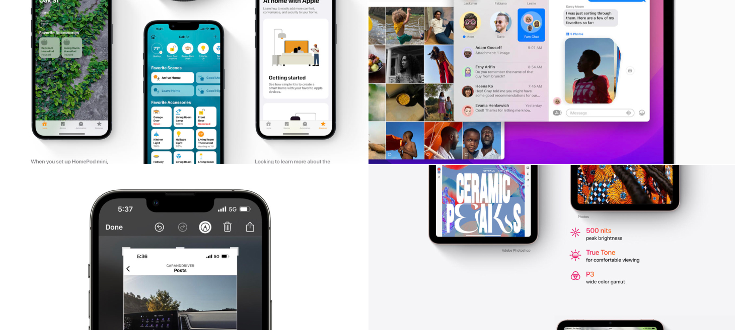
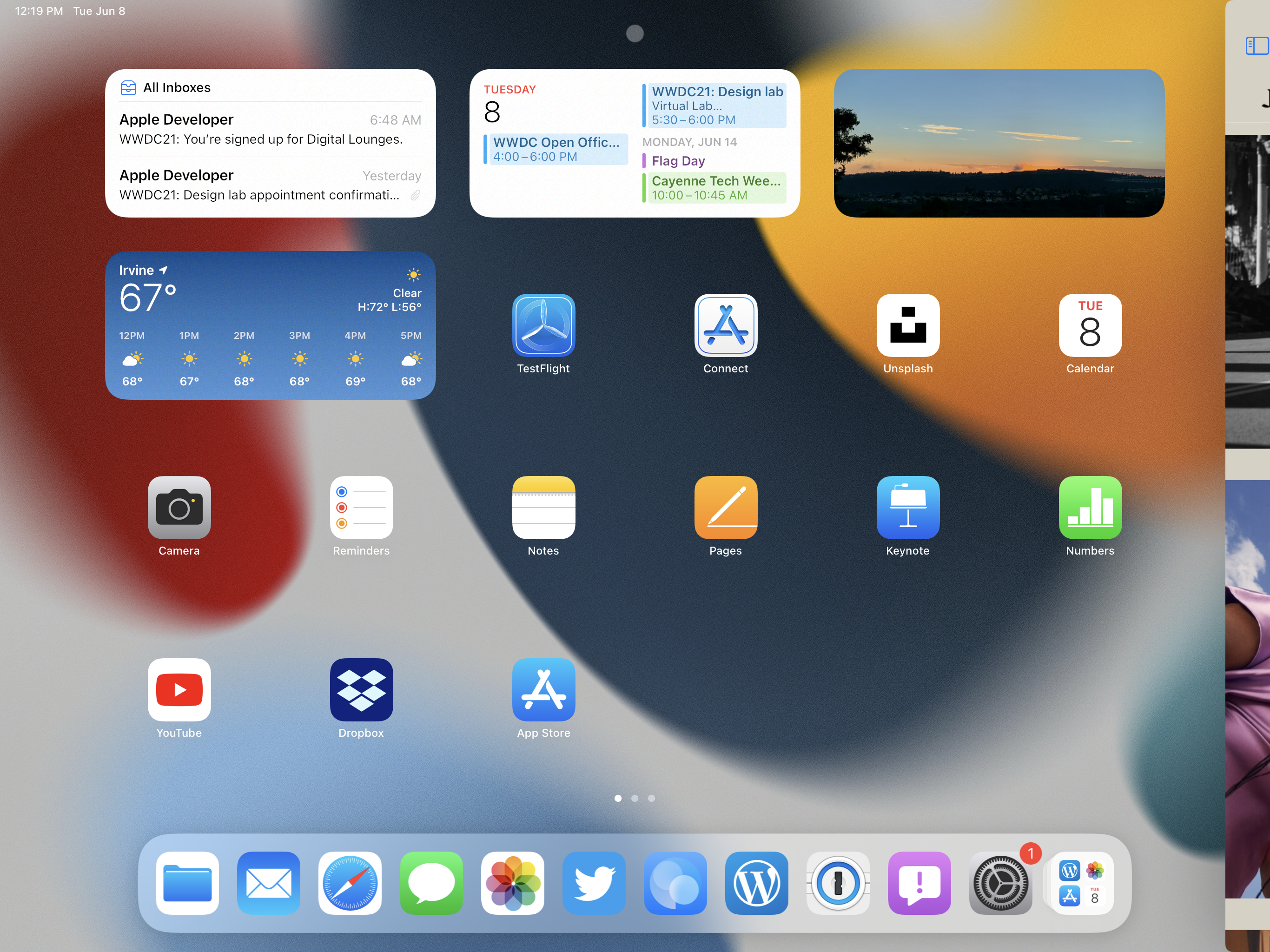
Home on iOS 15 makes a beautiful display of a lot of information. By simply lighting up the rounded rectangle and the visual elements representing one of your Home scenes, it tells you that the scene is active and the others are not. Home uses these visual elements as buttons too, where simply tapping takes you to more about that home device. Key takeaways here I believe are that we shouldn’t be afraid of loading up visual elements in our designs with multiple meanings and multiple uses—it may be true that the people using our designs come to them with multiple reasons depending on the time of day or what they were doing just before, and our designs can keep that in mind.
More Beauty in a Smaller Space
Pictures stack together in Messages on macOS Monterey. For me, Apple Design strikes its most triumphant notes when its interfaces bring in elements of the real world. It may seem something so simple, but this new way of showing pictures is beautiful while also being better in many ways: a set of pictures now takes up just one spot in the conversation instead of taking up a long scroll; you can quickly tap and flick through the set of pictures without losing your spot in the conversation; did I mention it’s beautiful?
Between Elements, Design with Difference
Screenshots and Markup on iOS 15. Along the top, visual elements for each button are all in the same light color that has great contrast on the darker, blurred background. This design shows us with the way the markup icon is currently highlighted with a white circle background that we can use very simple, almost tiny differences to communicate in our designs. For example, nowhere on the screen does it currently say “Markup” or “Markup Mode”; it’s just the pen having a white circle highlight behind it. Also noteworthy that there is a delete button right there at the top with all of the other actions. If deleting was a common action that people wanted to take here, it makes sense to include that right away at the same level, instead of after a “…” tap, for example.
Less is More
On the topic of simplicity and tiny differences, here’s another example. The current speaker is simply seen a little bigger with a white border and a shadow. There’s no text saying “Current Speaker” or “Speaking”.
Announcements in Color Stay Together
Colorful headlines on the page for iPad mini. This is a great example of how you can use color to add more feeling to the writing in your designs. On the white background, amidst the smaller primary text, the colored icon-and-headline pairs stand out.
Every Friday, we post curated links for user interface designers interested in iOS design, macOS design, and more on our newsletter UI Designer Weekly. You can read each post here or sign up for the weekly email.
Safari on iOS 15 brings the bar to the bottom. This design beautifully lifts the address bar above the panel, a great example of how to use shadow effectively. And still, the buttons in a row below remain a cool, thin blue. This design moves ahead and answers a question that might pop up more and more going forward: Should the iPhone have buttons lower on the phone? Have too many buttons become too hard to reach? Safari’s compact presentation here bodes well for designs in the future moving more of their interactions down to the bottom.
The Downloads panel presents with beautiful transparency on the page for iPad mini. Transparency like this shines when displaying over photography, graphics, and other colors. When an area of your design may include variations of color, photography, or visuals people often customize, try using blur, lightness, and transparency to help your design blend in over that potentially vivid base. The text, buttons, and separators here look beautiful here while remaining perfectly readable.
A color picker on the page for HomePod mini displays every option all at once. Often, designs will show the currently selected choice by itself and wait for a tap or a click to reveal the other choices. This is a great example of a handful of choices that make sense being shown all at once, since they are easy to display in a compact way and together form a sort of overview that itself provides information. If part of your design asks for a decision to be made, and the choices are less than a handful deep, consider presentations where all options are visible at once.
Paragraphs of text become beautiful on the page for AirPods. In the Apple Human Interface Guidelines, there are two “semantic” (or meaningful) colors that are named Primary and Secondary. When a device is in light mode, Primary shows in black and Secondary shows in gray. When a device is in Dark Mode, Primary shows as white and Secondary still as a gray, although a subtly different one. You can use the combination of Primary and Secondary to help draw people in, to communicate which information is more vital than the other, and to help make designs glanceable and beautiful. And, I don’t think we can leave this example without enjoying the colorful image on the right—yet another example of the effectiveness and lasting, simple beauty of white text on color photos. Maybe one day I’ll send you a newsletter that doesn’t call this out, but today isn’t that day.
Building on this conversation about Primary and Secondary, here is a great example of Primary working wonders on the page for the new MacBook Pro. There are beautiful splashes of color in the background, large graphical elements for each chip, and colorful gradients in the text below. And, even with all this color and form around, standing out simply and easily are the two lines of text set in the Primary color (which here would be white). This is perhaps a great example that Primary is the best choice for text and symbol elements that are supposed to stand out, even when you think you might need more color and flash.
We’ve been hard at work improving DetailsPro and making it into the product we dreamed up from the beginning. There are so many improvements in our latest update, version 3.0, that we wanted to write this post to highlight our favorites.
You can get the latest version of DetailsPro for free on the App Store and design forever with up to 5 files at no cost.
Inline editing You can design refined, beautiful SwiftUI interfaces with our all-new editing UI that maximizes interface control and context. Expand and edit multiple SwiftUI modifiers simultaneously. Browse through SF Symbols, colors from the Human Interface Guidelines, and more all while viewing your work in-progress.
New visuals for SwiftUI concepts Use SwiftUI to design to your fullest potential with helpful and accessible labeling and visuals we’ve added throughout. Our new visuals include, for example, beautiful and highly-communicative icons for concepts like Alignment. We’re really excited to be addressing universal needs like these, for those who prefer images in their tools. This is also another step we’re taking to make DetailsPro more global and less reliant on English language reading.
Faster Live Preview We’ve refined the animation timing across the board from our design editing interface to our live preview—everything is snappier and more responsiveness to keep up with your design process.
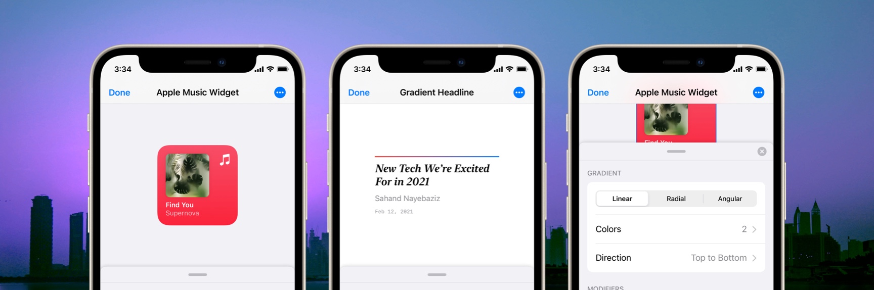
New Gradient Picker You can skip the difficult process of making good gradients—no more hunting around for the right colors or trying to guess which direction the gradient would look best in. Our new gradient picker introduces visual previews in every direction that you can preview and select from live as you edit your colors. With just a tap, you can explore gradient directions and find which one feels best in less time than ever.
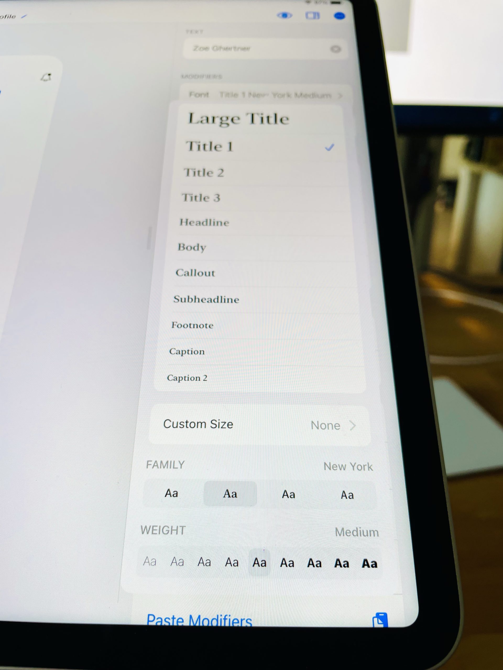
New Font Picker Designing with typography is a sacred experience. Okay, maybe some designers see it a little more casually and pragmatically than that, but for others, this is where all the fun begins.
Our subtly updated picker has simplified the experience and kept our philosophy in tact: it’s as easy as it could be for you to select a beautiful typography style from the Apple Human Interface Guidelines. Explore different font families and weights and instantly see your options update live. Finally, you can select a custom size if you are looking for something that isn’t included in the system styles. We have a lot of fun spending hours obsessing over the details of just this font picker—we wouldn’t be a niche Apple design tool if we didn’t. Now, we can’t wait to spend more time hearing your feedback and improving this super-high traffic part of our design interface.
New Color Picker Just like our new font picker, our new-and-improved color picker sharpens the same focus on the needs of the Apple designer. You can now quickly and seamlessly design across the semantic colors provided by the Apple Human Interface Guidelines and custom colors you’ve added in yourself with fewer taps and in a more compact, visual UI.
Opacity Shortcuts You can zoom any design element between the most commonly-used opacity levels in interface design with our quick-access shortcuts for opacity. We love the window-shopping aspects of the design process and this fits right in to the speed we want to give you with every update.
Better SF Symbol Search You can find the perfect SF Symbol now with our improved search algorithm and the improved compact UI for browsing the categories and testing the image scales available.
… this is just the beginning! This update was a huge update for us as we refined the entire design experience and introduced new, niche detail for the Apple designer throughout even our most boring corners (we still love you, opacity modifier). This is just the beginning for our summer releases. We are hard at work on design versions, folders and tags, reusable designs, copy and paste, and more.
Thank you for designing with DetailsPro and always sending us your feedback! If you’d like to stay up-to-date on everything DetailsPro, follow us on Twitter @detailsproapp.
Apple debuted new operating systems and applications at the 2021 Worldwide Developers Conference (WWDC) and included in all of the new updates were many new design updates and changes. From SharePlay to new designs in Messages, there was something for everyone. Here’s a list of our favorites.
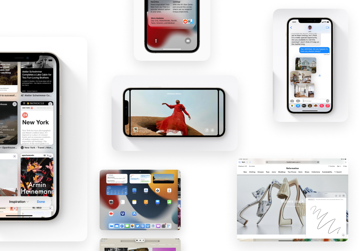
1. New design for pictures in messages
Apple debuted a brand-new design that kicks in when you send multiple photos in Messages. If you send a few, you see them tossed together in an airy stack (pictured above) and if you send more than a few, you see them collected together in a neat stack. This vibrant new design also works with an interactive swiping gesture that lets you flick through the different images easily. Bonus: sending a bunch of photos no longer takes up a ton of space in the conversation.
2. An amazing look for new Photos ”Memory Mixes”
Apple shared a new feature for Photos called ”Memory Mixes” that mixes music you’ve been listening to with photos that you’ve taken. You can take a look back at a weekend you spent listening to the Bee Gees, or a birthday night you spent playing Polo & Pan. This design is definitely one of the more sophisticated and elegant ones that we’ve seen, with it’s parallax-like sliding effects and neatly overlaid text.
3. An all-new Safari toolbar design
Apple debuted an exciting and polarizing new look for Safari: the address bar has moved entirely to the bottom and now floats over the content of the page. We are loving this new look because it makes the address bar so much easier to reach as opposed to being all the way up at the top.
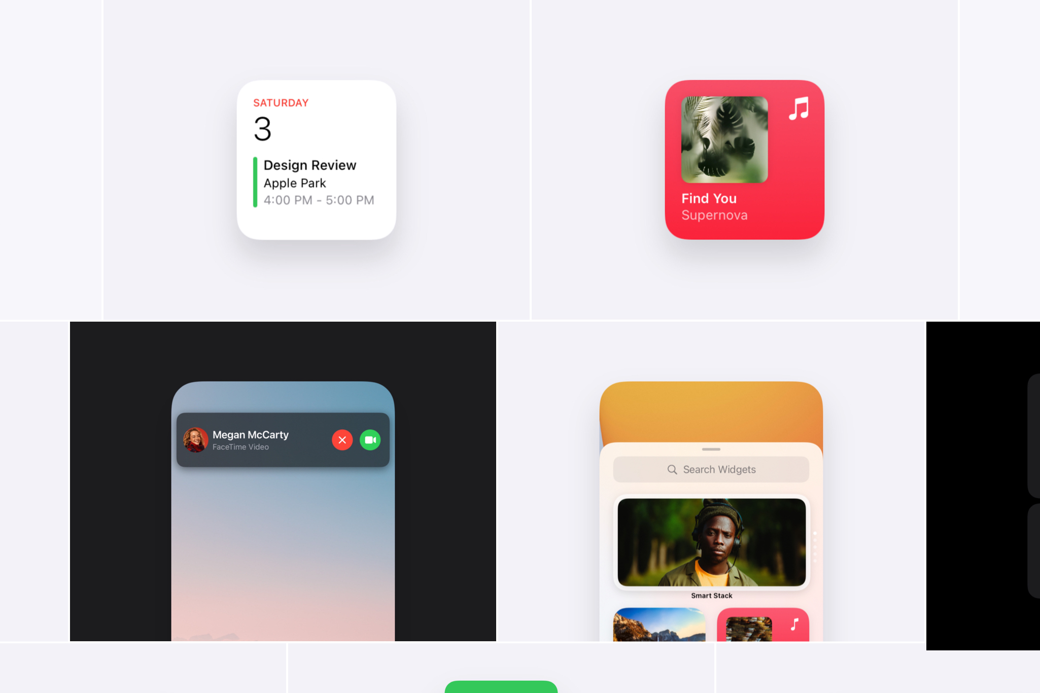
4. A new note-taking UI called ”Quick Note”
Apple debuted a new utility that looks great on the iPad called Quick Note, and it works by interacting with the bottom right screen edge of your device to pull up a new blank note. What’s more, Quick Note can store links, images, and even knows the context of what app you were in, whether it’s a page in Safari or an item in a 3rd party app. With that context, Quick Note can save the place you were in an let you come back. This is another light and feathery interface that features a compact toolbar, extremely high levels of interactivity, and beautiful Apple clarity.
5. New Multitasking Affordances (AKA Visual Hints)
Apple debuted a pretty genius, simple improvement to the iPadOS Multitasking system. Now you’ll see a subtle “…” at the top of each window. Simply tap that icon and you’ll be greeted by a super simple switcher that helps you do multitasking. Want to take that app in Split Screen? There’s an icon for that. Want to take a Split Screen app back into fullscreen? There’s an icon for that too. These new buttons make multitasking way easier and more obvious by being always-visible.
Here, you can see what happens when you start to take an app into Split Screen… it elegantly slides over to the side! See our Safari window here, all the way on the right? Now, the entire Home Screen becomes an app picker. Just tap the next app you want to open in Split Screen!
6. A new notifications design called “Notification Summary”
Apple also showed off a new way you can manage growing lists of notifications. You can now opt in to receiving a notification summary (pictured above) that collects a bunch of your notifications together into what looks like a miniature newspaper! This is a classic Apple design that organizes information in a way that’s easy to scan at a glance and jump into for more detail.
What did you think?
We’re just starting to explore the new designs presented at WWDC 2021 and can’t wait to get more experience with the new and updated operating systems. What was your favorite design from WWDC 2021? Let us know @detailsproapp on Twitter or on our contact page!
With WWDC ’21 coming up, we wanted to take a look back at the best designs that came out of WWDC ’20. There were so many that were worth mentioning. We’ve narrowed it down to the ten we found most exciting. Without further ado, let’s get started…
1. Widgets
Widgets were easily the biggest feature of iOS 14 with their inventive spirit and iconic style. They brought creative, glanceable windows of information to our home screens anywhere we wanted them. 16pt padding is ?.
The Widget Gallery was perhaps the most beautiful piece of the new additions—easy, beautiful browsing supported by clear typography, dynamic placeholders, and the 3D live tilting when you drilled in. Absolutely hit it out of the park.
Compact calls were another crowd favorite. These were more about what wasn’t there than what was. This new smaller form replaced what used to be a full screen cover with a fresh, familiar banner.
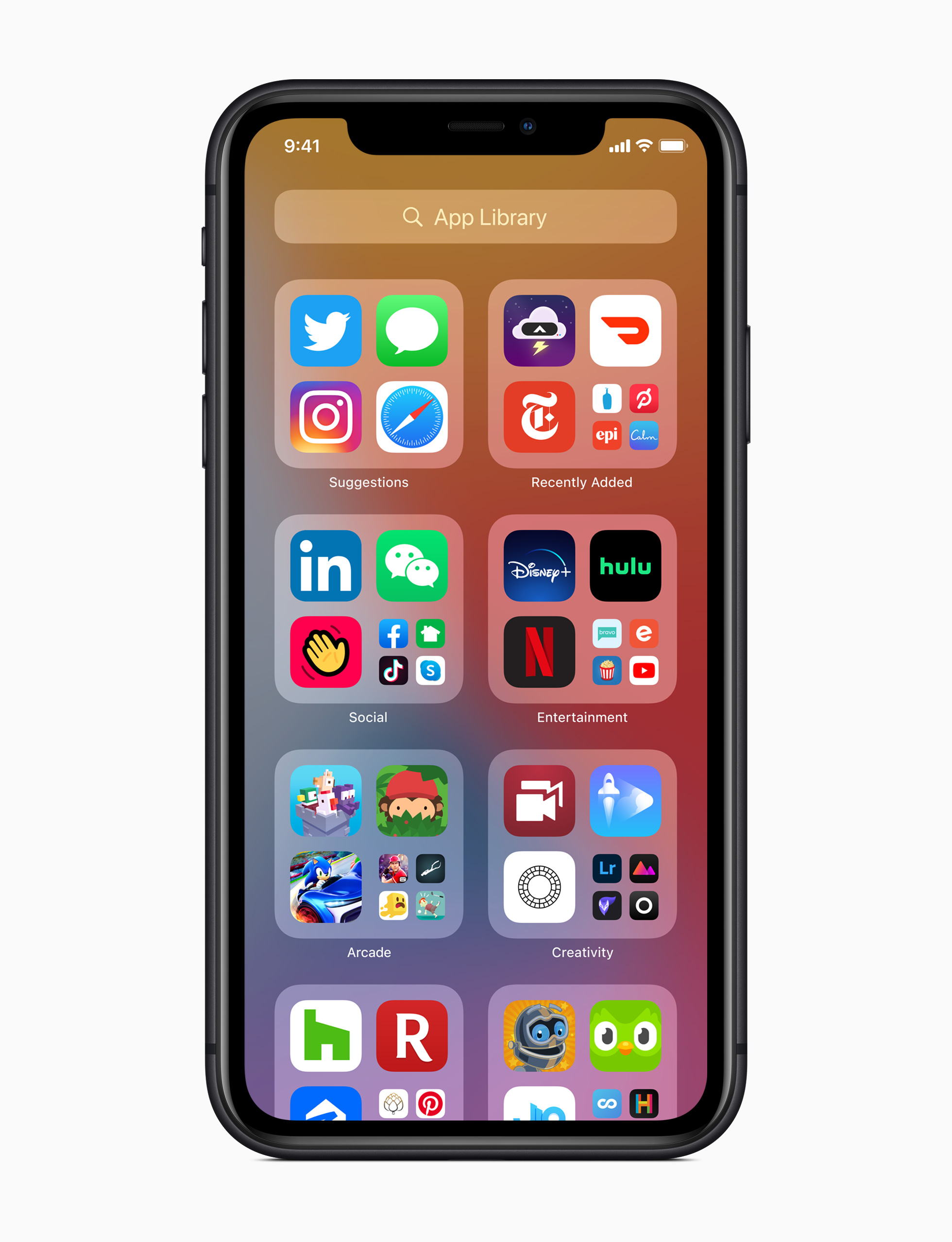
App Library was another entry in the Home Screen Improvements category. This design stayed true to the history of the Home Screen with simple labels and familiar shapes that showed design discipline.
Along with Big Sur, Control Center was introduced—an exciting new design for macOS. This design pushed on being compact, transparent, and useful in small spaces.
Messages added fun features like pinned conversations, preview bubbles, and group photos. The new designs made the app feel brighter and livelier than before.
Get the SwiftUI design file:
Check back Thursday, June 3rd for the SwiftUI design files for this design.
6. Compact Siri
Siri and Shortcuts opened up their world to more compact UI. From lists to prompts and images to notifications, there seems to be no shortage of work and thoughtful design that went into this design evolution.
Get the SwiftUI design file:
Check back Thursday, June 3rd for the SwiftUI design files for this design.
7. Maps
Maps is one of our favorite places to learn Apple Design. High complexity and a high bar seem to keep the design team creative and sharp. The refinements in iOS 14 were no exception.
Get the SwiftUI design file:
Check back Thursday, June 3rd for the SwiftUI design files for this design.
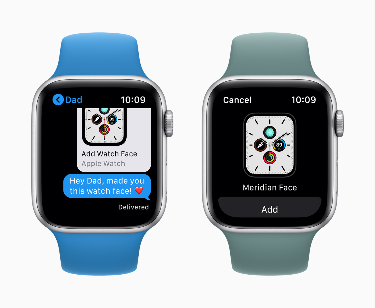
9. Face Sharing
A beautifully simple and compact design that took something rather complicated and made it feel like it must have even been easy to make—which it surely wasn’t. We loved the preview in iMessage and the font pairing between “Add Watch Face” and “Apple Watch”.
Get the SwiftUI design file:
Check back Thursday, June 3rd for the SwiftUI design files for this design.
10. Safari Tabs
Safari took a great big step forward in design with the rest of macOS Big Sur, but this feature was a total surprise: elegant previews of other websites as you hover between your tabs.
Get the SwiftUI design file:
Check back Thursday, June 3rd for the SwiftUI design files for this design.
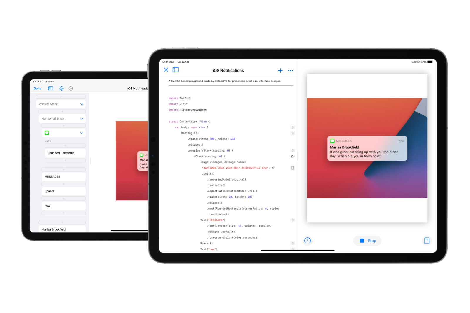
We want to make SwiftUI accessible to more people around the world. Our love of design is at the heart of this goal. Today, we are excited to announce a feature that makes DetailsPro even more flexible for the way designers and developers work: SwiftUI Playground export.
You can now export any design and open it instantly in Swift Playgrounds. See the impact of Swift code you’re working on with a beautiful SwiftUI preview; study the basics by learning from your own designs; prepare educational playgrounds with beautiful SwiftUI views built right in—all with designs made moments earlier in DetailsPro.
Any design made in DetailsPro can be exported to Swift Playgrounds instantly.
Day-in and day-out, we think about everyone from the curious kid working on their first app to the Apple designer working on the future of iOS. Thanks to SwiftUI, there is a new medium to create beautiful designs with that reveals itself to you as you explore.
We believe there is great promise here. Thanks to SwiftUI, a stunning design can be made with just a stack, a couple lines of text, and an image. We fit into this picture by giving designers, developers, and curious creatives around the world an easy way to get started.
To that end, we are always going to work hard to support the diversity of workflows that people have. From the beginning, we’ve been focused on supporting many ways to take your work with you out of DetailsPro.
You can already export designs as JPEGs and transparent PNGs to use in presentations, documents, and other design tools like Figma, Sketch, and Adobe XD. You can also export designs as Swift files ready for import into Xcode. We’re proud to add Swift Playgrounds as another option today and are eagerly looking forward to what comes in the future.
Designers can use DetailsPro templates, like the iOS 14 Medium Widget, and export the templates into Swift Playgrounds.
Exporting Swift Playgrounds requires DetailsPro 2.12.1 (available on the App Store). To export a Swift Playground, open a design, tap •••, and tap Export as SwiftUI Playground.
Alex’s app Coffee Book was featured as App of the Day on the App Store.
Hello, Alex! Thank you for speaking with us and being our first designer and developer on In Conversation. How’s your week been?
Hey guys. thanks for having me! My weeks been a bit of a whirlwind with the surprise App of the Day feature, but certainly very fun.
Let’s take it all the way back to the beginning. What was your first experience with an Apple product?
My very first time getting to experience something made by Apple was the 3rd generation iPod nano (the square-ish one). I had a wander around the Apple Store on a shopping trip and played with a bunch of devices. Then, just as we were about to head home, my dad got the Product Red Nano—I was very jealous. When I eventually got to play with it I was blown away by just how great it sounded having only experienced more budget sound before that. I’d watch video podcasts and even full movies on it despite being sat in-front of a perfectly fine TV. Safe to say there was no going back from this point and my love for Apple’s tech started to brew.
Alex’s first iPod.
When you think back, what stands out to you about the designs of that time?
In terms of the hardware I think we were in a bit of a strange period. There were still lots of metal backs on devices (with scratches galore!) paired with funky colours on the front. I remember how much my iPod stood out against the chunky plastic design of my HP laptop. Software for me back then was basically games and music, so I didn’t get exposed too much to the design trends of the time—it was quite a few years later before I started to really appreciate what I was looking at. One thing that really stood out was that we didn’t seem to be fully set on going skeuomorphic, there were the odd bits of UI here and there that just ignored the concept and would fit right in with today’s trends.
I have to say I think I kind of miss how “friendly” things felt in the hand. Everything was rounded and sorta chunky, which I don’t feel we get from modern devices.
Alex’s iPhone 3G. This phone is probably my all-time favorite as well. It was beautiful and it was my first.
Zooming back to today, what your thoughts about the designs in modern day?
Modern apps are a truly fascinating area of design to me. I’m someone who tends to lean towards the standard system design, which tend to be quite flat with rounded edges and the odd splash of color, but I can’t ignore how wonderful some apps are that mostly ignore convention. Headspace for example looks nothing like an app Apple would ship on the system, yet it fits right in with clever use of familiar navigation. I think there’s room for more creativity in apps, feeling like we’re maybe heading towards a ceiling with flat design.
After the Big Sur release and the “return of fun in visual design” began, I was hoping to see more apps to let this look start to bleed into their UI, not just stopping at the icon.
Your app Coffee Book has a vibrant, simple design that is easy to admire. Can you talk to us a little bit about your process?
My process for most of my apps starts with something that bothers me—Coffee Book was because I had a coffee book and I kept spilling coffee on it.
This is a particularly bad example of a page—some had holes in them were I’d tear off the stained bit. Normally I’d start to grab a sketchbook and think about what I might make to fix the problem, but this time I just went straight to Xcode—my notebook in front of me covered in coffee was essentially my research.
The coffee book, stains front-and-center, that led Alex to develop Coffee Book.
I took the fields of data I’d been noting down, thought about what I learned from each one and what more I could have written down and then quite quickly threw together a prototype for the espresso brew form. This very first prototype is actually what’s on the App Store now. Thanks to following Apple form design (ish) everything was quite straight forward. My design approach with this app was essentially “see what Apple does, if they don’t do it, find something thats close and mess with it”.
After building a prototype I had to consider that more people than just me will be using this thing, hopefully. I only make espresso these days so the app was designed around that but I knew it wouldn’t be enough for everyone. Realising that I’d need to add all the types that are currently in the app, I asked around how people make their brews better. The important part for me was understanding what in particular they’d look at to improve, wether it was temperature, grind, yield or anything else, rather than just asking “what do you write down”. After adding all the fields people mentioned and some fairly basic design of the selection screens, I decided to send out a TestFlight. At this point the app was not too-dissimilar to now, with the core design being set at the start.
Coffee Book made it easier to craft the perfect brew and quickly found an audience.
I found that often people get comfortable with certain parameters and only tweak one or two things to get their perfect brew—this revealed a big flaw in my app, that I required every single field to be filled out. I should have probably drawn this same conclusion from the earlier research, but I ended up making a very strict app. Removing all of the validation (nearly!) on the forms meant you could store as little or as much data as you like, which helped me make the app accessible to beginners and pros.
Was your process any different with your new app, Pass Book?
A couple differences really changed how pass book was designed. First, I used SwiftUI, which meant I could iterate as fast as I liked with instant canvas reloads, turning my IDE into a sketchbook. Second, I said that I wasn’t allowed to just copy Apple. It’s been quite a while since I just did something without any inspiration at all, so I had absolutely no idea how this would turn out.
The concept itself was very simple with little wiggle room. I had a set of data to capture and I had a list of codes to show after the user entered data. This helped ground the end result and remove some of that blank page anxiety. I soon found that the end product was taking a very different direction to the apps I’d built before it.
Something interesting I tried to do was make the app feel fun and welcoming without coming across as a toy to serious users. Everything is as rounded as I could get away with, pushing the weights up of the rounded fonts to the point where they’re about to look like bubble writing. Things were spaced out a lot more than usual, trying to give the user breathing room instead of huge chunks of options. Whilst this does compromise the experience on smaller devices, I think its worth it. A good example of this is in the form where I separated each individual field into its own section.
I’m quite happy with how it turned out, with the learnings from this app certainly affecting the next couple updates of Coffee Book.
Alex’s app Pass Book features a modern design with clean controls and sections.
What are you most looking forward to in the field of human-computer interaction and user interface design?
I hinted on it a little earlier, but when it comes to interface design I’m excited to see what comes next with the return of fun. I hope that apps are going to start to diverge a bit when it comes to their general design, creating more innovative experiences.
As for interaction—I think the answer is AR. I’ve of course played various AR games and tried out some experiences like IKEA Place, but I am sure there’s more to do here. I imagine an experience where we just touch things in the air that have been super-imposed onto out vision (or glasses), giving us a whole new challenge of feedback in a world without physical touch.
To shadow, or not to shadow? To Corner Radius, or not to Corner Radius?
I absolutely love a good shadow. If theres enough information on a page to warrant a stronger visual hierarchy, get stuff elevated. Grey shadows with a nice big blur can make for a lovely looking app, with the advantage of colouring the shadow if you want something really vibrant. As for corner radius I think always yes—as long as you can take advantage of a continuous radius. Once you’ve seen a proper squircle, you can’t go back.
Alex Logan is the developer behind Pass Book, Coffee Book, and Snippit. We were able to interview Alex to learn more about his design practice and creative process.
For more from Alex, visit his apps on the App Store and follow him on Twitter.
We added gradients as design elements you can add to your designs. You’ll find Linear, Radial, and Angular as options and a friendly interface for adding and editing colors and controlling the parameters of each type. Where changing gradients in Xcode can be cumbersome due to different signatures, we wanted to make this simpler with DetailsPro. Simply tap to change the type and the options (and SwiftUI code export) will automatically update. We also support the default iOS 14 Color Picker so colors you’ve saved across apps are accessible here.