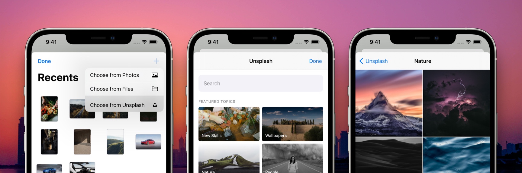
Hand-in-hand with great design is great photography and Unsplash is really the place to find great photography.
As of today, you can add images from Unsplash directly to your SwiftUI designs, all from within DetailsPro on iPhone, iPad, and Mac.
We’ve added a new option you’ll find when choosing to add a new photo, Choose from Unsplash. Along with Choose from Photos and Choose from Files (we are very proficient in naming), this new option fits in nicely with what we currently have.
A new option, Choose from Unsplash, makes it easy to add great photos to your designs.
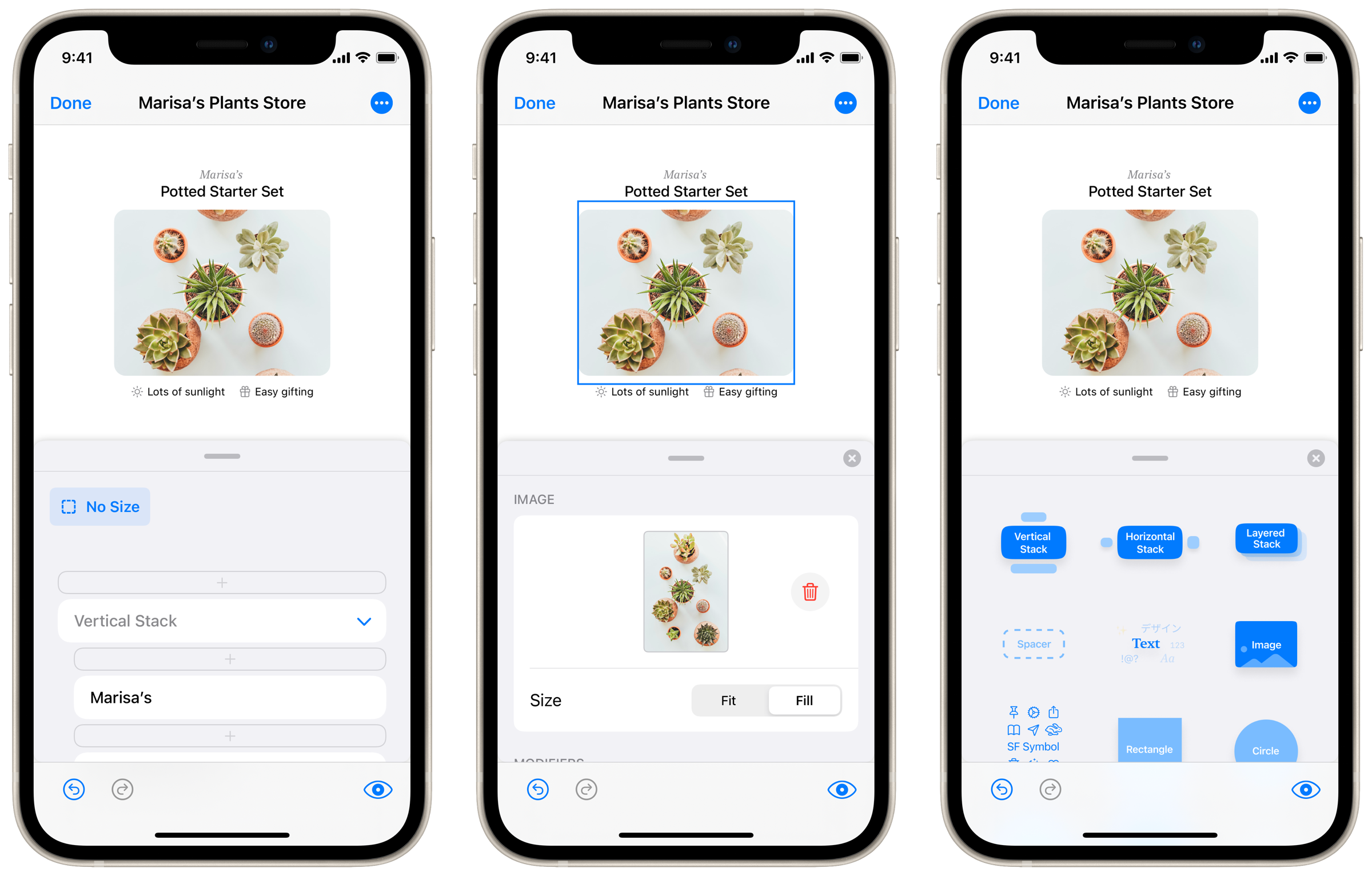
Our intention is for DetailsPro to have absolutely off-the-charts support for photos and the way that designers use them. So, this is a great time for a quick refresher on how DetailsPro handles images. When a designer adds an image, the source file for that image is saved in DetailsPro and made available to multiple designs at once.
We know from experience that most designers end up working on projects for a while and you’re basically reaching for the same or similar assets over that period of time. So we made DetailsPro specifically for this pattern to save designers from having to import the same images over and over and over. Leave the folder of assets behind after you’ve imported the images into DetailsPro just once.
We added an Unsplash integration into our image picker. Now, alongside Choose from Photos and Choose from Files, you can select Choose from Unsplash to search Unsplash by term or by curated collection. This should make it a lot easier to mock something up when you don’t already have the perfect images.
Fixes and improvements
Convert to Stack now keeps any modifiers that were on the original stack
Rotation Effect allows easy increment by 15° or 45°
We made continued improvements to the editing UI that appears on iPhone. The drawer now opens up faster, and picking a new design element to add happens in an additional compact drawer that floats above everything else.
We are hearing a lot that many of you are primarily designing from your iPhones while on-the-go and that has us very excited. Our goal has been, from the beginning, to make designing beautiful interfaces accessible to as many people as possible. So we are going to be making sure as time goes on that every important upgrade to DetailsPro has a first-class implementation on the compact size as well as the larger sizes of iPad and the Mac.
We found a number of areas where we could make loading, interaction, and animation smoother than before. DetailsPro is a 100% native app written in SwiftUI, optimized for the M1 chip and the latest iPhones and iPads on iOS 14. With this update, we greatly reduced DetailsPro’s memory usage and CPU usage so you should feel the app is snappier and faster than before.
We’ve taken inspiration from one of our favorite apps that helps us build DetailsPro, Linear, and started this changelog to keep you up-to-date on the latest improvements we make week-to-week.
We are working on DetailsPro all the time to make it easier for you to design your greatest ideas in less time than ever.
We found a number of areas where we could make loading, interaction, and animation smoother than before. DetailsPro is a 100% native app written in SwiftUI, optimized for the M1 chip and the latest iPhones and iPads on iOS 14. With this update, we greatly reduced DetailsPro’s memory usage and CPU usage so you should feel the app is snappier and faster than before.
The spaces we design for influence what we create.
When Apple introduced the Apple Watch in 2014, they led with a remarkable set of videos titled Rise, Up, and Us. Each showed the watch in unique scenarios. Rise can be watched here while it’s still available.
These videos introduced a new product and a new space for interaction to consumers—the Apple Watch display.
Incredible work had been done by Apple Design to make it to this point. Imaginative, creative, and ground-breaking is how I would describe the cumulative effort that led to the beautiful interfaces shown on the watch. And so, with the public release, the baton would be passed to new designers to create new experiences.
This is where it’s vital that our tools meet the moment. The easier it would be for designers to design for the Apple Watch, the better and greater quantity of designs they would make. That’s what I believe, anyway.
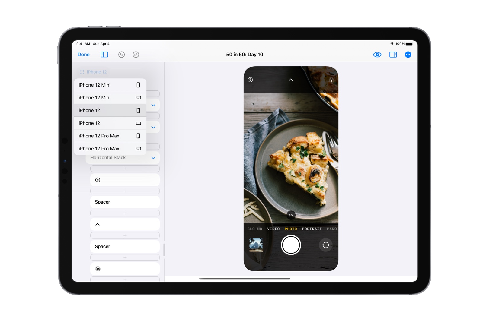
DetailsPro makes this process easy today and will continue to going forward with our new feature out today: Size Templates. Size Templates help designers quickly and easily target the precisely correct size for the devices they design for.
This update contains widget sizes (Small, Medium, and Large widgets), iPhone sizes, and iPad sizes. Apple Watch sizes and Mac sizes will be coming in a future update.
Designers can choose from built-in size templates for iPhones and other Apple devices.
DetailsPro takes care of knowing the exact point dimensions of each device and will even change the corner radius of the canvas to match that of the device. If a designer is working on something for iPhone 12, they will see not only the correct size but also the correct device corner radius. All they have to do is tap iPhone 12 and select between Portrait and Landscape. It’s that easy.
We also extend beyond device templates into other operating system-specific templates that we will continue to expand as these products evolve. Today, DetailsPro already includes support for the new widgets that debuted with iOS 14.
Size Templates include other relevant sizes, including those of iOS 14 widgets.
DetailsPro is a focused design product built exclusively for Apple platforms. We can focus deeply on what it means to design for these platforms. We can build features that designers would never see anywhere else because nowhere else has this focus.
We’ll be keeping these templates up-to-date with the latest devices always because this is what DetailsPro is all about—helping Apple platform designers do their work.
Designers are expected to deliver designs that look great in Light mode and Dark Mode.
DetailsPro can help you design in both modes easier than ever, in two ways.
First, if you simply put your device into Dark Mode, your designs will show in true Dark Mode. This happens automatically with no work needed. How does this happen? Well, since you are designing with real SwiftUI, everything is reflecting true, natural SwiftUI states. Text changes color, system colors like blue and red show their true dark mode variants, and backgrounds change too.
Second, you can switch between Light mode and Dark Mode quickly and easily with the new moon icon released today in DetailsPro 1.1.
Turns out, you won’t need to manually copy changes over from your Light mode variant to your Dark Mode variant anymore.
You also won’t need to worry about them falling out sync. In DetailsPro, your Light mode design and your Dark Mode design are the same design.
Update to the latest version of DetailsPro and let us know what you think!
Whether you’re planning on grabbing a new iPhone or just thinking back to the keynote and all the beautiful transitions, camera work, and design, I hope there was something out there this week that inspired you.
Inspiring in Color and Space
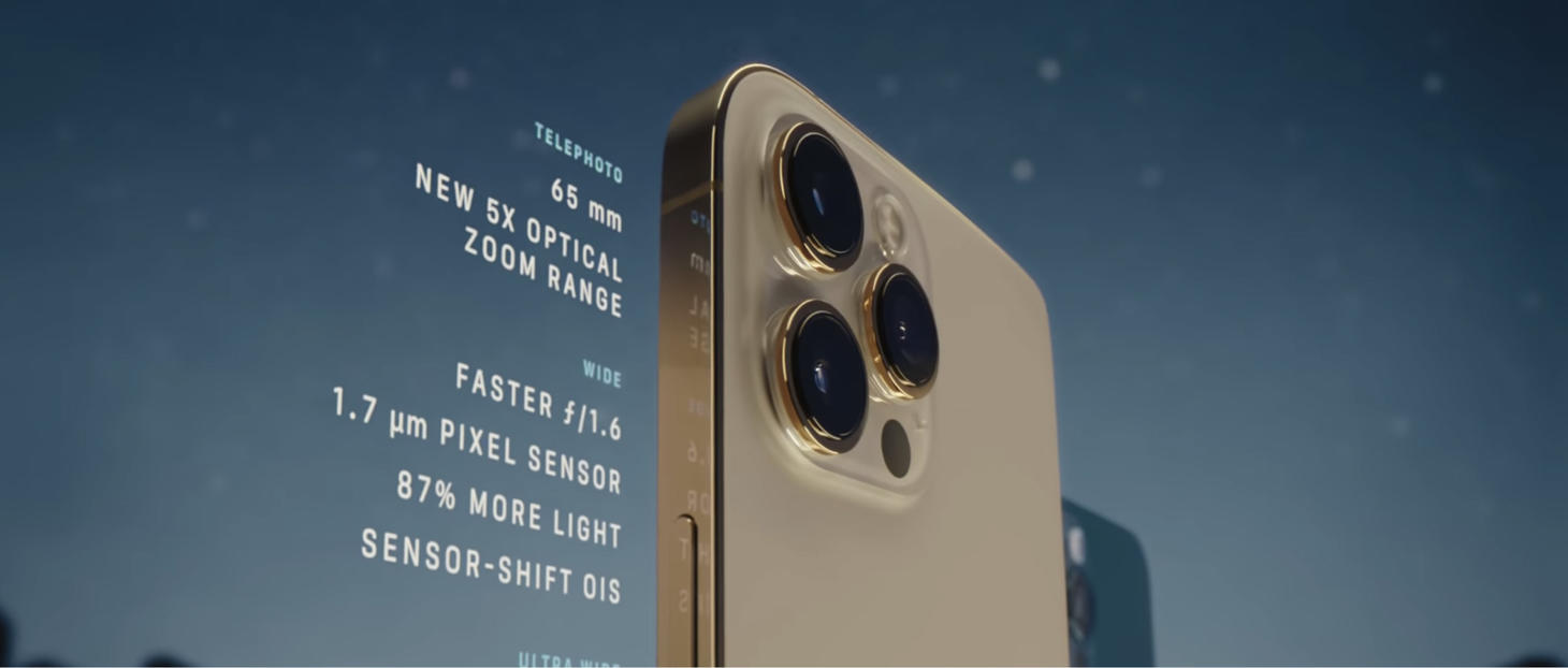
Beautiful, colored section headers and nice padding in This is iPhone 12 Pro from Apple. While marketing content doesn’t map one-to-one to interfaces, there’s still some connection and something to appreciate within the design. Did you notice the reflection?
Always a Toggle Away
Reminders in iOS 14 presents a toggle to enable and expand several of the options on each reminder. You may normally expect to see a placeholder value for each of these options. The toggles feel fresh as they save space, keep many parts of the interface hidden until they are needed, and clearly communicate when something isn’t being used at all: for example, seeing “Date” and then an off toggle. This is also a great example of useful, inline UI. The location row surfaces a few common destinations and then has a “Custom” option which presents a whole search view. Surfacing those common few destinations first saves having to push another interface on top of this every time you want to choose a destination.
Time to Filter Friendly
An inspiring design for filters previewed on the page for ?Fitness+. Each aspect has been given a special appearance adapted for its purpose. A face beside each name, a clock for each duration. These are small touches that elevate the design.
Spaced Out and Clear to See
Elements placed in different corners in this in-class view for ?Fitness+. Here, they bring balance. This is an example of both keeping related information close together and also of creating anchor points and meaningful locations for the different elements in a design. (Think about where screenshots float on-screen after they are taken. The bottom right corner on macOS, the bottom left corner on iOS. Oddly enough, different corners.)
The New, Now
This creative concept by Adam Varga demonstrates what an interface for app selection might look like in several dimensions. Take a look for yourself, the animation may inspire you.
Taking It Lightly
One more from the page for ?Fitness+. Light text on a light background, used in a large hero spot to make up for the lower accessibility.
Hello and welcome to first issue of UI Designer Weekly!
My name is Sahand and I’m a UI designer that was hoping to find something like this. I’m always finding interesting new designs in newly-released products that keep me up-to-date on the latest interface ideas.
My hope is to collect these beautiful, informative, and thought-provoking examples of design, no matter how subtle, and share them with you so they help you see something new and give you ideas you can mix into your work.
Happy to have you here!
P.S. If you have any feedback or requests, I’d love to hear from you on Twitter!
Cards, Back and Better Than Ever
A beautiful rendition of cards on the page for ?One. Centered text, clean pairing of the primary headline with secondary text below. Each iPhone looks, if I may say, cozy under its overlay. This is perhaps an example that shows you can use centered text to give cards identity and a little more “theater”, so the cards feel like big, bold, exciting things. (If you were displaying news articles, for example, standard left or right alignment specific to the reader’s language would probably be more appropriate, whereas here each card is getting significant weight and presence because it is a list that’s only ever going to have six cards that don’t change.)
Quick Actions, Elevated
Notes in iOS 14 presents buttons, including Delete, in a compact row at the top of the sheet. You may normally expect to find Delete at the bottom. If more often than not, a note-taker opens this sheet looking for Delete, than this is way better than having that button at the bottom! It feels like a fresh way to present buttons that users use often that might have otherwise blended in.
Both Playful Design and Keep-Your-Title-Text-Close Masterclass
A big popcorn emoji and the idea of using big emojis to represent group conversations coming in new UI in macOS Big Sur. Note that “Film Club” is set in Regular weight. It’s always a balancing act figuring out when to use Medium or Semibold versus when to stick with Regular. Regular in this case is just fine, isn’t it? Also a reminder that keeping related visual elements close helps a ton.
Making It Easy to Compare
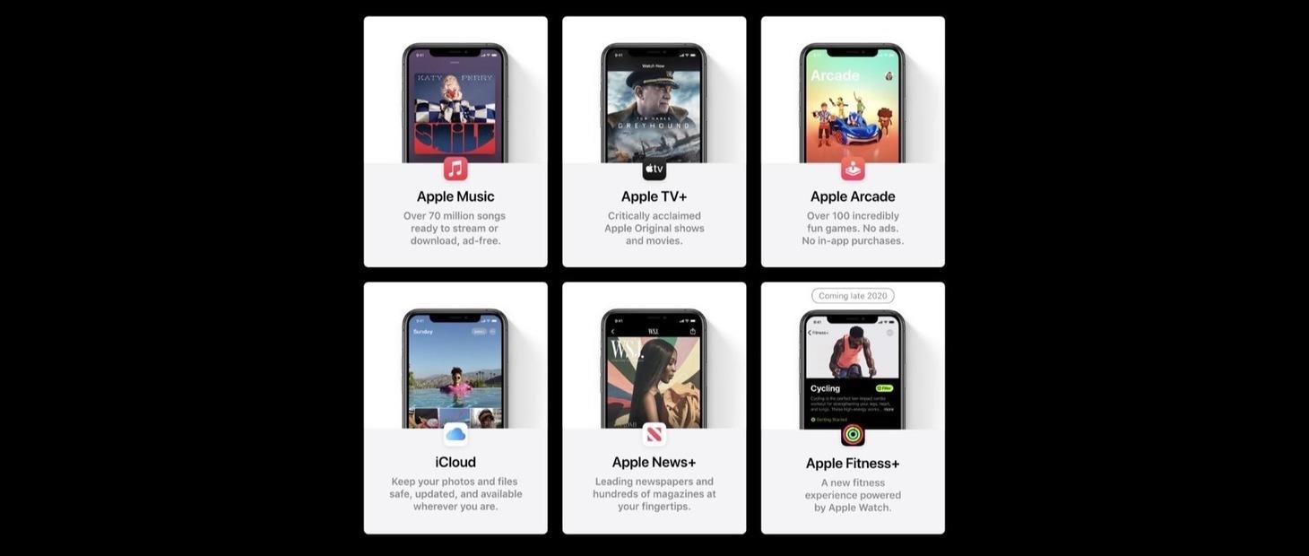
The plans on the page for ?One hammer home that you can use different axes together to complement and clarify your displayed information. Here, you quickly figure out that the “Premiere” plan has more stuff in it without even reading. The horizontal axis is then used to arrange the plans for comparison. Imagine how much harder these would be to compare if they were stacked vertically. The vertical axis would be overloaded with meaning and you’d have to work harder to see which list was longer.
No-Fuss Text Callouts
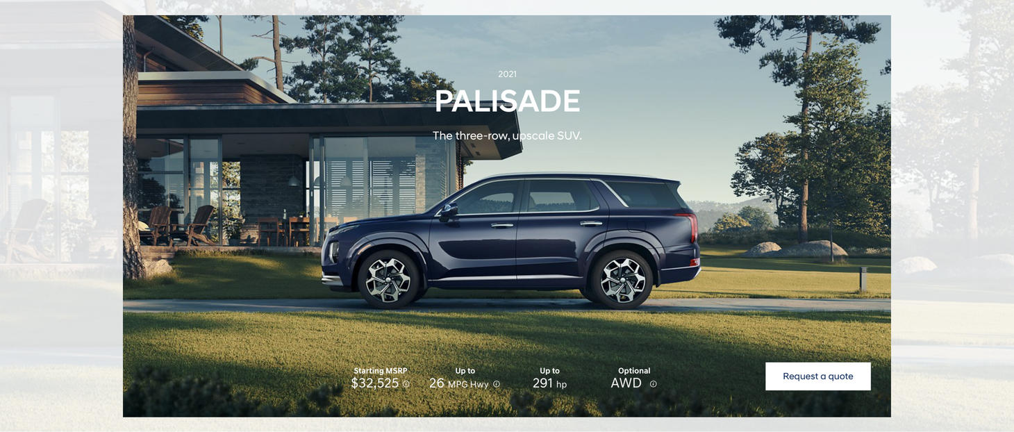
There’s just something about light text on beautiful photography, isn’t there?
Aesthetics Taking Instagram Slideshows to New Heights